Default UI Menu: Tools/Palettes/Style Manager/Wall Styles
Ribbon UI Menu:
Walls are composed of components with each component representing a part of the walls geometry. By default every Wall Style has at least one component of the "Standard" type. Components are essentially long boxes defined by the components properties. To add components to a wall style
- Select that wall style in the Style Manager.
- Increase value in the Number of Components field to the desired value.
To delete components from a wall style
- Select that wall style in the Style Manager.
- Decrease the value in the Number of Components field to the desired value.
Warning: Components are added sequentially to the Wall style. If you increase the number of components the new components will be added to the bottom of the list of components. If you decrease the number of components the components at the end of the list will be deleted. The best practice is to add, build and complete each component in turn before adding more.
Component Wall Properties
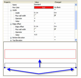
There are nine categories of wall properties. Several of them have sub-properties: Name: This property is used to specify the name of the component Pen Color: This property is used to specify the Pen Color of the component. Width: These properties are used to specify the width of the component. Edge Offset: These properties are used to specify the horizontal placement of the component. Bottom Elevation: These properties are used to specify the bottom of the component. Top Elevation: These properties are used to specify the top of the component. Dimension: These properties are used to specify the width of the component. Brush: These properties are used to specify the brush style of the component. Component material: This property is used to specify the material of the component. Component draw priority: This property is used to specify how the component will interact and intersect with other components and walls.
Direction
Walls have direction with a right and left side. Whether a side is Left or Right depends on the wall's direction. To determine side is by assuming you are standing at the start point wall and facing the end point of the wall. Another way to visualize In other words, if a wall is drawn from left to right, the side toward the top of the screen is the left side of the wall, and the side toward the bottom of the screen is the right side of the wall. You can show a walls direction by checking the Show Direction on the Wall page of the wall's properties. Horizontal values use for defining components may have a negative or positive value. The left side of the wall is the positive direction, and the right side of the wall is the negative direction.
Width
The width of a wall is measured from the Edge Offset of the wall. There are four Width properties that combine to set the actual width of a component:
Width: This value sets base width value for the component.
Plus Wall Width: If this value is checked, the wall's modified Width value will be added to the Component's Width value to specify the total width of the component.
Operator: Specifies how the Value will modify the wall's Width (added, subtracted, multiplied, or divided) before it is added to the components Width.
Value: This number is used to modify the wall's Width before it is added to the component Width.
Note: A wall's width is specified in the wall's properties
These for properties combine in the following pattern:
- Actual Component Width = Width + (Wall Width
Value) - depending upon the operator selected. In other words: - Actual Component Width = Width + (Wall Width + Value) - if adding
- Actual Component Width = Width + (Wall Width - Value) - if subtracting
- Actual Component Width = Width + (Wall Width * Value) - if multiplying
- Actual Component Width = Width + (Wall Width / Value) - if dividing
So, if the Width of the component is 2 feet, and the Width of the wall is 1 foot, if the operator is Divide, and the Value is set to 4, the components actual width will be 2.25 feet.) Or 2+(1/4).
Edge Offset
There are four Width properties that combine to set the Edge Offset of a component: Offsets are measured from the baseline of the wall. The baseline of a wall is indicated in the Style Manager by the two blue nodes. The direction arrow of always resides on the baseline.
Edge Offset: this value sets base offset value for the component. Plus Wall Width: if this value is checked, the wall's modified Width value will be added to the Component's Edge Offset value to specify the total offset of the component. Operator: specifies how the Value will modify the wall's Width (added, subtracted, multiplied, or divided) before it is added to the components Edge Offset. Value: this number is used to modify the wall's Width before it is added to the component Edge Offset.
Note: A wall's width is specified in the wall's properties
These properties combine in the following pattern:
- Actual Offset = Edge Offset + (Wall Width
Value) - depending upon the operator selected. In other words: - Actual Offset = Edge Offset + (Wall Width + Value) - if adding
- Actual Offset = Edge Offset + (Wall Width - Value) - if subtracting
- Actual Offset = Edge Offset + (Wall Width * Value) - if multiplying
- Actual Offset = Edge Offset + (Wall Width / Value) - if dividing
So, if the Edge Offset of the component is 4 inches, and the Width of the wall is 6 inches, if the operator is Add, and the Value is set to 4, the components actual offset will be 14 inches.) Or 4+(6+4).
Bottom Elevation
The Bottom Elevation is specified by two properties: Offset: this value specifies the distance between the From Elevation and the bottom of the component. From Elevation: this setting provides four positions along the wall height, from which the Offset can be measured. Wall Bottom — this is the absolute lowest point of the wall as measured from the position of the wall on the Z axis (Z location). It is normally the same as the Baseline, but it may vary if a Wall Modifier has been applied to the wall. Wall Top — this is the absolute highest point of the wall as measured from the position of the wall on the Z axis (Z location). It is normally the same as the Base Height, but it may vary if a Wall Modifier has been applied to the wall. Base Height — this is the Height value specified in the Wall's Height property. Baseline — this is the walls Z location, its position on the Z axis
Top Elevation
The Bottom Elevation is specified by two properties: Offset: this value specifies the distance between the From Elevation and the top of the component. From Elevation: this setting provides four positions along the wall height, from which the Offset can be measured. Wall Bottom — this is the absolute lowest point of the wall as measured from the position of the wall on the Z axis (Z location). It is normally the same as the Baseline, but it may vary if a Wall Modifier has been applied to the wall. Wall Top — this is the absolute highest point of the wall as measured from the position of the wall on the Z axis (Z location). It is normally the same as the Base Height, but it may vary if a Wall Modifier has been applied to the wall. Base Height — this is the Height value specified in the Wall's Height property. Baseline — this is the walls Z location, its position on the Z axis
Dimension
The options are:
- From Left Side
- From Center
- From Right Side
Component Draw Priority
The Component Draw Priority is used to specify how components will draw, heal and clean up with other components and other walls. The following conditions apply with the Component Draw Priority: Components with the same Draw Priority will heal to each other. Components with a lower value will pass through components with a higher value. Draw Priority takes precedence over Draw order