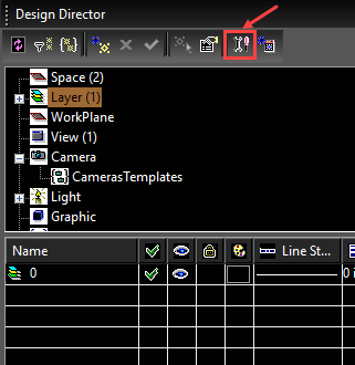
The Design Director
(Available in Platinum, Professional, Deluxe)
Hotkey: F3
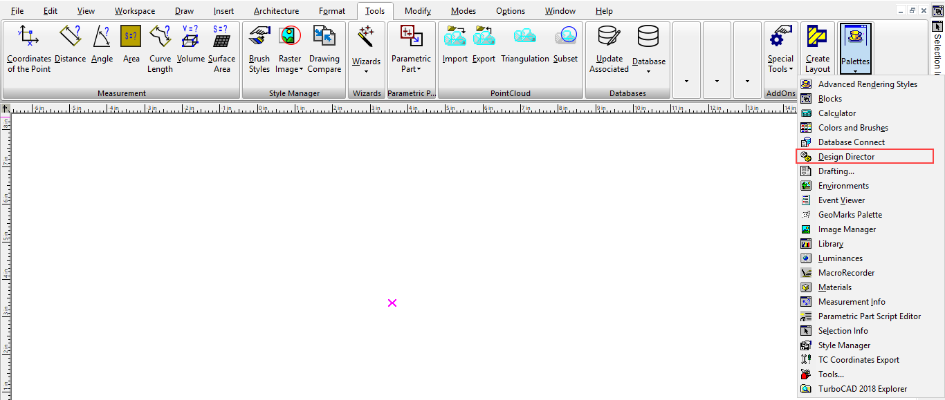
Default UI Menu: Tools/Palettes/Design Director
Ribbon UI Menu:
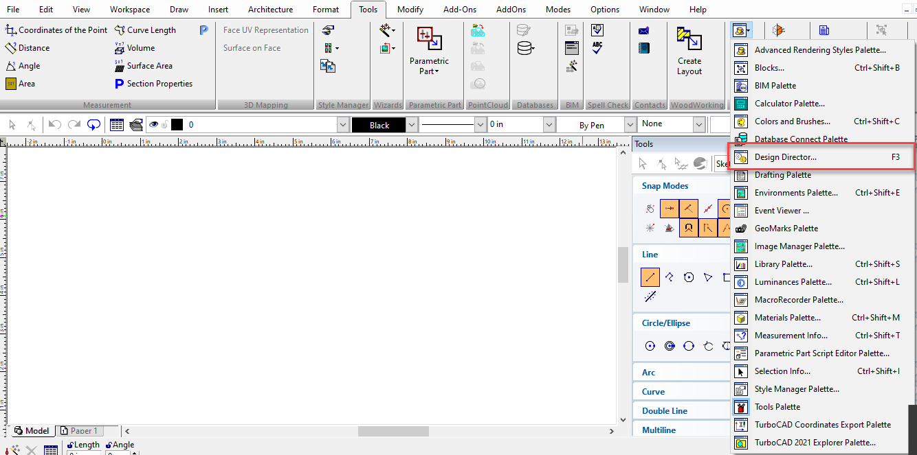 The Design Director is a convenient place to perform commands related to layers, workplanes, views, cameras, and graphic objects or object groups.
Design Director-Cameras
Default UI Menu: Tools/Palettes/Design Director/Camera
Ribbon UI Menu:

Enables you to manipulate all the cameras and camera sets in the drawing . To create a new camera or camera set, select Create New in the Design Director toolbar or local menu. When Cameras or Camera Sets is selected in the upper pane of the Design Director, the lower pane has the following options:
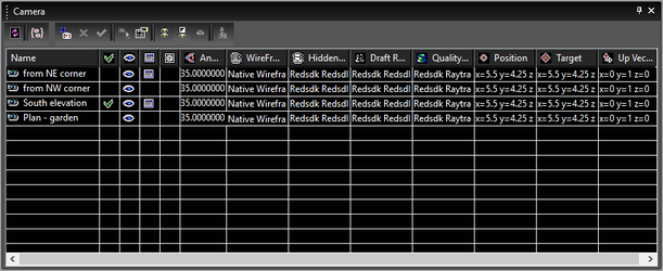
Active: Displays the view taken by the camera, and attaches the window to the camera. Visible: Displays or hides the camera symbol in the drawing. Attached: Creates a new window associated and synchronized with the camera. Draft Rendering: Sets the rendering type when the view is rendered in Draft rendering mode. Quality Rendering: Sets the rendering type when the view is rendered in Quality rendering mode. Perspective: Activates Perspective mode. Angle: The view angle for perspective mode. Position: The location of the camera position. Target: The location of the point the camera is facing. UP Vector: A point defining the up direction of the camera.
Camera Sets
A camera set is a group of cameras, which can be handy if you want to set rendering, perspective, and visibility parameters for multiple cameras.
- Select Cameras in the upper pane of the Design Director.
- On the lower pane, select the cameras you want to include in the camera set.
- Select Create Set in the Design Director toolbar or local menu.
- Select Camera Sets in the upper pane in order to see the defined camera sets in the lower pane.
- Select the properties (visibility, render type, etc.) of the camera set. When the camera set is made Active, these properties will be automatically applied to all cameras in the set.
Design Director-Categories
Default UI Menu: Tools/Palettes/Design Director/Category
Ribbon UI Menu:

In the Design Director, "Categories" refers to groups of objects - 2D, 3D, cameras, etc. You can insert a category into the Design Director in order to have easy access to zooming, visibility, and other properties of the object group.
Note: To add single objects to the Design Director, use Graphics.
To place a group of objects into the Design Director:
- Select the objects in the drawing space.
- In the Design Director select Categories in the upper pane and select Create New from the toolbar or local menu.
- Accept the default name or assign one that will help you recognize the object.
All object groups you add to the Design Director will appear in the lower pane. The lower pane contains the following options: 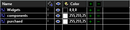
ZoomTo: Zooms to the extents of the objects. Visible: Displays or hides the objects. Color: Sets the object's pen color. Add To Category: Adds the selected object to the category. Remove From Category: Removes the selected object from the category.
Design Director-Graphics
Default UI Menu: Tools/Palettes/Design Director/Graphic
Ribbon UI Menu:

In the Design Director, "Graphics" refers to objects - 2D, 3D, cameras, etc. You can insert single objects into the Design Director in order to have easy access to zooming, visibility, and other properties of the objects.
Note: To add groups of objects to the Design Director, use Categories.
To place a graphic object into the Design Director:
- Select the object in the drawing space.
- In the Design Director select Graphics in the upper pane and select Create New from the toolbar or local menu.
- Accept the default name or assign one that will help you recognize the object.
All objects you add to the Design Director will appear in the lower pane. The lower pane contains the following options: 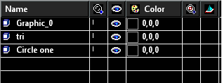
ZoomTo: Zooms to the extents of the object. Visible: Displays or hides the object. Color: Sets the object's pen color. View by WorkPlane: Displays the view by the workplane that is set as WorkPlane by Entity. . Get WorkPlane: Sets the current workplane by this object.
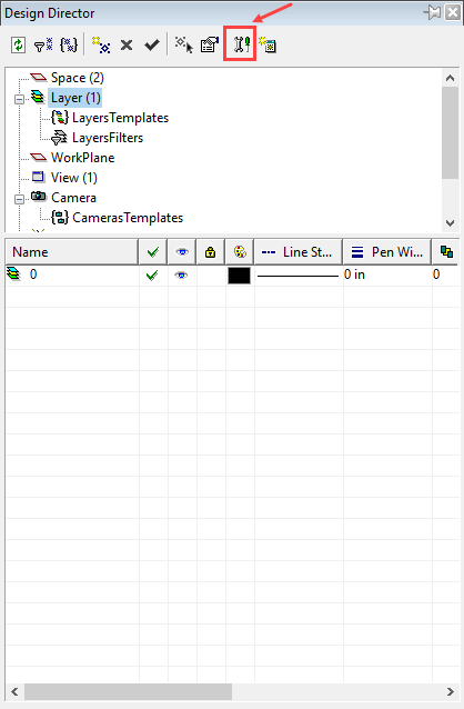
Design Director-Layers
Default UI Menu: Tools/Palettes/Design Director/Layer
Ribbon UI Menu:

Enables you to manipulate all the layers and layer sets in the drawing . To create a new layer or layer set, select Create New in the Design Director toolbar or local menu. When Layers or Layer Sets is selected in the upper pane of the Design Director, the lower pane has the following options: 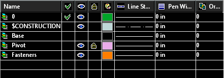
Active: Sets the layer as active, or applies the layer set. Also indicates the layer for a selected object or tool. Visible: Sets the layer visibility. Lock: Use this switch to lock layers, which means the objects on them will be read-only. You can add objects to locked layers, but you cannot edit or delete objects. Color: Sets the layer color. Order: The order number of the layer. Line Style: specifies the Line Style for the layer. Pen Width: Specifies the Pen Width for the layer. Print Style: Specifies the Print Style for the layer.
Layer Sets
A layer set is a group of layers, which can be handy if you want to set visibility, locking, and other parameters for multiple layers.
- Select Layers in the upper pane of the Design Director.
- On the lower pane, select the layers you want to include in the layer set.
- Select Create Set in the Design Director toolbar or local menu.
- Select Layer Sets in the upper pane in order to see the defined layer sets in the lower pane.
- Select the properties (visibility, locking, etc.) of the layer set. When the layer set is made Active, these properties will be automatically applied to all layers in the set.
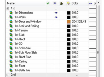
Layer Filters
 Layer filters provide you with a powerful tool to organize your work, workflow and drawing. This feature also allows you to import DWG file that have embedded layer filters
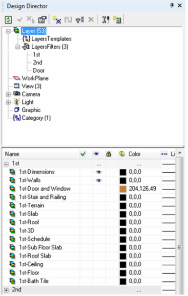
Layer filters will organize you layer by a defined set of parameters.
Layer Templates
Layer templates allow you to create and save alternate configurations for layers. Layer templates store how layers are setup, but do not store layers themselves. Layer templates are saved in a *.lrs file which can be stored anywher in you system directory. All layers which meet the parameters define by the filter will be grouped in the lower panel of the Design Director.
Note: The Show Filters and Group by Filters options must be turned on in the Design Director options for Filter groups to be displayed.
You can control all of the settings for the layers in the group. This means that if you change the color adjacent to the filter the color for all of its layer will be change to that color. If you change the visibility adjacent to the filter the visibility of all its layer will be changed to that visibility. If for any setting the layers contained in the filter have mixed settings for an option the filter will display a blank field or an ellipsis (...) for that setting. however you can still control the settings of the filtered layers. To Change Layer Color Properties via the Filter
- In the Design Director of a filtered drawing:
- In the lower panel of the Design Director, hover the cursor over the color field adjacent to a filter.
- Click on the color field.
- When the Color dialog appears, select a color.The colors of all the filtered layers will be changed to the selected color.
To Create a Filter
- Click the Create Layers Filter button in the toolbar of the Design Director.
- When Prompted assign a name to the filter.
- When the Filter Dialog appears, specify the parameters for the filter.
- Click OK.
To Edit a Filters Parameters
- Select the Filter in the top Panel of the Design Director.
- Right click and Select Edit Filter Parameters..
- When the Filter Dialog appears, reset the parameters for the filter.
- Click OK.
Layer Filter Dialog
The Layers filter dialog allows you to specify how your filters work.
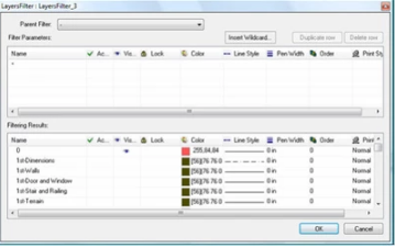
The dialog is divided into three sections: Toolbar, Filter Parameters table, Filtering Results table.
Filter Toolbar
Parent Filter: Filter can have sub-filters. This setting allows you to specify a parent filter that will constrain the list of layer that the current filter will apply to. Insert Wildcard: This button opens the Wildcard dialog which allow you to insert a wildcard into the currently selected field. The dialog also defines how each of the wildcards function.
Duplicate Row: This button duplicates the currently selected row in the Filter Parameters table. Delete Row: This button deletes the currently selected row in the Filter Parameters table.
Filter Parameters
The Filter Parameters table is where you specify how the filter will work by entering a set of parameters. Parameters are defined by values and wildcards. Each field in takes specific types of values. Name: The Name field uses the name of layers to filter. Full names or parts of names can be combined with wildcards to specify what layers you want the filter to catch. The name field is the most versatile in regard to using wildcards. Active: The Active field uses the Active status of layers to filter. It can take two values TRUE or FALSE. These can be combined with the NOT (~) wildcard to signify the opposite meaning. E.g. ~TRUE means = is not true. Since there can be only one Active layer at anytime, this option will make the filter dynamic as to what layers are captured. Visible: The Visible field uses the Visible status of layers to filter. It can take two values TRUE or FALSE. These can be combined with the NOT (~) wildcard to signify the opposite meaning. E.g. ~TRUE = is not true. Locked: The Locked field uses the Locked status of layers to filter. It can take two values TRUE or FALSE. These can be combined with the NOT (~) wildcard to signify the opposite meaning. E.g. ~TRUE = is not true. Color: The Color field uses the Colors of layers to filter. It takes values which identify colors, either as RGB (True Color) values expressed as three numbers separated by commas, e.g. 10,20,30, or as Index colors expressed as a single number ranging from 1 to 255. These can be combined with the NOT (~) wildcard to signify the opposite meaning. E.g. ~10 = is not color 10. You cannot embed wildcard within the RGB value. Line Style: The Line Style field uses the Line Styles of layers to filter. It takes values which are the names of Line Styles, such as CONTINUOUS or BORDER. These can be combined with the NOT (~) wildcard to signify the opposite meaning. E.g. ~BORDER = is not BORDER. Pen Width: The Pen Width field uses the Pen Widths of layers to filter. It takes values which are the numeric values of the pen widths along with the units. For Example 0.5in or 33 mm. These can be combined with the NOT (~) wildcard to signify the opposite meaning. E.g. ~0.5in = is not 0.5in. Order: The Order field uses the Order of layers to filter. It takes values which are the numeric values of the Order. For Example 1 or 55. These can be combined with the NOT (~) wildcard to signify the opposite meaning. E.g. ~10 = is not 10. Print Style: The Print Style field uses the Print Styles of layers to filter. It takes values which are the names of Print Styles, such as 'Normal' or New Style. These can be combined with the NOT (~) wildcard to signify the opposite meaning. E.g. ~BORDER = is not BORDER.
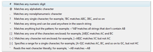
Wildcards
Wildcards are special characters that are combined with other values to constrain a result. The wildcards that are supported by the filters are:
# (pound) Matches any single numeric digit. For example, if there are 1000 layers named 1 to 1000, you can build the filter to capture all of the layers from 500 to 599 by using 5##, or 550 to 559 by using 55#
@ (at) Matches any single alphabetic character. For example, if there four layers named EAST, WEST, BEST and TEST, you can build a filter to capture all four by using @@ST, or just the last three layer by using @EST
. (period) Matches any single non alphanumeric character. For example, if there were four layers named TOP_VIEW, TOP-VIEW, TOP VIEW and TOP:VIEW, you can build a filter to capture all four by using TOP.VIEW
* (asterisk) Matches any string (sequence of characters) and can be used anywhere in the search string, beginning, middle or end. For example, you have dozens of layers that include the term 1ST, you can capture all of them by using 1ST**
? (question mark) Matches any single character; for example, ?BC matches ABC, 3BC, etc. As another example, if there four layers named EAST, 2EST, _EST and TEST, you can build a filter to capture all four by using ??ST, or just the last three layer by using ?EST
~ (tilde) Matches anything but the pattern, in other words it equals NOT. For example; ~AB matches all strings that don't contain AB. As another example, you have dozens of layers that include the term 1ST, you can exclude them all from being captured by using ~1ST
[ ] Matches any one of the characters enclosed; for example, [AB]C matches AC and BC. As another example, all of the layers begin with a single number, and you want to capture just those that begin with 5, 7 and 8. You can capture them by using [578]*
[~] Matches any character not enclosed; for example, [~AB]C matches XC but not AC. As another example, all of the layers begin with a single number, and you want to exclude from capture just those that begin with 5, 7 and 8. You can do this by using [~578]*
[-] Specifies a range for a single character; for example, [A-G]C matches AC, BC, and so on to GC, but not HC. As another example, all of the text layers have a format like TXT followed by a number followed by more characters e.g.TXT1TOP or TXT2BOTTOM. You want to capture any with the numbers 2, 3, 4, or 5. You can capture all of them using TXT[2-5]*
**** (reverse quote) Reads the next character literally; for example,~AB matches ~AB. This is especially useful if your layers have characters in their names that otherwise would be interpreted as wildcards. Important Items to remember:
All items on the same row of a filter further refine (tighten) the results of the filter. For example, on one row, if under the Name field you have 1ST and in the Color field you have 55, the filter will capture only those items that have both 1ST and are Color 55
Items on separate rows expand the results of the filter. For example, if on one row in the Name field you have 1ST and on the next row in the Color field you have 55, the filter will capture all layers with 1ST and all layers with Color 55.
Sub filters are restricted to capturing only layers which are contained within their parent filters.
Filter Results
The Filtering Results table displays results of the filter as defined in the Filter Parameters table, this gives you a preview of how your filter will operate. There are several functions which are available if you right click a field in the Filtering Results table. Refine using this value: If this option is chosen the value in the field will be added to each row of the Filter Parameters table with content. This further restricts the results of the filter. Refine excluding this value: If this option is chosen the value in the field will be added to each row of the Filter Parameters table with content with a ~ prepending the value. This further restricts the results of the filter. Add all with this value: If this option is chosen the value in the field will be added to a new row of the Filter Parameters table. This expands the results of the filter. Add all without this value: If this option is chosen the value in the field will be added to a new row of the Filter Parameters table with a ~ prepending the value. This expands the results of the filter.
Filters and XREFs
When external references (XREFs) are add to a file all of the layers of the external referenced file are appended. The layers are listed under the XREF name as if the XREF was itself a filter. in add ti on the XREF is listed under the filters in the top panel of the Design Director. Within the Design Director lower panel you can treat the XREF as if it is a filter, including changing the values for the properties of all the layer s by making changes at the filter level. However, you cannot edit the parameters of the XREF as if it were a filter.
Design Director-Lights
Default UI Menu: Tools/Palettes/Design Director/Light
Ribbon UI Menu:

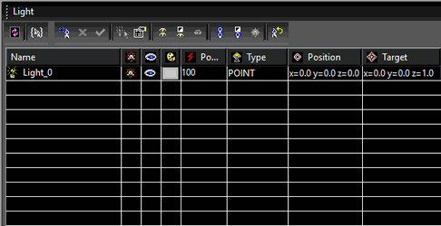
Enables you to manipulate all the lights and light sets in the drawing. To create a new light or light set, select Create New in the Design Director toolbar or local menu. When Lights or Light Sets is selected in the upper pane of the Design Director, the bottom pane has the following options: 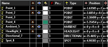
The lower pane contains the following options: On/Off: Turns the light on and off. Visible: Displays or hides the light indicator in the drawing. Color: Sets the color of the light. Power: Specify the power of the light in units of Watts. Type: Sets the type of light (headlight, spot light, etc.). Position: The coordinates of the light source, relevant for Point, Spot, and Sky lights. Target: The target point of a directional light, relevant for Directional, Spot, and Sky lights.
Light Sets
A light set is a group of lights, which can be handy if you want to set on/off, visibility, and other parameters for multiple lights.
- Select Lights in the upper pane of the Design Director.
- On the lower pane, select the lights you want to include in the camera set.
- Select Create Set in the Design Director toolbar or local menu.
- Select Light Sets in the upper pane in order to see the defined light sets in the lower pane.
- Select the properties (on/off, visibility, etc.) of the light set.
Lights Dialog
 Refresh: Refresh the Light manager display. New Light Template: Creates a new light template from the currently selected layers. New Light: Creates a new light. The default name will include a prefix by default, but the name can be changed. Delete Light: Delete the selected lights. Activate: Sets the currently selected layer (only one) as the active layer. This will effect any currently active drawing tool or currently selected object. Select By: Selects the currently selected lights. Edit Properties: Opens the light properties dialog. Visible/Invisible All: If any layer is invisible all lights are made visible. If all lights are visible they are all made invisible. Invert Visibility: Turns all visible lights invisible, and all invisible lights visible. Exclusive Visible: Makes only the currently selected lights visible, all other become visible. ON/OFF All: If any light is off all it is turned on. If all lights are on they are all turned off. Invert On: Lights that are on are turned off, lights that are off are tuned on. Exclusive On: Turns on only the currently selected lights, all others are turned off.
Design Director Options
Default UI Menu: Tools/Palettes/Design Director
Ribbon UI Menu:
General options for items to display or hide, how the mouse will be used, and confirmation windows. 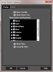
- Show Tool Bar: Select to display the Tool bar.
- Show Entries Tree: Select the items you want displayed in the Design Director.
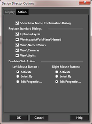
- Double-Click Action: Sets the action performed when double-clicking on either the right or left mouse button.
- Show New Name Confirmation Dialog: If checked, you will be asked to confirm the name of each new item you create using Create New. If not checked, the names will be assigned automatically.
- Replace Standard Dialogs: Select the items you want displayed using the Design Director components as dialogs instead of standard dialogs.
Design Director-Spaces
Default UI Menu: Tools/Palettes/Design Director/Space
Ribbon UI Menu:

In the Design Director, "Spaces" refers to the Model space and all of the Paper spaces. Using Design Director-Spaces serve as an alternative to using the workspace tabs at the bottom of the screen. Model space contains a list of named views, Each paper space has a list of viewports. 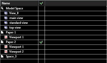 All items have an "Activate" property:
- Click on a model space item - the model space is activated with a current view
- Click on a named view item - the model space is activated at first and the selected view
- Click on a paper space item - the selected paper space is activated with a current view
- Click on a viewport item - the selected paper space is activated at first and zoom to the selected viewport
All items have a local menu (Right Click):
- Model space item - "Activate" and "Properties".
- Paper space item - similarly the space tab local menu
Design Director Toolbar and Menu
The following options are available on the Design Director toolbar and on the local menu. The available options depending on the item chosen (layer, layer set, workplane, etc.)
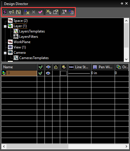
Refresh: Redraws the Design Director pane. Activate: (hotkey: Ctrl+A): Applies, or makes active, the selected item. Select By: (hotkey: Ctrl+S): Selects the selected item in the drawing space . Edit Properties: (hotkey: Ctrl+P): Change properties of the selected item. Create New: (hotkey: Ctrl+N): Adds a new item. Create Set: Creates a set of all or selected items in the table. Relevant for layers, lights, and cameras. Delete: (hotkey: Ctrl+D): Deletes the selected item. Options: Invokes the Options window to customize the Design Director. Open as Separate Palette: Open the selected item as separate palette. This is useful if you want to keep multiple sections of the Design Director open at once. The following options appear on the local menu only: Load From File: (hotkey: Ctrl+Shift+O): Loads an item from the file with the corresponding extension. Save To File: (hotkey: Ctrl+Shift+S): Saves an item to the file with the corresponding extension. Show Toolbar: Shows or hides the Design Director toolbar.
Design Director-Views
Default UI Menu: Tools/Palettes/Design Director/View
Ribbon UI Menu:

Enables you to manipulate and create new views. To create a new view from the current display, select Create New in the Design Director toolbar or local menu. When Views is selected in the upper pane of the Design Director, all views you saved will appear in the lower pane. The lower pane contains the following options:
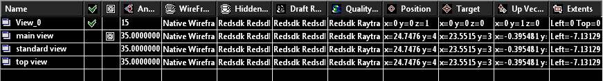
Active: Sets the view as active. Draft Rendering: Sets the rendering type when the view is rendered in Draft rendering mode. Quality Rendering: Sets the rendering type when the view is rendered in Quality rendering mode. Perspective: Activates Perspective mode. Angle: The view angle for perspective mode. Position: The location of the camera position. Target: The location of the point the camera is facing. UP Vector: A point defining the up direction of the camera. Extents: The boundaries of the view.
Design Director-Workplanes
Default UI Menu: Tools/Palettes/Design Director/WorkPlane
Ribbon UI Menu:

Enables you to manipulate and create new workplanes. To create a new workplane, select Create New in the Design Director toolbar or local menu. When Workplanes is selected in the upper pane of the Design Director, all workplanes you saved using Set Named Workplane will appear in the lower pane. The lower pane contains the following options:
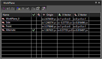
Active: Sets the workplane as active; all inserted objects will be located or based on this workplane. Also indicates the workplane for a selected object or tool. View by WorkPlane: Sets the view normal to the workplane (workplane is against the screen). Origin: The point that represents the UCS origin. X Vector: The point that defines the direction of the X-axis in the UCS. Z Vector: The point that defines the direction of the Z-axis of the UCS.