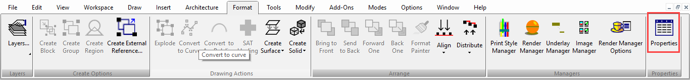
Object Properties
Default UI Menu: Modify/Properties
Ribbon UI Menu:
You can set an object's properties before or after it is created.
Setting properties for a group of tools (setting properties before creating an object)
Right-click on the tool icon to open the Properties window. Or activate a tool, then select Modify / Properties. Whatever properties you set here will be applied not only to the selected tool, but to all tools on the same toolbar. For example, if you set Line to be drawn in red, the Polygon and Rectangle tools will also share this color. If you change properties of a tool, the new properties will be assigned to all future objects created with the entire set of tools. However, objects already created will not be affected.
Note: You can save tool properties in template files, so that you don't have to create styles from scratch each time. To do this, set up the properties you want for the tools you commonly use. Then use File / Save As to save the file as a .tct file (TurboCAD Template). Place the template file in the "Template" folder of the TurboCAD root directory. Then when you want to open the template, use *File / New, and select New from Template.
Setting properties after creating an object
You can set certain basic properties, such as color and layer, directly on the Property toolbar. For more options, there are several ways to set the remaining parameters: With the Select tool active, double-click the object.
Right-click anywhere in the drawing and select Properties from the local menu.
Click the Properties icon on the Inspector Bar.
 Open the Selection Info Palette. You can set properties within the table that appears in the palette, or access the object's Properties window from within the palette.
Tip: You can take properties from one object and assign them to other objects.
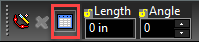
Property Toolbar
Default UI Menu: View / Toolbars
Ribbon UI Menu:
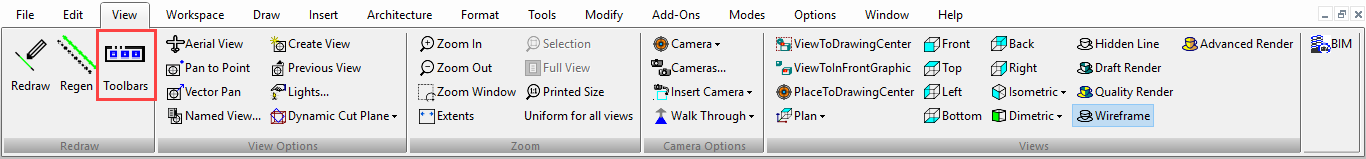
Provides a quick and convenient way of setting some basic properties of a selected object or group of objects, or for setting the default properties of a group of drawing tools. If the Property toolbar is not visible, you can display it using the View / Toolbars window.
 If no objects are currently selected, the settings on the Property toolbar apply to the active drawing tool. For example, if you activate a Line tool and then change the settings on the Property toolbar, the settings will apply to all objects drawn with any Line tool. If there are objects selected, settings in the Property toolbar apply to the selected objects.
Tip: For properties to appear, the number of selected objects must be less than or equal to Maximum Multiple Entity Property Count, which is set in the Program Defaults page of the TC Explorer Palette.
Entity Style: Applies predefined property settings to a drawing tool. You can save styles in the Properties window. This control can be used only to set the properties of a drawing tool; it is unavailable if you are setting the properties of selected objects.
Layer: Set the layer on which objects are drawn, or move selected objects to a layer.
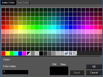
Pen Color: Sets the pen color. There are two types of Pen color available. True Color/RGB and Index color. For True Colors You can select a predefined color, or define your own using RGB or HSL values. The last three icons in the color thumbnail rows enable you to set the color by layer, by block or open a menu in which you can change how the colors are sorted.
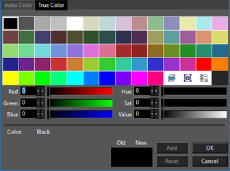 For Indexed colors you can only select the predefined colors.
 For more on colors,
Pen Style: Sets the line style of the line.
Brush Pattern: Sets the fill pattern for closed objects.
Pen Width: Sets the line width.
Font: Available for text objects.
Text Height: Available for text objects.
For more on colors,
Pen Style: Sets the line style of the line.
Brush Pattern: Sets the fill pattern for closed objects.
Pen Width: Sets the line width.
Font: Available for text objects.
Text Height: Available for text objects.
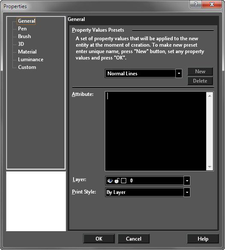
Property Value Presets
Presets bundle the properties defined for a group of tools for reuse. For example, you can have one preset to create blue, dashed lines on Layer 5, and use another preset to create red thick lines on Layer 2 Presets provide a convenient way to quickly assign a set of properties to objects. Presets can be accessed on the General page of an active tool's Properties window. Presets are only applicable to tools, not objects. You cannot apply a preset to selected objects. You can define a style based on the properties of selected objects by using the Format Painter. To create a new preset:
- Right-click on an icon for a group of tools to open the tool's Properties window. The tool must be active for the Property Values Presets field to be editable.
Note: Properties set for a tool affect all other tools in its group. For instance, setting Line properties affects Rectangle, Polygon, etc. Presets are separate for different sets of tools.
2. On the General page, enter a new preset name and click New.
3. Make any changes to the other properties (Pen, Brush, etc.). The available properties depend on the type of object (for example, the Properties window for Text tools contains a Text page). These properties will be saved to the new preset.
To edit an existing preset, select it from the Property Values Presets menu and make any property changes.
Properties Window
Default UI Menu: Modify/Properties
Ribbon UI Menu:

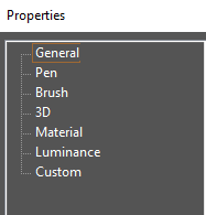
An object's Properties window consists of a series of categories, each on its own page. There are categories that are common to all objects: General, Pen, 3D, Luminance, Brush (for 2D objects) and Custom - these are all described in this section.
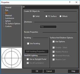
3D Properties
Properties relating to 3D, either for a standard 3D object such as a sphere or box, or for a 2D object made into 3D by assigning it a thickness.
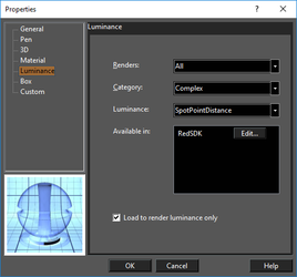
Luminance Properties
Light properties of objects, which is different than the lights contained in the overall model.
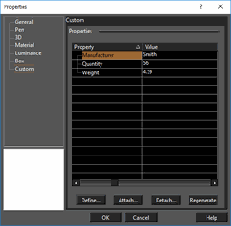
Custom Properties
Attributes you can add to objects via the database.
Material Properties
Properties related to material for the 3D objects. They are not enabled for 2D objects.
Brush Properties
Default UI Menu: Modify/Properties/Brush
Ribbon UI Menu:

Brush properties specify the filling properties for closed objects such as circles and polygons, and for flexible text.
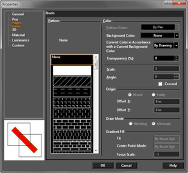 Setting the Brush pattern for the group of Hatch tools establishes the hatch pattern that will be applied.(hatching.html#a_195163325Hatching1)
These settings are relevant for closed objects such as circles and polygons, and for flexible text. Pattern: Select solid fill, or one of the predefined hatch patterns. To define your own hatch, bitmap, or gradient pattern, In the Preview window, the red diagonal line is to help visualize transparency in the case of a solid or gradient fill, or when a Background Color is used.
Setting the Brush pattern for the group of Hatch tools establishes the hatch pattern that will be applied.(hatching.html#a_195163325Hatching1)
These settings are relevant for closed objects such as circles and polygons, and for flexible text. Pattern: Select solid fill, or one of the predefined hatch patterns. To define your own hatch, bitmap, or gradient pattern, In the Preview window, the red diagonal line is to help visualize transparency in the case of a solid or gradient fill, or when a Background Color is used.
- Color: Set the color of the brush.
- Convert Color in Accordance with a Current Background Color:This feature is used to override the setting in the Background Color dialog for the selected object.
- Scale: Sets the scale of the hatch pattern. A scale of 2 doubles the size.
- Angle: Sets the angle of the pattern.
- Crossed: The pattern will be drawn a second time, perpendicular to the first pattern.
- Background Color: The color used for empty spaces in the pattern.
Origin: By default, hatch patterns use the origin as a point of reference. If you want to modify the placement of hatches without changing their angle, you can modify the point of origin used to place the hatch. World uses the WCS, and Entity uses the lower left corner of the object being hatched. Use the Offset fields to change the reference origin. Draw Mode: Options for how hatch patterns are drawing over overlapping objects.
- Winding: The same hatch pattern will cover areas where filled objects overlap
- Alternate: The hatch pattern to be drawn on every other overlapping layer, creating an alternating pattern.
- Transparency (%): For solid or gradient fills. A percentage of 0 means the fill is opaque, and 100 means the fill is invisible.
Gradient Fill: Relevant for gradient brush styles, which must be defined using Brush Styles. The parameters in this section are the same as the ones already set for the gradient pattern. For Fit Mode and Center Point mode, use By Brush Style to keep the parameters as defined for the pattern. Changing either setting overrides the pattern's settings. For Focus Scale, a value of -1 keeps the focus scale the same as the pattern definition. Use a value between 0 and 1 to override it.
General Properties
Default UI Menu: Modify/Properties/General
Ribbon UI Menu:

These are properties generally not related to geometry or other physical characteristics.
 Attribute: For text and dimension objects, contains the text string. For groups, contains the group name.
Hyperlink: Specifies the location of a desired file on your hard disk or on a company's network,or specifies a URL. You can type in the field or browse your system or the web to find the desired path.
Layer: Set the object's layer by selecting from the drop-down box.
Print Styles: Select the print style you want to use when printing.
Property Value Preset: A group of properties defined for a group of tools.
Attribute: For text and dimension objects, contains the text string. For groups, contains the group name.
Hyperlink: Specifies the location of a desired file on your hard disk or on a company's network,or specifies a URL. You can type in the field or browse your system or the web to find the desired path.
Layer: Set the object's layer by selecting from the drop-down box.
Print Styles: Select the print style you want to use when printing.
Property Value Preset: A group of properties defined for a group of tools.
Pen Properties
Default UI Menu: Modify/Properties/Pen
Ribbon UI Menu:

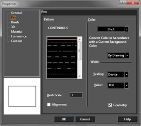
Properties of the pen and line style.
Tip: You can also use the Design Director to quickly set the color of an object or group of objects. For single objects. For groups of objects.
Pattern
Select a continuous line or one of many dot-and-dash patterns. If By Layer or By Block is used, the pattern will depend on the layer or block. There are several predefined line styles to choose from, or you can create your own. Dash Scale: Scale of the dot-and-dash pattern. Alignment: Align the pattern so that the corners of rectangles and polygons are always solid.
Color
Color: Pen Color with which the object will be drawn. Convert Color in accordance with Current Background Color: This option is designed to prevent objects from disappearing into a background of the same color (e.g. White on White) This is accomplished by inverting the display color of the object, but not the actual color setting. There are three options:
- By Drawing - color conversion will match the global setting in the Drawing Setup under
- Yes - Color conversion will occur
- No - Color conversion will not occur
Width
Scaling: Determines whether the width of the line will be scaled, or remain the same size, when you zoom in and out of the drawing. Device: The pen's width and pattern sizes are defined in device units (the monitor or printer). If you zoom the line width and pattern size will not change on the screen. World: The pen's width and pattern sizes are defined in by the drawing spaces units. If you zoom the line width and pattern size will change in accordance with the zoom factor. Device Width: The pen's pattern size is defined by the drawing spaces units, and pen's width is defined in device units (the monitor or printer). If you zoom the line patterns size will change, but the pen width size will not change. Value: Pen width. A zero width uses one screen pixel, and will print at one unit of the printer's available resolution (a 300 dots-per-inch printer will print a zero width line at 1/300".) Geometry: Used only when World is selected for the Scaling. If checked, TurboCAD creates external and internal "walls" for the object obtained by applying a thickness method to a 2D object. You can render your drawing to see the effects of this option.
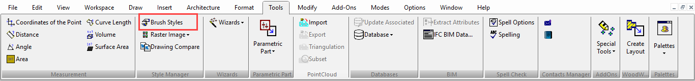
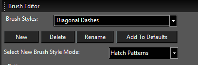
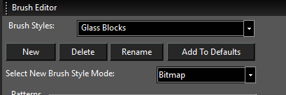
Brush Styles
Default UI Menu: Tools/Palettes/Colors and Brushes
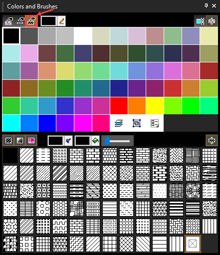
Ribbon UI Menu:
The Brush Styles palette appears by default in the palette area, on the right side of the screen. This tool enables you to modify existing hatch patterns and create new ones You can also define and edit bitmap and gradient patterns. Brush styles can be used to fill a closed 2D object, either by using an object's Brush Properties or by Hatching
Note: You can use this tool to update existing patterns. Select the hatch, bitmap, or gradient pattern, make the changes, and click Update. Return to the drawing, and the fill will update in each object where it appears. If the update is not immediate, click the object in Select mode.
Hatch Patterns
You can use Brush Styles to edit existing hatch patterns and create new ones. As an example, select Hatch Patterns for Brush Style Mode and set the Brush Style to ANSI35.
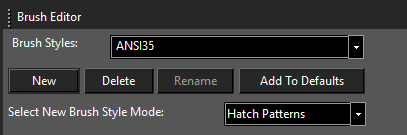 This style consists of two Patterns - each pattern is a line that repeats at constant offsets. Highlight each pattern number to see the line highlight in red below, in the Preview area.
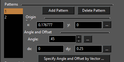
In this case, Pattern 1 is the dashed line and Pattern 2 is the unbroken line.
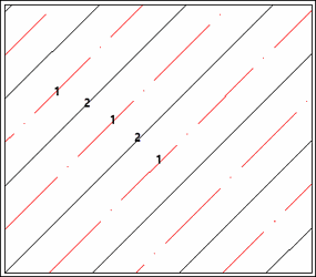 To edit a Pattern line, you can change its Origin Point manually, or click the 3-dot icon to select an origin on-screen. You can set the Angle and Offset values the same way. If you click Specify Angles and Offset by Vector, you can define two vectors on-screen: the first defines the angle of the line, and the second defines the spacing between repeating lines. Highlight Pattern 1 (the dashed line), and you can see that it consists of four patterns.
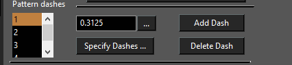
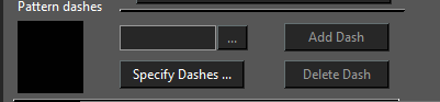
Dashes are always defined in pairs; odd numbers represent the line segments and the even numbers represent the dashes. The length value for dashes is always negative. Specify Dashes is used to create a dashed pattern from an unbroken line. Use Add Dashes and Delete Dashes to modify the dash pattern. You can update pattern lengths manually or use the 3-dot icon to define length on-screen. The following example shows how to define a new hatch pattern.
- At the top of the palette, click New and enter a new name for the hatch pattern.
-
The new pattern will be based on whatever pattern was active when the new pattern was created (ANSI35 in this case). Click Delete Pattern so that only one pattern line remains.
-
Click Specify Angle and Offset by Vector.
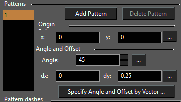
- Draw a line on-screen that has the angle you want in the pattern. You can snap to existing points or draw a free-form line.
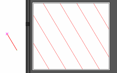
- Next, draw a line on-screen that defines the offset between repeating lines.
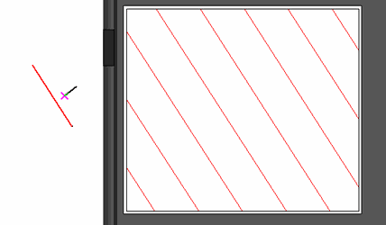
- To make this a dashes line, click Specify Dashes.
- The first line on-screen defines the length of the line segment of the dashed pattern. Be sure to define this length in the same direction you used to create the original pattern line.
-
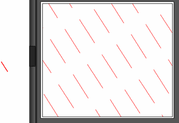
The next vector defines the length of the dash, resulting in two dash patterns. If you want more dash patterns, always in pairs, continue defining vectors in the same direction.
-
Create more patterns and dashes as needed to get the entire pattern.
When the style is defined, click Update Style to use it in the current drawing, or Add to Defaults to be able to use it in future drawings.
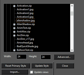
Bitmap Patterns
Enter the name of the style at the top of the palette.
In the middle section, use the browser to locate the image file you want to use. A preview of the image appears in the lower section. The size of the repeating image is controlled by the Width and Height values. You can change these values manually, or click Advanced for more control.
Gradient Patterns
Enter the name of the style at the top of the palette.
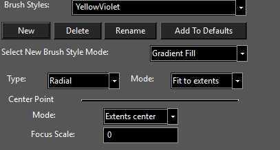
There are four types of gradient fills: Linear, Radial, Reflected, Diamond, and Custom. Each type is explained later in this section. Mode (called Fit Mode in the Brush Properties):
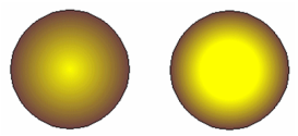
Exact Fit: The gradient completely fills the object itself. In this example, the fill completely reaches the second gradient color at the boundary of the circle.
 Fit to Extents: The gradient completely fills the extents rectangle that encloses the object. In this example, the second gradient color is only reached at the boundary of the extents rectangle, which is larger than the circle itself. This is why the color at the circle boundary is lighter than in the example above.
Center Point:
Modes: Select Extents center to center the fill at the center of the object's extents rectangle. Reference point centers the fill at the object's reference point .
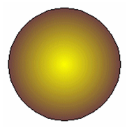
Focus Scale: This must be a value between 0 and 1. Zero means the color interpolation start from the center (left image below). A value of 0.5 will start the interpolation halfway between the center and the edge (right image below).
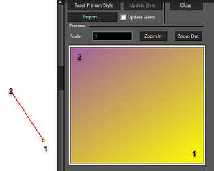
Note: Settings for Fit Mode, Center Point, and Focus Scale are set here as the fill defaults. These values can be overridden for filled objects by modifying the object's Brush Properties. Linear Gradient Linear fill moves from one color to the other along a straight vector. Under Control Points, highlight First and set the Color. Do the same for Second. By default, the First color runs vertically along the left side and changes to the Second color along a left-to-right vector. To change this vector, click the icon with the three dots. Define the new vector on the screen. The first point of the vector controls where the First color appears.
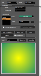
 Radial Gradient
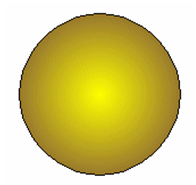
Radial fill moves from one color to the other along a radial path. Under Control Points, highlight Center and set the center color. Highlight Radius and set the outer color. Set the radius manually, or click the 3-dots icon and set the radius on-screen.
Radial Gradient
Radial fill moves from one color to the other along a radial path. Under Control Points, highlight Center and set the center color. Highlight Radius and set the outer color. Set the radius manually, or click the 3-dots icon and set the radius on-screen.
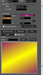
 Reflected Gradient
Reflected fill consists of one line of reflected color, fading to another color on either side. moves from one color to the other along a radial path. Under Control Points, highlight First and set the reflective color. Highlight Second and set the fade color.
Set the angle of the reflection line manually, or click the 3-dots icon and set the direction on-screen.
Reflected Gradient
Reflected fill consists of one line of reflected color, fading to another color on either side. moves from one color to the other along a radial path. Under Control Points, highlight First and set the reflective color. Highlight Second and set the fade color.
Set the angle of the reflection line manually, or click the 3-dots icon and set the direction on-screen.
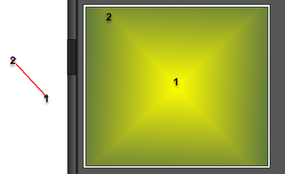
 Diamond Gradient
Diamond fill moves from from the center outward in four directions, each separated by 90 degrees. Under Control Points, highlight Center and set the color of the center and linear patterns. Highlight Radius-Vector and set that appears in between the Center color lines.
By default, the Center color runs vertically and horizontally to either side. To change this vector, click the icon with the three dots.
Define the new vector on the screen. The first point of the vector controls where the Center color appears. The second point of the vector controls the angle of the four lines.
Diamond Gradient
Diamond fill moves from from the center outward in four directions, each separated by 90 degrees. Under Control Points, highlight Center and set the color of the center and linear patterns. Highlight Radius-Vector and set that appears in between the Center color lines.
By default, the Center color runs vertically and horizontally to either side. To change this vector, click the icon with the three dots.
Define the new vector on the screen. The first point of the vector controls where the Center color appears. The second point of the vector controls the angle of the four lines.
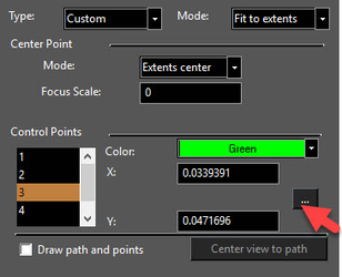
 Custom Gradient
Use this type to create a custom polyline and apply colors to each polyline point. The results will resemble a Diamond Gradient, but can have numerous points, each with its own color. Color 1 runs from the center outward to each point. By default there are three other points (triangular polyline). To change the polyline, click the icon with the three dots.
Custom Gradient
Use this type to create a custom polyline and apply colors to each polyline point. The results will resemble a Diamond Gradient, but can have numerous points, each with its own color. Color 1 runs from the center outward to each point. By default there are three other points (triangular polyline). To change the polyline, click the icon with the three dots.
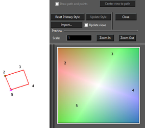
 Define the polyline on the screen, proceeding in the order of Color 2, Color 3, and so on. The polyline automatically closes, and cannot intersect itself. Press space bar to finish. You can also select an existing polyline from the drawing; click the arrow icon in the Inspector Bar to do this.
If the polyline has more than three points, the number of Control Points increases, and you can set a color for each point.
Define the polyline on the screen, proceeding in the order of Color 2, Color 3, and so on. The polyline automatically closes, and cannot intersect itself. Press space bar to finish. You can also select an existing polyline from the drawing; click the arrow icon in the Inspector Bar to do this.
If the polyline has more than three points, the number of Control Points increases, and you can set a color for each point.
 When the style is defined, click Update Style to use it in the current drawing, or Add to Defaults to be able to use it in future drawings.