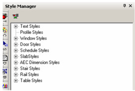
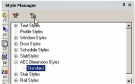
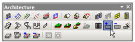
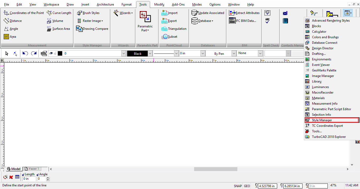
The Style Manager Palette
Default UI Menu: Tools/Palettes/Style Manager
Ribbon UI Menu:

The Style Manager enables you to define styles for the following commonly-used objects:
- Text
- Profiles (for modifying windows and doors)
- Windows
- Doors
- Walls
- Schedules
- Slabs
- AEC Dimensions
- Dimensions
- Stairs
- Rails
- Tables
You select assign a style to an object through the object properties on the General page. Simply select the style in the Style drop-down box at the bottom of the page.
You can open the Style Manager by selecting Tools / Palettes / Style Manager Palette.
Each category in the Style Manager contains one pre-defined style, called "Standard." For each of these styles, you can define relevant properties.
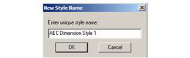
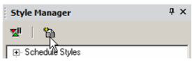
To create a new style, highlight a style you want to base the new style on, and click Create New Style.
Once you have new style, there are icons at the top you can use to Rename or Delete it.
The Delay Style Modification* icon can be enabled if you don't want to update your style with each property change.
If Delay Style Modification is enabled, you can view both old and new properties in the lower pane. At the top is an icon for updating the entire style at once, or for clearing changes not yet implemented.
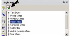
Door Styles
(Available in Platinum, Professional and Deluxe)
Default UI Menu: Tools/Palettes/Style Manager/Door Styles
Ribbon UI Menu:

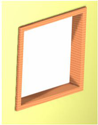
The Door tool can be used to insert doors into walls, but you need to first define door styles.
Note: If you want to save styles to a template
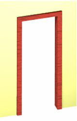
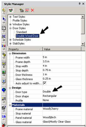
In the Style Manager, there is one style, "Standard," listed under "Door styles." A preview showing a previous of the door style is on the lowest pane.
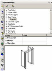
Note: In the Preview area, you can click to zoom part of the graphic. Double-click to fit the graphic in the window.
- You can change the "Standard" style, but if you want to preserve this style, make sure "Standard" is highlighted and click Create New Style.
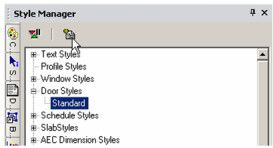
- Assign a name.
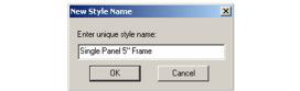
This creates a new style which is a copy of "Standard."
- There are three categories of properties. Open Dimension, where you can specify measurements of the frame, stop, door panel, and glass.
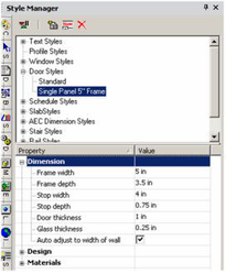
Auto Adjust to Width of Wall: Sets the depth of the door so that it will cut all the way through the wall.
- Open Design, where you can specify the door type (single, double, pocket, etc.) and shape (rectangular, arch, half round, etc.).
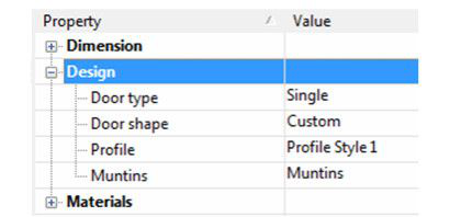
- You can also select, edit and create muntins.
Note: Profile is used when you've created a profile for changing the door shape, or for adding holes.
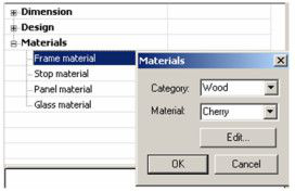
- The last category is Materials, in which you can set the materials of the frame, stop, panel, and glass. If you leave any material blank (such as the Stop Material below), the object will be colored according to the Pen color set in the window's Properties.
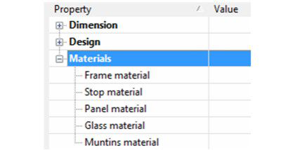
To set or change a material, just click in the field. In the Materials window that opens, select the Category and Material.
Note: For details on materials. Glass material will only be used if the door uses a profile that includes holes.
- before creating any doors, you must have at least one wall defined. To assign height to a wall, define a Thickness in the 3D page of the wall's Properties.
-
This is the icon for Door. Right-click on the icon to set the tool's Properties, and click the icon when you're ready to insert a door.
-
Open the Door tool's Properties. On the General page, select the Door Style.
- On the Door Main page, set the overall dimension of the door. The preview at the lower left updates when you change the values.
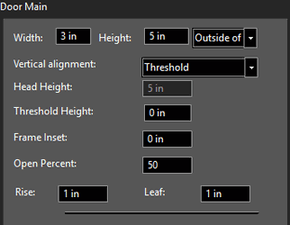
Width and Height: Overall outer dimensions of the door.
Inside/Outside of Frame: Specifies that the dimensions of the door are applied by measuring to the inside or outside of the door frame.
Vertical alignment: Specifies whether the door vertical position is specified by the Threshold Height, or the Head of the door.
Head Height: Specifies the vertical location of the top of the door. This field is only accessible if the vertical alignment option is set to Head of object.
Threshold Height: Specifies the vertical location of the sill of the door. This field is only accessible if the vertical alignment option is set to Threshold.
Rise: The distance from the top corner to the top center, in the case of arched or peaked doors.
Frame Inset: The distance from the front of the wall to the door frame.
Elevation: The distance from the bottom of the wall to the bottom of the door. This value is also available on the Inspector Bar.
Open Percent: Defines how wide the door is open.
Leaf: in the case of uneven doors, the size of one of the panes.
- On the Pen page, specify the color of the door. This color will be applied to any part of the door that does not have a material assignment.
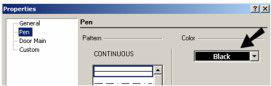
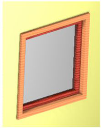
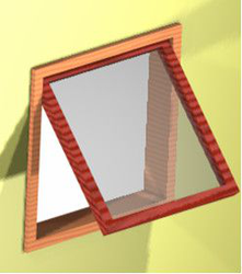
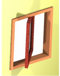
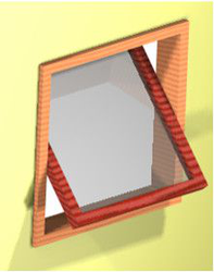
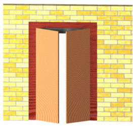
- When all parameters are set, click the wall to place the door. The wall material within the door area is removed. No matter where you click on the wall, the door is placed according to the Elevation value. In this example, the door stop is colored black, which is the default Pen color. The frame and panel have the assigned materials.
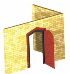
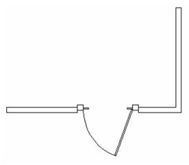
In World Plan view, you can see how the door cuts the wall.
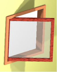
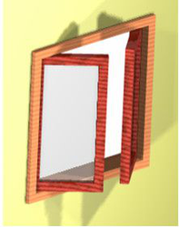
- You can orient of the window to the wall by using the Flip Left-Right, Flip Inside-Outside controls in the Local menu, or Inspector bar. All parameters that available on the Properties window, including Door style, are also available on the Selection Info palette. If you move a door, it will remain within the plane of the wall.
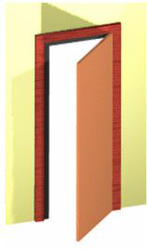
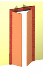
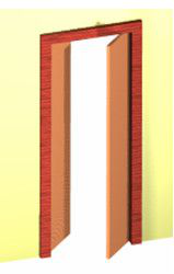
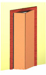
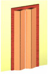
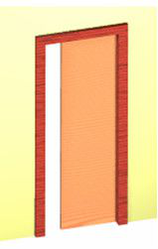
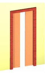
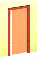
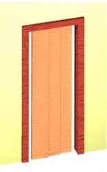
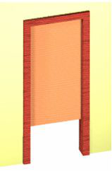
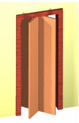
Door Types
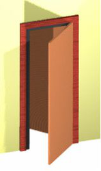
These are the standard door types available in the Design category of the Style Manager. Single
Double
Double Opposing
Bifold
Bifold Double, Panel
Double Pocket
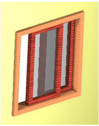
Sliding Double
Sliding Triple
Overhead
Revolving
Pass Through (no panel)
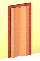
Accordion
Communicating
Door Muntins
Door muntins can be applied only to doors with glass components. To make a door with glass components you must create profile first (Style Manager | Profile Styles). As soon as you have profile style created, navigate to the door styles, select the door style you wish add muntins to and select the profile as door shape (Door Shape = Custom, Profile = "Profile Style 1") Door muntins are available in several patterns that you can customize into many different styles:
- Rectangular
- Diamond
- Prairie 9 Lights
- Prairie 12 Lights
- Starburst
- Sunburst
The Starburst and Sunburst patterns are combined rounded/rectangular patterns with a half-round or a quarter-round spoked top and can be used for half- and quarter-round as well as rectangular muntins. The other patterns are primarily rectangular but will fit into a half-round. Multiple muntin blocks can be assigned to each style. This allows you to have different patterns of muntins for each panel of glass, or to combine muntin patterns. To setup muntins component please do the following:
- Open the Style Manager Palette.
- Navigate to the Door styles.
- Select the door style you wish to add muntins to.
- Expand the Design properties category and click Muntins.
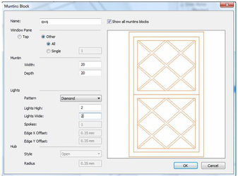
- The Muntins dialog will appear.
This dialog contains list of all muntins assigned to the door style. For example you can add muntins with Rectangular pattern to the one door glass component and muntins with diamond to other component.
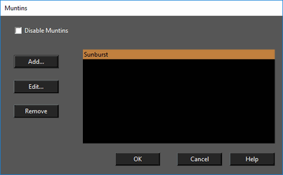
Add: displays the Muntins Block dialog where you can define a name for the muntins block and it's properties. Edit: displays the Muntins Block dialog with properties for the selected muntins. Delete: Deletes the selected muntins block. Disable Muntins: when ON - muntins are disabled.
- Open the Style Manager and select a door style you wish to add muntins to.
- Expand the Design properties category and click Muntins.
- The Muntins dialog will open.
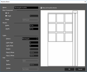
- Click the Add button to open Muntins block dialog.
- Muntins can be applied to All door glass components, or to individual glass component pane.If you specify a single panel you must specify the number of the panel to be used. The number of the panel corresponds to the order in which you selected the hole profiles.
Note: If you cannot see the door because the preview is rotated, click on the preview with the center mouse button (wheel) hold and drag. This will rotate the preview.
- Define the muntins width and depth.
- Select the Rectangular in Pattern combo-box.
- Enter number of horizontal muntins lights in "Lights High" edit box.
- Enter number of vertical muntins lights in "Lights High" edit box.
- Click OK to close the Muntins Block dialog.
- Click OK to close Muntins dialog.
The Diamond Muntins pattern uses the same options as the Rectangular pattern. Prairie-9 Lights pattern, and the Prairie-12 Lights pattern use two alternate options: Edge X Offset and Edge Y Offset: these specify the distance of the outer muntins from the panel edge. The Starburst Muntins pattern has two additional options: Spokes: which sets the number of spokes that radiate out from the center to form the burst pattern. Center: which sets whether the hub will be at the Top or Bottom of the radial pattern. The Sunburst Muntins pattern has two additional options. Style: this sets the whether the center of the sunburst will be an open circle or a closed disk. Radius: this sets the radius for the center of the sunburst.
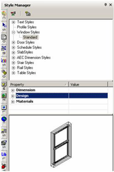
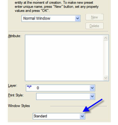
Window Styles
(Available in Platinum, Professional and Deluxe)
Default UI Menu: Tools/Palettes/Style Manager/Window Styles
Ribbon UI Menu:

The Window tool can be used to insert windows into walls, but you need to first define window styles.
Note: If you want to save styles to a template,
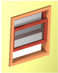
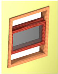
In the Style Manager, there is one style, "Standard," listed under "Windows." A preview showing a previous of the window style is on the lowest pane.
Note: In the Preview area, you can click to zoom part of the graphic. Double-click to fit the graphic in the window.
- You can change the "Standard" style, but if you want to preserve this style, make sure "Standard" is highlighted and click Create New Style.
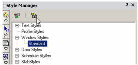
- Assign a name.
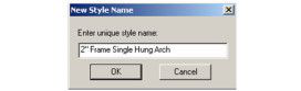
This creates a new style which is a copy of "Standard."
- There are three categories of properties. Open Dimension, where you can specify measurements of the frame, sash, and glass.
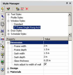
Auto Adjust to Width of Wall: Sets the depth of the window so that it will cut all the way through the wall.
- Open Design, where you can specify the window type (double hung, transom, etc.) and shape (rectangular, arch, octagon, etc.).
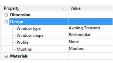
- You can also select, edit and create muntins.
Note: Profile is used when you've created a profile for changing the window shape, or for adding holes.
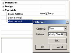
- The last category is Materials, in which you can set the materials of the frame, sash, and glass. If you leave any material blank (such as the Sash Material below), the object will be colored according to the Pen color set in the window's Properties.
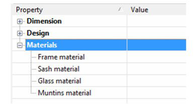
To set or change a material, just click in the field. In the Materials window that opens, select the Category and Material.
Note: For details on materials,
- Before creating any windows, you must have at least one wall defined. To assign height to a wall, define a Thickness in the 3D page of the wall's Properties.
-
This is the icon for Window. Right-click on the icon to set the tool's Properties, and click the icon when you're ready to insert a window.
-
Open the Window tool's Properties. On the General page, select the Window Style.
- On the Window Main page, set the overall dimension of the window. The preview at the lower left updates when you change the values.
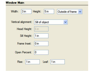
Width and Height: Overall outer dimensions of the window.
Inside/Outside of Frame: Specifies that the dimensions of the window are applied by measuring to the inside or outside of the window frame.
Vertical alignment: Specifies whether the widows vertical position is specified by the Sill Height, or the Head of the window.
Head Height: Specifies the vertical location of the top of the window. This field is only accessible if the vertical alignment option is set to Head of object.
Sill Height: Specifies the vertical location of the sill of the window. This field is only accessible if the vertical alignment option is set to Sill of object.
Rise: The distance from the top corner to the top center, in the case of arched or peaked windows.
Frame Inset: The distance from the front of the wall to the window frame
Open Percent: Defines how wide the window is open.
Leaf: in the case of uneven windows, the size of one of the panes.
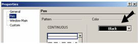
- On the Pen page, specify the color of the window. This color will be applied to any part of the window that does not have a material assignment.
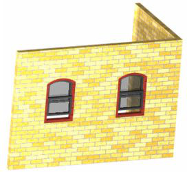
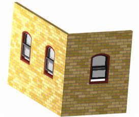
- When all parameters are set, activate Window and click the wall to place the windows. The wall material within the window area is removed. No matter where you click on the wall, the windows are placed according to the Elevation value. In this example, the sash is colored black, which is the default Pen color. The frame and glass have the assigned materials.
- If you click another wall, the window properly aligns to it.
- You can orient of the window to the wall by using the Flip Left-Right, Flip Inside-Outside controls in the Local menu, or Inspector bar.
In World Plan view, you can see how the windows cut the walls.
All parameters available on the Properties window, including Window style, are also available on the Selection Info palette. If you move a window, it will remain within the plane of the wall.
Window Types
These are the standard window types available in the Design category of the Style Manager.
Single Hung
Double Hung
Pass Through (no glass)
Picture (does not open)
Casement
Double Casement
Glider
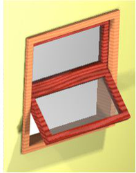
Awning Transom
Hopper Transom
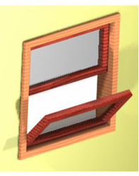
Single Hopper
Single Awning
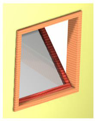
Vertical Pivot
Horizontal Pivot
Uneven Double Hung: the two panes have different heights.
Window Muntins
Window muntins are available in several patterns that you can customize into many different styles:
- Rectangular
- Diamond
- Prairie 9 Lights
- Prairie 12 Lights
- Starburst
- Sunburst
The Starburst and Sunburst patterns are combined rounded/rectangular patterns with a half-round or a quarter-round spoked top and can be used for half- and quarter-round as well as rectangular muntins. The other patterns are primarily rectangular but will fit into a half-round. Multiple muntin blocks can be assigned to each style. This allows you to have different patterns of muntins for each panel of glass, or to combine muntin patterns. To setup muntins component please do the following:
- Open the Style Manager Palette.
- Navigate to the Window styles.
- Select the window style you wish to add muntins to.
- Expand the Design properties category and click Muntins.
- The Muntins dialog will appear.
This dialog contains list of all muntins assigned to the window style. For example you can add muntins with Rectangular pattern to the one window glass component and muntins with diamond to other component. 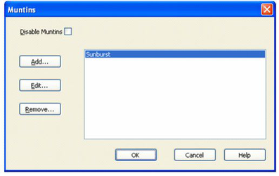
Add: displays the Muntins Block dialog where you can define a name for the muntins block and it's properties. Edit: displays the Muntins Block dialog with properties for the selected muntins. Delete: Deletes the selected muntins block. Disable Muntins: when ON - muntins are disabled.
- Open the Style Manager and select a window style you wish to add muntins to.
- Expand the Design properties category and click Muntins.
- The Muntins dialog will open.
- Click the Add button to open Muntins block dialog.
- Muntins can be applied to All window glass components, or to individual glass component pane.If you specify a single panel you must specify the number of the panel to be used. The number of the panel corresponds to the order in which you selected the hole profiles.
Note: If you cannot see the window because the preview is rotated, click on the preview with the center mouse button (wheel) hold and drag. This will rotate the preview.
- Define the muntins width and depth.
- Select the Rectangular in Pattern combo-box.
- Enter number of horizontal muntins lights in "Lights High" edit box.
- Enter number of vertical muntins lights in "Lights High" edit box.
- Click OK to close the Muntins Block dialog.
- Click OK to close Muntins dialog.
The Diamond Muntins pattern uses the same options as the Rectangular pattern. Prairie-9 Lights pattern, and the Prairie-12 Lights pattern use two alternate options: Edge X Offset and Edge Y Offset: these specify the distance of the outer muntins from the panel edge. The Starburst Muntins pattern has two additional options: Spokes: which sets the number of spokes that radiate out from the center to form the burst pattern. Center: which sets whether the hub will be at the Top or Bottom of the radial pattern. The Sunburst Muntins pattern has two additional options. Style: this sets the whether the center of the sunburst will be an open circle or a closed disk. Radius: this sets the radius for the center of the sunburst.
Wall Styles
(Available in Platinum, Professional and Deluxe)
Default UI Menu: Tools/Palettes/Style Manager/Wall Styles
Ribbon UI Menu:
 The Wall tool is used to insert Walls. Every wall is based upon a defined Wall style created and managed in the Style Manager.
In the Style Manager, there is one style, "Standard," listed under "Wall Styles." A preview showing a previous of the Wall style is shown on the lowest pane of the palette.
The Wall tool is used to insert Walls. Every wall is based upon a defined Wall style created and managed in the Style Manager.
In the Style Manager, there is one style, "Standard," listed under "Wall Styles." A preview showing a previous of the Wall style is shown on the lowest pane of the palette.
- You can change the "Standard" style, but if you want to preserve this style, make sure "Standard" is highlighted and click Create New Style.
- Assign a name. This creates a new style which is a copy of "Standard."
Component Walls
Default UI Menu: Tools/Palettes/Style Manager/Wall Styles
Ribbon UI Menu:

Walls are composed of components with each component representing a part of the walls geometry. By default every Wall Style has at least one component of the "Standard" type. Components are essentially long boxes defined by the components properties. To add components to a wall style
- Select that wall style in the Style Manager.
- Increase value in the Number of Components field to the desired value.
To delete components from a wall style
- Select that wall style in the Style Manager.
- Decrease the value in the Number of Components field to the desired value.
Warning: Components are added sequentially to the Wall style. If you increase the number of components the new components will be added to the bottom of the list of components. If you decrease the number of components the components at the end of the list will be deleted. The best practice is to add, build and complete each component in turn before adding more.
Component Wall Properties
There are nine categories of wall properties. Several of them have sub-properties: Name: This property is used to specify the name of the component Pen Color: This property is used to specify the Pen Color of the component. Width: These properties are used to specify the width of the component. Edge Offset: These properties are used to specify the horizontal placement of the component. Bottom Elevation: These properties are used to specify the bottom of the component. Top Elevation: These properties are used to specify the top of the component. Dimension: These properties are used to specify the width of the component. Brush: These properties are used to specify the brush style of the component. Component material: This property is used to specify the material of the component. Component draw priority: This property is used to specify how the component will interact and intersect with other components and walls.
Direction
Walls have direction with a right and left side. Whether a side is Left or Right depends on the wall's direction. To determine side is by assuming you are standing at the start point wall and facing the end point of the wall. Another way to visualize In other words, if a wall is drawn from left to right, the side toward the top of the screen is the left side of the wall, and the side toward the bottom of the screen is the right side of the wall. You can show a walls direction by checking the Show Direction on the Wall page of the wall's properties. Horizontal values use for defining components may have a negative or positive value. The left side of the wall is the positive direction, and the right side of the wall is the negative direction.
Width
The width of a wall is measured from the Edge Offset of the wall. There are four Width properties that combine to set the actual width of a component:
Width: This value sets base width value for the component.
Plus Wall Width: If this value is checked, the wall's modified Width value will be added to the Component's Width value to specify the total width of the component.
Operator: Specifies how the Value will modify the wall's Width (added, subtracted, multiplied, or divided) before it is added to the components Width.
Value: This number is used to modify the wall's Width before it is added to the component Width.
Note: A wall's width is specified in the wall's properties
These for properties combine in the following pattern:
- Actual Component Width = Width + (Wall Width
Value) - depending upon the operator selected. In other words: - Actual Component Width = Width + (Wall Width + Value) - if adding
- Actual Component Width = Width + (Wall Width - Value) - if subtracting
- Actual Component Width = Width + (Wall Width * Value) - if multiplying
- Actual Component Width = Width + (Wall Width / Value) - if dividing
So, if the Width of the component is 2 feet, and the Width of the wall is 1 foot, if the operator is Divide, and the Value is set to 4, the components actual width will be 2.25 feet.) Or 2+(1/4).
Edge Offset
There are four Width properties that combine to set the Edge Offset of a component: Offsets are measured from the baseline of the wall. The baseline of a wall is indicated in the Style Manager by the two blue nodes. The direction arrow of always resides on the baseline.
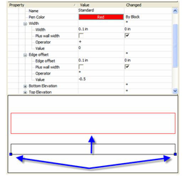
Edge Offset: this value sets base offset value for the component. Plus Wall Width: if this value is checked, the wall's modified Width value will be added to the Component's Edge Offset value to specify the total offset of the component. Operator: specifies how the Value will modify the wall's Width (added, subtracted, multiplied, or divided) before it is added to the components Edge Offset. Value: this number is used to modify the wall's Width before it is added to the component Edge Offset.
Note: A wall's width is specified in the wall's properties
These properties combine in the following pattern:
- Actual Offset = Edge Offset + (Wall Width
Value) - depending upon the operator selected. In other words: - Actual Offset = Edge Offset + (Wall Width + Value) - if adding
- Actual Offset = Edge Offset + (Wall Width - Value) - if subtracting
- Actual Offset = Edge Offset + (Wall Width * Value) - if multiplying
- Actual Offset = Edge Offset + (Wall Width / Value) - if dividing
So, if the Edge Offset of the component is 4 inches, and the Width of the wall is 6 inches, if the operator is Add, and the Value is set to 4, the components actual offset will be 14 inches.) Or 4+(6+4).
Bottom Elevation
The Bottom Elevation is specified by two properties: Offset: this value specifies the distance between the From Elevation and the bottom of the component. From Elevation: this setting provides four positions along the wall height, from which the Offset can be measured. Wall Bottom — this is the absolute lowest point of the wall as measured from the position of the wall on the Z axis (Z location). It is normally the same as the Baseline, but it may vary if a Wall Modifier has been applied to the wall. Wall Top — this is the absolute highest point of the wall as measured from the position of the wall on the Z axis (Z location). It is normally the same as the Base Height, but it may vary if a Wall Modifier has been applied to the wall. Base Height — this is the Height value specified in the Wall's Height property. Baseline — this is the walls Z location, its position on the Z axis
Top Elevation
The Bottom Elevation is specified by two properties: Offset: this value specifies the distance between the From Elevation and the top of the component. From Elevation: this setting provides four positions along the wall height, from which the Offset can be measured. Wall Bottom — this is the absolute lowest point of the wall as measured from the position of the wall on the Z axis (Z location). It is normally the same as the Baseline, but it may vary if a Wall Modifier has been applied to the wall. Wall Top — this is the absolute highest point of the wall as measured from the position of the wall on the Z axis (Z location). It is normally the same as the Base Height, but it may vary if a Wall Modifier has been applied to the wall. Base Height — this is the Height value specified in the Wall's Height property. Baseline — this is the walls Z location, its position on the Z axis
Dimension
The options are:
- From Left Side
- From Center
- From Right Side
Component Draw Priority
The Component Draw Priority is used to specify how components will draw, heal and clean up with other components and other walls. The following conditions apply with the Component Draw Priority: Components with the same Draw Priority will heal to each other. Components with a lower value will pass through components with a higher value. Draw Priority takes precedence over Draw order
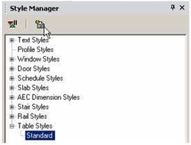
Table Styles
(Available in Platinum, Professional and Deluxe)
Default UI Menu: Tools/Palettes/Style Manager/Table Styles
Ribbon UI Menu:

Tables can be used to define table properties. Table can be created using Insert / Table or they are created automatically when you create a report .
Note: If you want to save styles to a template,
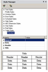
In the Style Manager, there is one style, "Standard," listed under "Tables."
- You can change the "Standard" style, but if you want to preserve this style, make sure "Standard" is highlighted, then click Create New Style.
- Assign a name or accept the default.
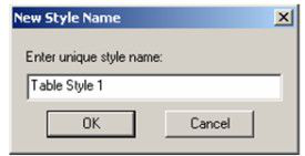
This creates a new style which is a copy of "Standard."
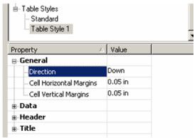
- Highlight the new style, and open the General category. This is where you can define margins and direction. If Direction is down, the header and title appear at the top of the table.
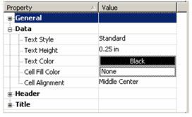
- The Data category contains properties of the text and colors in the main cells of the table (not the headers or title). For details on defining text, see Text Styles.
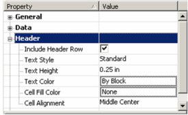
- The Header and Title categories are similar to Data. They have the additional option whether to display header or title rows.
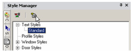
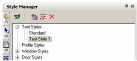
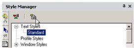
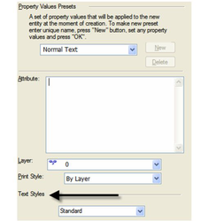
Text Styles
(Available in Platinum, Professional and Deluxe)
Default UI Menu: Tools/Palettes/Style Manager/Text Styles
Ribbon UI Menu:

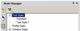
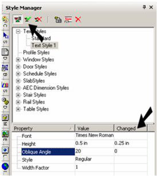
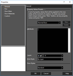
The can be used to set various styles for text. For details on creating text, . In the Style Manager, there is one style, "Standard," listed under "Text styles." This style defines properties such as font and height. A preview showing a layout the style is on the lowest pane.
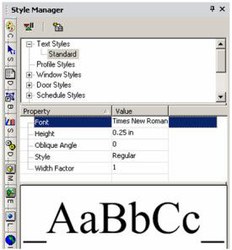
Note: In the Preview area, you can click to zoom part of the graphic. Double-click to fit the graphic in the window.
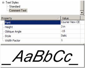
- You can change the "Standard" style, but if you want to preserve this style, make sure "Standard" is highlighted and click Create New Style.
- Assign a name or accept the default.
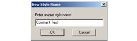
This creates a new style which is a copy of "Standard."
- Highlight the new style you created, and change some of the parameters.
- To apply this style, open Properties of a text string to the General page.
Note: If a text string already has other parameters defined, such as color or a text box, these properties will remain. Only the changed style parameters, such as font or height, will update.
Standard Dimension Styles
(Available in Platinum, Professional and Deluxe)
Default UI Menu: Tools/Palettes/Style Manager/Dimension Styles
Ribbon UI Menu:
For styles and Style Manager usage for standard dimensions
AEC Dimension Styles
(Available in Platinum)
Default UI Menu: Tools/Palettes/Style Manager/AEC Dimension Styles
Ribbon UI Menu:

The Style Manager can be used to set various styles for wall dimensions. These dimensions are created with the Wall Dimension tool.
Note: If you want to save styles to a template,
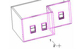
- Start with some walls, and add openings like windows or doors.
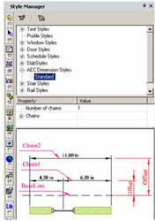
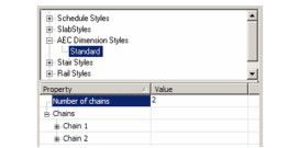
In the Style Manager, there is one style, "Standard," listed under "AEC Dimension styles." This style has one chain, and a preview showing a layout of AEC Dimension styles is below.
Note: In the Preview area, you can click to zoom part of the graphic. Double-click to fit the graphic in the window.
- Activate Wall Dimension, and select one chain of walls, using the Shift key for multiple selection. Select Finish Selection.
- The next click defines the location of the dimension baseline. The subsequent click defines the dimension angle - if you want the dimensions to proceed along the wall chain, the angle should be perpendicular to the walls.
Tip: To ensure a vertical or horizontal angle line, you can use the X or Y lock in the Coordinate Field.
This is the resulting dimension chain in the current style.
Note: If you want to change the properties of the dimensions themselves, such as font or leader lines,
- You can change the "Standard" style, but if you want to preserve this style, make sure "Standard" is highlighted, then click Create New Style.
- Assign a name or accept the default.
This creates a new style which is a copy of "Standard."
- To change the current wall dimension to the new style, open its Properties to the General page.
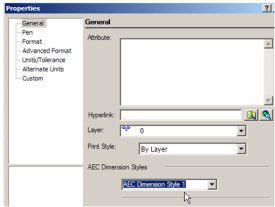
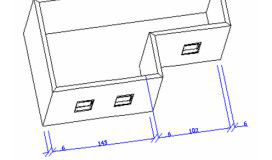
- With the new style highlighted, change the Number of chains to 2.
Note: If Delay Style Modification is enabled, you can see the old and new values for each field. Then you can update the style by clicking Apply Style Changes. If there is no delay, then all changes are implemented immediately.
- To separate Chain 2 from Chain 1, add an Offset.
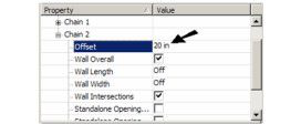
Chain 1 is offset from the baseline, which is where you first clicked to define the dimension line's location. Chain 2's offset is its distance from Chain 1.
- Open the properties for Chain 1 and make these changes.
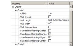
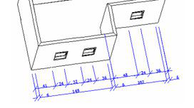
Now Chain 1 dimensions the openings. Chain 2 is still the same as the "Standard" style.
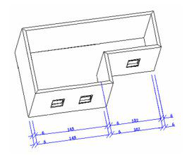
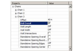
- To add an overall dimension, add Chain 3 and offset it from Chain 2. Only Wall Overall should be checked.
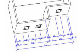
This is the result.
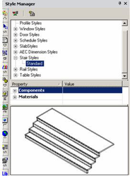
Stairs Styles
(Available in Platinum)
Default UI Menu: Tools/Palettes/Style Manager/Stair Styles
Ribbon UI Menu:
The Style Manager can be used to set various styles for stairs. For details on the types of stairs you can create,
Note: If you want to save styles to a template,
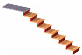
- Start with a staircase. This example uses a Simple Stair.
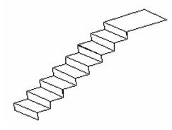
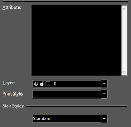
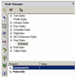
In the Style Manager, there is one style, "Standard," listed under "Stair styles." This style has two categories: components and materials. The graphic at the bottom shows a preview of the style.
Note: In the Preview area, you can click to zoom part of the graphic. Double-click to fit the graphic in the window.
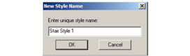
- You can change the "Standard" style, but if you want to preserve this style, make sure "Standard" is highlighted, then click Create New Style.
- Assign a name or accept the default.
- The new style is a copy of the "Standard" style. To make some changes, open Components and change the parameters, such as tread and riser thickness, etc. Nosing Length* is how far the tread extends past the riser below. To view your changes, you can click inside the preview window to zoom in. (If you right-click in the preview window, a menu appears that enables you to change the view as well as render style.)
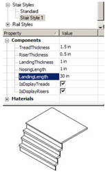
Note: Other stair properties, such as stair width, tread depth, and riser height, are set on the Stair page of the stair's Properties.
- Open the Materials category, in which you can assign different materials to the treads, risers, and landing. Set the preview to Quality Rendering to see the materials.
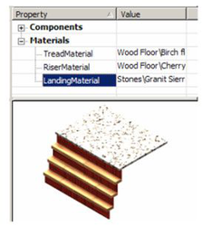
Note: For details on materials,
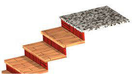
- To change the staircase in the model so that is has the new style, open its Properties to the General page. All styles defined for stairs will be available under Stair styles.
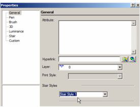
The staircase now has the properties of the new style.
Rail Styles
(Available in Platinum)
Default UI Menu: Tools/Palettes/Style Manager/Rail Styles
Ribbon UI Menu:

The Railing tool can be used to create a standalone, linear railing, or a railing along a staircase.
Note: If you want to save styles to a template,
Menu: Architecture / Stairs and Railings / Railing
In the Style Manager, there is one style, "Standard," listed under "Rail styles." A preview showing a layout of this rail style is below.
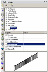
Note: In the Preview area, you can click to zoom part of the graphic. Double-click to fit the graphic in the window.
- You can change the "Standard" style, but if you want to preserve this style, make sure "Standard" is highlighted, then click Create New Style.
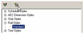
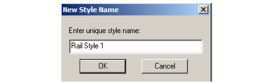
- Assign a name or accept the default.
This creates a new style which is a copy of "Standard."
- To create the railing with the new style, open the tool's Properties to the General page.
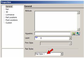
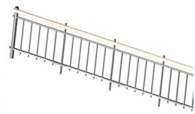
- Highlight the new rail style, and open the Rail Locations category. This category sets which rails are displayed, their heights along horizontal and sloped segments, and their offsets from the vertical posts. In this example, only a Handrail* is included.
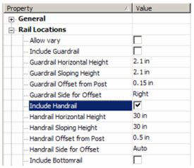
- Open Balusters* are placed between dynamic posts. In this example, only balusters are included.
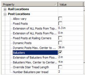
Note: You can either specify the number of balusters per tread, or baluster spacing. If the number per tread is entered, this will by default override the spacing. If you check Override, the spacing value will be used.
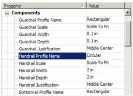
- Open Components, in which you specify the shapes and dimensions of rails and posts.
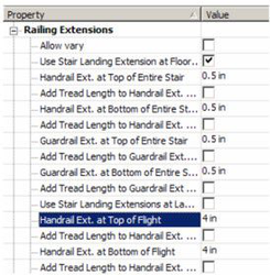
- Open Railing Extensions, in which you can specify horizontal extensions of rails, relative to posts and landings.
- Finally, open Materials, in which you can specify the material for each post and rail type.
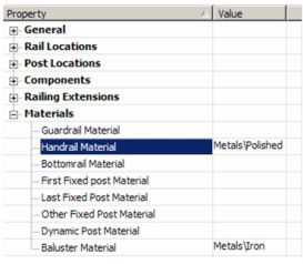
Note: For details on materials,
- This example is for a stair railing, so start by creating a staircase. (For details.)
- Activate Railing. By default, Stair Railing is active
- To place rails on both sides of the stair use the Attach to Both Sides option.
- Select the staircase, and the railing is created. The other type of railing is standalone, defined by linear segments. To create this, make sure Stair Railing is not selected.
This railing is defined by one or more segments, similar to a polyline or wall. A preview of the railing appears while defining the segments. When finished, select Finish from the local menu or Inspector Bar.
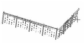
This example includes a handrail, guardrail, and bottom rail. The posts include a fixed post at the end, dynamic posts along the length, and balusters between bottom rail and guard rail.
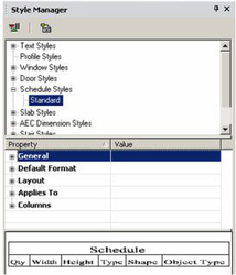
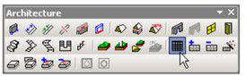
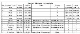
Schedule Styles
(Available in Platinum, Professional and Deluxe)
Default UI Menu: Tools/Palettes/Style Manager/Schedule Styles
Ribbon UI Menu:
The Schedule tool can be used to create a table in your file detailing all selected walls, windows, doors, and/or slabs.
Note: The Fill Schedule Wizard is another way to add a schedule, that scans for objects on specific layers.
Note: If you want to save styles to a template,
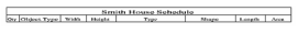
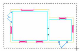
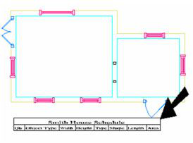
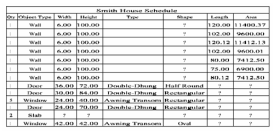
- This example starts with a model that has walls and slabs. There are two types of windows and three types of doors.
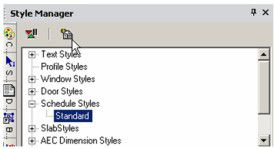
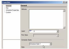
Note: For details on these components, In the Style Manager, there is one style, "Standard," listed under "Schedule styles."
- You can change the "Standard" style, but if you want to preserve this style, make sure "Standard" is highlighted, then click Create New Style.
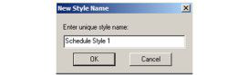
- Assign a name or accept the default.
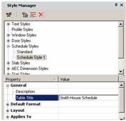
This creates a new style which is a copy of "Standard."
- Highlight the new style, and open the General category. This is where you can define the schedule title.
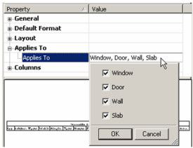
- Default Format and Layout contain various options for the text and cells in the table. Next to Applies To, click the Value field to specify which components you want to include in the schedule.
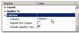
- To specify the columns, click the Value field next to Columns.
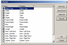
- This opens a menu from which you can select the schedule's columns. To move a column up or down, highlight it and click Move Up or Move Down. In this example, Object Type was moved to the top of the list.
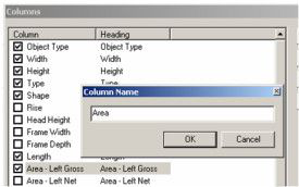
- If you want to change the name of a column, click its name in the Heading field. In this example, "Area - Left Gross" was changed to "Area."
-
Click OK to end the column definitions.
-
This is the icon for Schedule. Right-click on the tool to set the tool's Properties
- Open the Schedule tool's Properties to the General page.
- Switch to World Plan view. Activate Schedule, and click two corners to define the schedule's width.
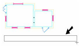
When first created, the schedule contains only the title and column headers.
- To build the schedule, select Add Object to Schedule.
- First click the schedule you want to add to, then select the windows and doors to include. Use Shift to select multiple objects, or use a selection window.
- When finished, select Finish from the local menu or Inspector Bar. The windows and doors appear in the schedule.
- If you want to remove objects, use Remove Object from Schedule. All schedule objects are highlighted; select the windows and doors you want to remove. Select Finish, and the objects are removed from the schedule.
Fill Schedule Wizard
The Fill Schedule Wizard enables you to scan your drawing for objects to include in the schedule; you do not have to select objects manually. The wizard scans for specific types of objects on specific layers, which is useful for large drawings which may have objects on invisible layers, or in which slabs are not easy to select because of multiple floors.
- This examples uses a model that has walls and slabs. There are two types of windows and three types of doors.
-
Use the Style Manager to create a schedule style.
-
To create the schedule with the new style, open the Schedule tool's Properties to the General page.
- Switch to World Plan view and use the Schedule tool to place the schedule, by clicking two corner points.
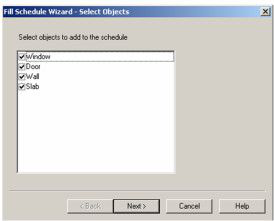
- Select Fill Schedule Wizard.

-
Click the schedule you want to fill.
-
In the wizard, check the types of objects to include. (The list that appears in the window depends on what was defined as part of the schedule style.) Then click Next.
- Select the layers you want to include in the scan, and click Next.
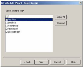
Note: For details on layers, The schedule is filled with all objects found on the selected layers.
Slab Styles
(Available in Platinum and Professional)
Default UI Menu: Tools/Palettes/Style Manager/Slab Styles
Ribbon UI Menu:
The Style Manager can be used to set various styles for slabs. For details on creating slabs,
Note: If you want to save styles to a template,
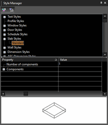
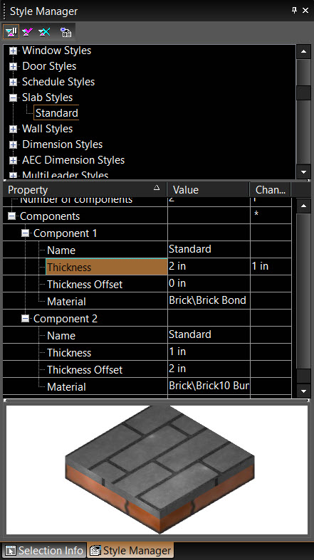
In the Style Manager, there is one style, "Standard," listed under "Slab styles." A preview showing a previous of the slab style is on the lowest pane.
Note: In the Preview area, you can click to zoom part of the graphic. Double-click to fit the graphic in the window. You can also preview dynamically by using mouse wheel.
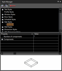
- You can change the "Standard" style, but if you want to preserve this style, make sure "Standard" is highlighted and click Create New Style.
- Assign a name.
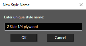
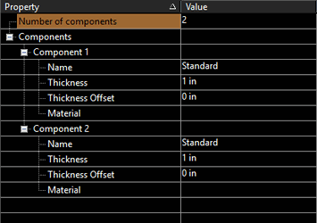
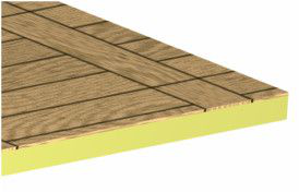
This creates a new style which is a copy of "Standard." By default, a slab consists of one component, for which you can specify a name, thickness, offset, and material.
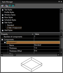
- In this example, there will be two components. Change the number and press Enter, and an additional component is added.
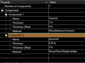
- Component 1 is a 2" concrete slab with zero offset, which means the slab will be created flush with the bottom of the walls. Component 2 is 1/4" wood with an offset of 2", so that it will sit directly atop the concrete slab. To define material, click inside the field, then select a category and material.
Note: For details on materials
-
These are the icons for Add Slab by Click and Convert to Slab. Right-click on either icon to set the tool's Properties, and click the relevant icon to create the slab.
-
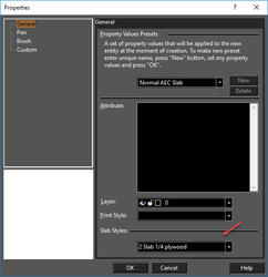
To create the slab with the new style, open the tool's Properties to the General page.
- Create the slab using one of the slab tools.
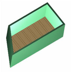
- In this example, if you remove the walls, both components of the slab can be seen.
Rendering Slab Preview:
You can also render the slab preview in style manager. Right click the preview pane and select the desired rendering from local menu. You can also change view by right clicking in the preview pane and selecting the desired view from the local menu.
You can now view the actual Slab setup including all the components and materials.
Custom Blocks for Windows and Doors
(Available in Platinum, Professional and Deluxe)
Default UI Menu: Tools/Palettes/Style Manager/Door Styles, Tools/Palettes/Style Manager/Window Styles
Ribbon UI Menu:

This functionality provides the means to attach one or several blocks to window and doors to provide additional geometry e.g. a window sill, door knob, shutters. You can attach custom block to entire window/door or to different parts. To make a door with components you must create the block first. The block used for this must be composed only of ACIS solids. Multiple muntin blocks can be assigned to each style. This allows you to have different patterns of muntins for each panel of glass, or to combine muntin patterns. To setup muntins component please do the following:
- Open the Style Manager Palette.
- Navigate to the Door or Window styles.
- Select the style you wish to add blocks to.
- Expand the Design properties category and click Blocks.
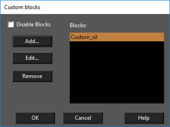
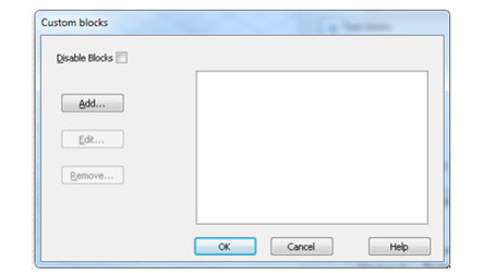
- The Custom Blocks dialog will appear.
This dialog contains list of all blocks assigned to the door or window style.
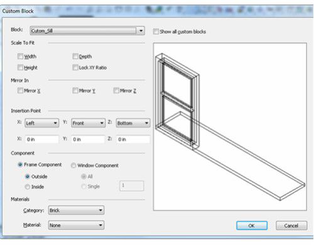
Custom Block Dialog
Disable Blocks: When ON - custom blocks are ignored. Add: displays Custom Block dialog to add new custom block. Edit: displays Custom Block dialog to edit selected custom block Remove: deletes selected custom block Blocks list: contains list of blocks attached to the window style.
Custom Blocks Editor
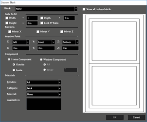
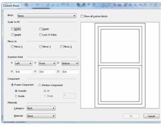
Block combo-box: Used for selecting the block (from the list of blocks) that is attached to the window/door style.
Scale To Fix Controls Group
Width check box: when ON - block is scaled to fit window/door width. Height check box: when ON - block is scaled to fit window/door height. Depth check box: when ON - block is scaled to fit window/door depth. + : The Plus ( + ) fields allow you to add additional width, depth or height to a block in surplus to the scaled fitting. Lock XY Ratio check box: works in combination with one of the (Width, Height, and Depth) check boxes. For example, when Width is ON and you click Lock XY Ratio the block is scaled in a way to keep XY ratio.
Mirror In Controls
Mirror X check box: mirrors block relative X axis. Mirror Y check box: mirrors block relative Y axis. Mirror Z check box: mirrors block relative Z axis.
Insertion Point controls group
X: combo-box: Defines how the block's origin is attached relative to window/door in X Axis (to Left Side, Center or Right Side) Y: combo-box: Defines how the block's origin is attached relative to window/door in Y Axis (to Back Side, Center or Front Side) Z: combo-box: Defines how the block's origin is attached relative to window/door in Z Axis (to Bottom Side, Center or Top Side) X: Y: Z: edit boxes: define the offset from block origin point
Component Controls Group
Frame Component:
Outside - block is attached to entire window Inside - block is attached to inside frame
Window Component
All - block is attached to all window component Single - block is attached to single window component
Materials Controls Group
These controls allow define material that will be used for this custom block in render.
Example of use
Suppose you would like to create custom sill for our window style.
Create a block.
First, we create a geometry for our sill (just a box with 10x2x0.2 in size
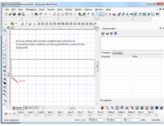
Note: Block used for Custom Blocks must be composed of ACIS solids. For best results align your block with the origin of the drawing.
Make Block
-
Select the box and select Format | Create Block.
-
Enter "Custom Sill" as the Block name and click OK.

-
Navigate to the style manager palette, select Standard window style and click the Block property in the properties of the window style.
-
The Custom Block dialog opens. It contains a list of all the blocks that are attached to the window style.
-
Click the Add button to add new block to the window style.
-
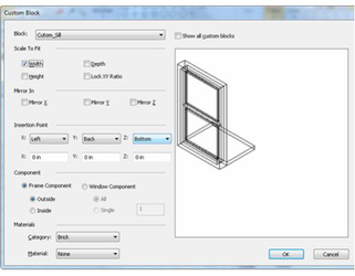
The Custom Block Editor dialog opens.
- Click the Block combo-box and select the desired block.
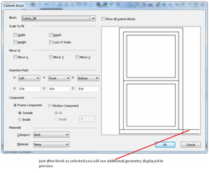
- Right click on the preview pane to display pop-up menu and select Isometric_SE item from it (to have better point of view)
-
Now let's adjust the block size and position.
-
Check Width check box (to scale the block width to the width of window).
-
Select Back from Y: combo-box (to place the block to back side of window)
-
Click OK.
-
Click OK again.
-
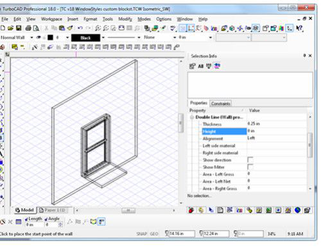
Now create a wall in drawing and insert a window (of Standard style) into it.
Profile Styles
(Available in Platinum)
Default UI Menu: Tools/Palettes/Style Manager/Profile Styles
Ribbon UI Menu:
Profiles are used to define custom shapes for doors, and windows. Once you have created the profile, the profile is selected as part of the window or door's profile.
Note: If you want to save styles to a template,
The first example will show how to use a profile for a door shape.
Example 1- Door Profile with One Boundary
- Before creating the door, create a new door style. This one is a double door with a rectangular shape.
Note: For details on doors,
- Create walls and insert the door. Use the door's Properties window to set the overall size and elevation of the door.
This is the door that will be modified with a profile.
- First, look at the Delay Style Modification icon; if it is enabled, you cannot create a new profile. Make sure Delay Style Modification is off.
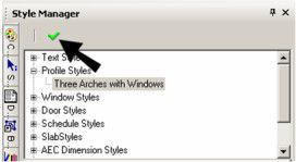
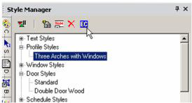
- Highlight Profile styles and click Create New Style.
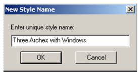
- Assign a name to the profile.
-
When you create a profile, you switch to Edit Geometry mode, and anything you have in your file is removed from view. Because you are creating a 2D profile, switch to World Plan view.
-
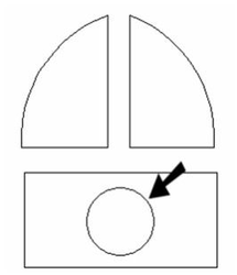
Use Polyline, Arc or Circle tools to create closed curves for boundaries and holes. In this example, the outer shape and the two rectangles were created using Polyline. The circle was created using Circle Center and Point.
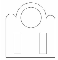
You can have one or more boundaries, but boundaries cannot overlap. Holes must be entirely within a boundary.
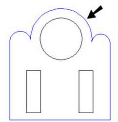
- To define which curves will be used for boundaries, select Edit Boundary Profile.

- Click the boundary curve or curves, which turn blue when selected.
-
Select Finish from the local menu or Inspector Bar.
-
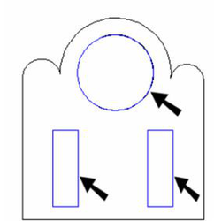
To define which curves (if any) will be used for holes, select Edit Hole Profiles.

- Click the hole curve or curves, which turn blue when selected.
-
Select Finish from the local menu or Inspector Bar.
-
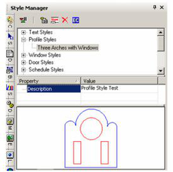
When the boundaries and holes are defined, click Finish to Edit Geometry in the Style Manager.
The profile now appears in the Preview area of the Style Manager. Boundary profiles are shown in blue, holes are shown in red.
- Now return to the door profile. Under Design, set the Profile to the one you just created.
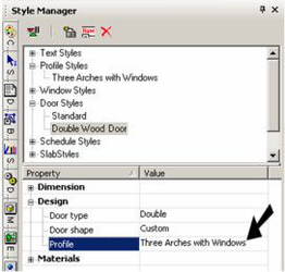
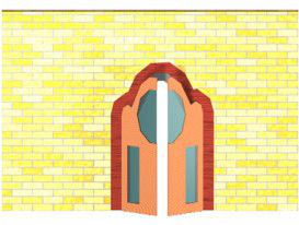
The door outline changes to match the profile. The hole profiles define the door glass, and these areas have the material specified for Glass in the door style.
- If you want to make changes to the profile, highlight it in the Style Manager, and then click Edit Content.
- You will return to Edit Geometry mode, where you can make your changes. When you're finished editing, click Finish to Edit Geometry. The door or window that uses the profile will update automatically.
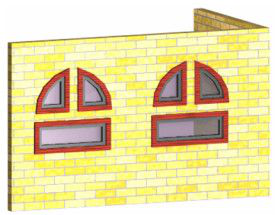
Example 2- Window Profile with Multiple Boundaries
- In this example, create a new profile that will be used in a window.
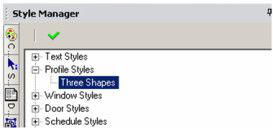
- This profile has three closed profiles, each created using Polyline.
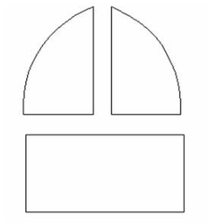
Hole profiles are not generally needed for windows, since the boundary profiles define where the window glass is. If you define holes in window profiles, holes will be placed in the glass.
- Now create a a window style that uses the profile. This example uses a Picture window.
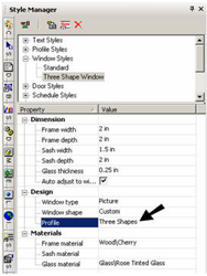
- Use the window Properties to define overall dimensions, and insert a window or two in a wall. Each window consists of three parts, defined by the boundary profiles.
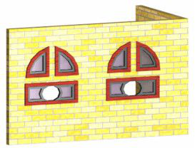
- To see what hole profiles would do, use Edit Content edit the profile. Add another profile within one of the boundaries. Use Tools / Architecture / Profile / Edit Hole Profile to define the new curve as a hole. Then click Finish to Edit Geometry.
The glass now has a hole where the new profile curve was created.
Saving as Templates
(Available in Platinum, Professional and Deluxe)
Default UI Menu: File/Save As
Ribbon UI Menu:

You can save styles in template files, so that you don't have to create styles from scratch each time. To do this, set up the styles you want for doors, schedules, slabs, etc. Then use File / Save As to save the file as a .tct file (TurboCAD Template). Place the template file in the "Template" folder of the TurboCAD root directory. Then when you want to open the template, use *File / New, and select New from Template.
Note: This also applies to tool Properties; set the properties you want, such as door dimensions or wall width and height, and save them as part of the template file as well.