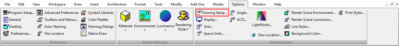
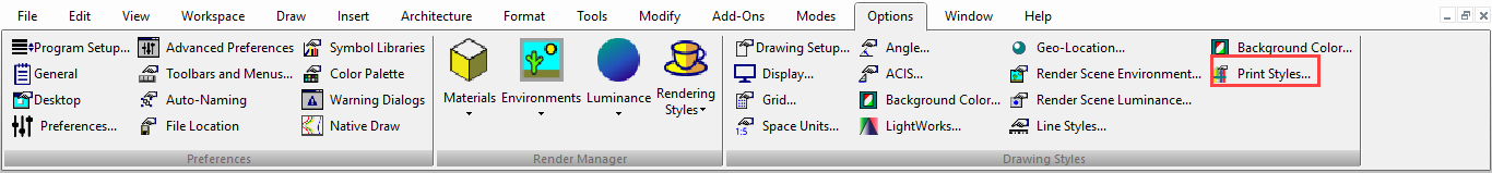
Default UI Menu: Options/Drawing Setup
Ribbon UI Menu:
Sets properties related to the current drawing.
TheDrawing Setup pages can be accessed from the Options menu, or from the flyout icon on the Standard toolbar.
 You can also display the Drawing Setup toolbar by right-clicking in any toolbar area and selecting Drawing Setup.
Tip: You can also use the Defaults for a drawing in the TC Explorer Palette to set drawing setup options.
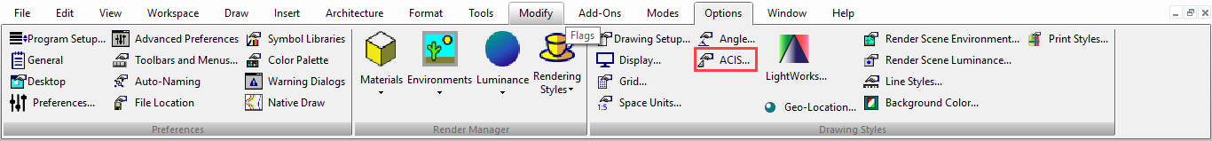
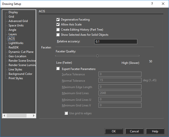
ACIS®
Default UI Menu: Options/Drawing Setup/ACIS
Ribbon UI Menu:
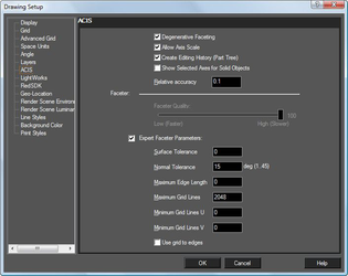
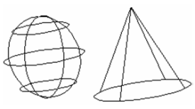
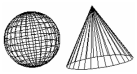
Controls faceting of ACIS 3D solid (not surface) objects, thereby the accuracy of the model representation. Faceting generates polygonal representations of object faces while maintaining the edge consistency between adjacent faces.
Note: The faceted representation of a face is also called a mesh.
Faceting is used during rendering, and faceting refinements may have a significant impact on the rendering process. Tighter facets (higher in number) produce a smoother rendered surface but slow down the rendering process. Degenerative Faceting: Reduces the number of edges without generating facets. Should be used if your model contains a significant number of 3D objects because the drawing loading time will be reduced. (For files of tens of megabytes, the loading time reduction may be more than ten times.) However, rendering such a model may take much longer.
With degenerative faceting
Without degenerative faceting
Note: To see the effects of degenerative faceting, check to Draw form-building edges on the Display page of the Drawing Setup (Options / Display).
Allow Axis Scale: ACIS solid objects can be scaled by entering different scale values in the Inspector Bar for each axis. If not checked, scaling will be uniform, and this uniform values must be entered in the scale fields for at least two axes.
Note: This parameter is only relevant for ACIS solids. Use the Selection Info palette if you are unsure about an object's type. For example, if you create a solid box, you will need to explode it once to make it an ACIS solid.
Creating Editing History: Enables you to edit 3D objects, after they are created, in the Selection Info palette. Show Selected Axes for Solid Objects: Applies to objects that will be assembled by axis.
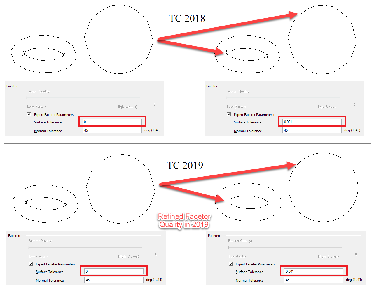
Faceter
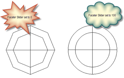
The level of facet refinement which is used to display ACIS objects can be set by the Faceter Quality slider. For greater customized control, select the Expert Faceter Parameters option, and then specify the desired values.
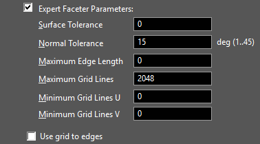
Expert Faceter Parameters
Normal Tolerance: Specifies the maximum angle (in degrees) between surface normals at points on a facet. Surface Tolerance: The Surface Tolerance represents the maximum distance between a facet and the true surface definition. By default this value is a predefined fraction of the body diagonal. However, using the Expert Faceter Parameters, you can override the default behavior and precisely control the deviation between the facet and true surface. For example, by specifying a value of 0.05, facets will deviate no further than 0.05 inches/mm from the true surface. This is particularly useful to remove facet display anomalies due to tolerances.
Max Edge Length: Constrains the maximum length of a side of a grid cell in object space. More precisely, the maximum edge length value constrains the maximum length of a diagonal of a grid cell, because the length of a grid cell diagonal provides an upper limit for the edge length of a facet. Therefore, this parameter also constrains the maximum edge length of a facet. Min Grid Lines U: Specifies the minimum number of u grid lines (i.e., grid lines in the u-direction). Min Grid Lines V: Specifies the minimum number of v grid lines (i.e., grid lines in the v-direction). Grid aspect ratio-Specifies the maximum ratio of the long side to the short side of a grid cell in 3D space. The aspect ratio value does not guarantee that triangles will have a particular aspect ratio; it applies only to the aspect ratio of grid cells. If the value of the grid aspect ratio parameter is less than or equal to 0.0, the grid aspect ratio is ignored. If the value of the grid aspect ratio parameter is greater than 0.0 and less than or equal to 1.0, a value of 1.0 is used. The default grid_aspect_ratio value is 0, which means the grid aspect ratio is ignored. Use Grid to Edges: Specifies whether a grid is used and whether the points where the grid cuts the edge is inserted to the edge.
Object Specific Faceting
Faceting can be controlled on an individual object basis via the Properties of the object. Object specified faceting overrides the global setting in the ACIS settings.
 Two entities with new faceter options:
Advanced Grid Options
Default UI Menu: Options/Drawing Setup/Advanced Grid Options
Ribbon UI Menu:

Advanced controls for the frequency and locations of grid lines.
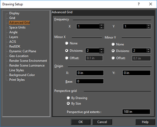
Note: Set Grid Origin is also accessible from the Grid toolbar.
Perspective grid: Relevant when the grid is displayed and you are working in Perspective mode.
By Drawing: An infinite grid will be displayed.
By Size: The size of the displayed grid is determined by Perspective grid extents. This value sets the grid extents in both directions from the WCS origin, i.e. a value of 3 inches will produce a 6 x 6 grid.
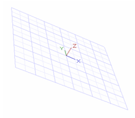
Base: It is an advanced base angle - grid rotation angle. This option works for all types of grids.
-
Enable Grid.
-
Select Advanced Grid Options from Options/Drawing Setup. Enter a value for example 30 in Base and press OK.
Base angle can be both; positive or negative. Positive base angle rotates the grid in an anti-clockwise direction and negative base angle rotates it in a clockwise direction.
Angle Options
Default UI Menu: Options/Drawing Setup/Angle
Ribbon UI Menu:
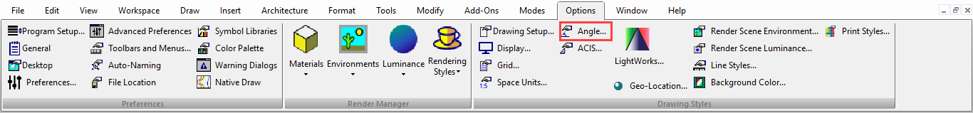
Controls the measurement and display of angles, as well as control over the Ortho angle.
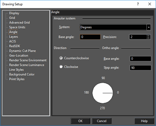
Angular System: Select degrees, degrees-minutes-seconds, grads, radians, or the surveyor system.
Base angle: The default base angle is 0 degrees (right quadrant point). You can change this value to start angle measurement from another base angle.
Precision: The number of decimal digits.
Direction: Choose whether to measure angles clockwise or counterclockwise.
Ortho Angle: By default, Ortho lines are 0 and 90 degrees. You can change this by entering new values here.
Base angle: Sets the angle from which the Ortho angle is measured.
Step angle: The angle to which Ortho constrains lines. If you set the step angle to 15, for example, the line will be constrained to angles 15 degrees apart. The default step angle is 90 degrees.
Background Color
Default UI Menu: Options/Drawing Setup/Background Color
Ribbon UI Menu:
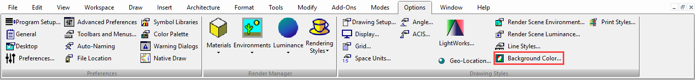
Changes the background color, which is white by default.
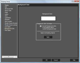 Foreground color conversion: This option is designed to prevent objects from disappearing into a background of the same color (e.g. White on White) This is accomplished by inverting the display color of the object, but not the actual color setting. Color conversion will occur if this is checked. This can be controlled at the object level as well:
Apply to all existing objects: Overrides the setting in individual objects and sets them to the 'By Drawing' default.
Foreground color conversion: This option is designed to prevent objects from disappearing into a background of the same color (e.g. White on White) This is accomplished by inverting the display color of the object, but not the actual color setting. Color conversion will occur if this is checked. This can be controlled at the object level as well:
Apply to all existing objects: Overrides the setting in individual objects and sets them to the 'By Drawing' default.
Display Options
Default UI Menu: Options/Drawing Setup/Display
Ribbon UI Menu:
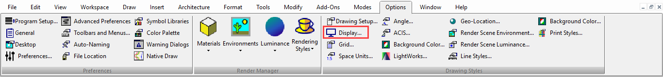
Options for adjusting the quality and redraw speed of the display, and options for displaying block attribute values.
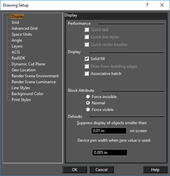
Performance
When working with large files or a slow computer, you may be able to increase your display speed by selecting one or more of these options. The display speed can sometimes be slowed by heavy text, styled lines, and fill patterns. Quick text: Displays all text as small boxes. Quick line styles: Simplifies the display of line styles. Quick vector brushes: Simplifies the display of hatch and fill patterns.
Display
Solid Fill: A line of a specified width will be drawn as solid. Draw form-building edges: Available in GDI mode. Draws form-building edges of 3D surfaces. Associative hatch: When you modify a hatched object, the hatch pattern will update to fit the new shape.
Block Attribute
Options relevant for blocks that contain block attribute definitions. Force invisible: Hides all attribute values. Normal: Shows the attribute values as they were defined while creating. Force visible: Shows all attribute values, even those defined as invisible.
Defaults
Suppress display of objects smaller than: Sets the size at which TurboCAD will draw a simplified representation of objects. This size is measured in device units (the "device" is your computer's display) so that one inch will be equal to approximately one inch of space on your screen. At smaller sizes, TurboCAD will display objects using a simplified representation, increasing display speed. As you zoom in, you get the detail required for precise editing; as you zoom out, you get faster redraw. Device pen width when zero value is used: Controls the printed width of lines set to zero width.
Grid Options
Default UI Menu: Options/Display Options/Grid Ribbon UI Menu:
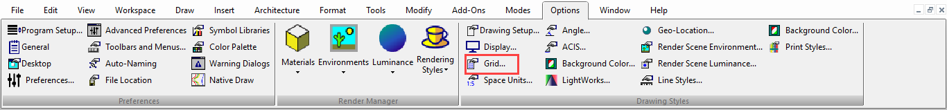
Controls the grid type, size, and display. You can set up different grid properties for Model Space and Paper Space.
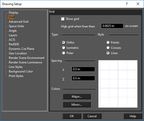 Show grid: Equivalent to displaying the grid using the Grid menu or Grid toolbar.
Hide grid when finer than: This value applies to distances on your screen which are not related to World or Paper units.
Type: These grid types are based, by default, on a horizontal baseline. This can be changed on the Advanced Grid page.
Ortho: Orthogonal grid.
Isometric: Aligned along lines measured 30º and 150º from the horizontal axis. This type of grid is used in isometric drawing, which uses perspective drawing techniques to represent 3D objects.
Polar: Points in the polar grid radiate from the origin, and are aligned by their radial distance from the origin and their angular distance from the horizontal axis.
Style: Select Points (dots at each grid point), Crosses (crosses at each main grid point), or Lines (graph paper).
Spacing: Sets the distance between all grid lines, major and minor, without respect to frequency. Select X and Y spacing, or angular and radial values for a polar grid.
Show grid: Equivalent to displaying the grid using the Grid menu or Grid toolbar.
Hide grid when finer than: This value applies to distances on your screen which are not related to World or Paper units.
Type: These grid types are based, by default, on a horizontal baseline. This can be changed on the Advanced Grid page.
Ortho: Orthogonal grid.
Isometric: Aligned along lines measured 30º and 150º from the horizontal axis. This type of grid is used in isometric drawing, which uses perspective drawing techniques to represent 3D objects.
Polar: Points in the polar grid radiate from the origin, and are aligned by their radial distance from the origin and their angular distance from the horizontal axis.
Style: Select Points (dots at each grid point), Crosses (crosses at each main grid point), or Lines (graph paper).
Spacing: Sets the distance between all grid lines, major and minor, without respect to frequency. Select X and Y spacing, or angular and radial values for a polar grid.
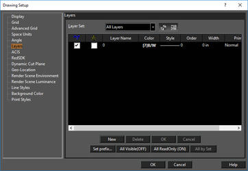
Layers
Default UI Menu: Options/Drawing Setup/Layers
Ribbon UI Menu:

Enables you to create new layers, set the current drawing layer, set the properties of layers, and delete layers.
These are legacy functions, use the Design Director or Layer Manager instead.
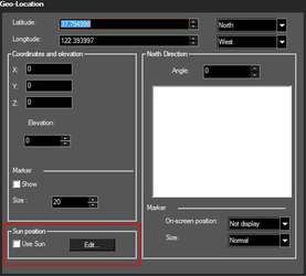
Geo-Location
Default UI Menu: Options/Drawing Setup/Geo-Location
Ribbon UI Menu:
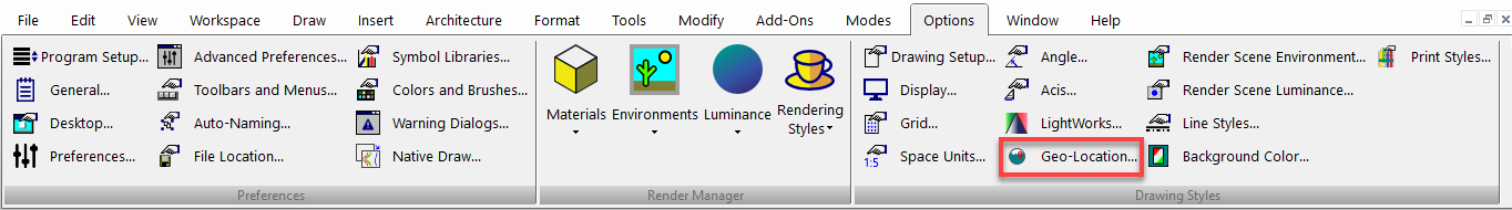
Geo-Location contains three primary functions: Location, Orientation, and Display.
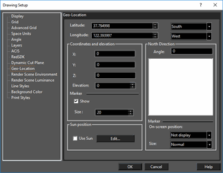 Location
- Latitude
– set the latitude of the drawing in degrees, to six decimal places.
-
South/North – specify whether the latitude angle is South or North
-
Longitude
– set the longitude the drawing in degrees, to six decimal places.
- East/West – specify whether the longitude angle is East or West
Coordinates and Elevation
-
X, Y, Z – specify the location in the drawing which corresponds to the geo-location. Units are in the model space defined Space units.
-
Elevation – specify the elevation of the drawing at that geo-location.
-
Marker
- Show – When on this shows a crosshair marker within the drawing, located at as specified by the X, Y, Z values. This maker can be snapped to as a drawing reference.
- Size – Sets the relative size of the to the crosshair marker.
North Direction
-
Angle – Specify the Angle of orientation for North relative to the drawing.
-
Marker
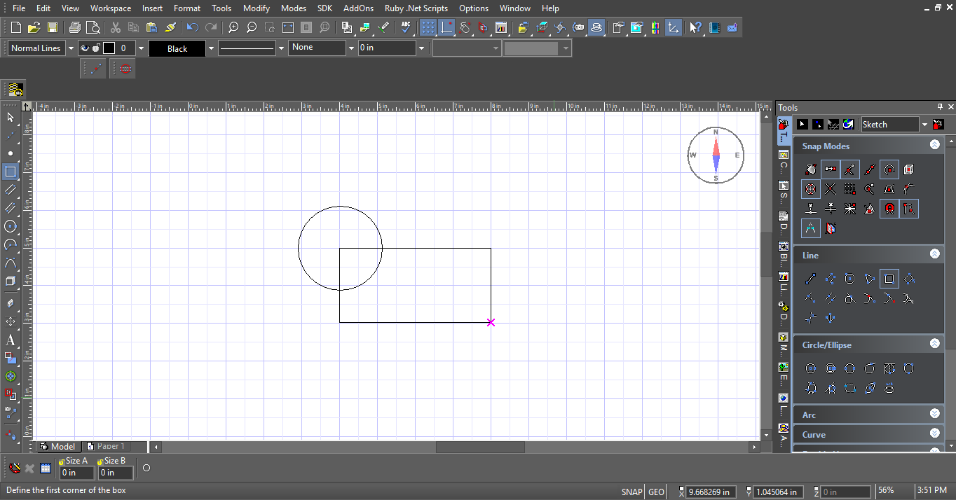
– Displays a compass rose for drawing orientation
- On Screen Position – Specify the location of the compass rose: Not Display, Top Left, Bottom Right, Top Left, and Bottom Left.
- Size-- Sets the relative size of the compass rose: Tiny, Small, Normal, and Large.
Geo-Location Crosshairs and Compass Rose
Sun Position
 The Sun control is designed to provide a universal control for the display of sunlight in all draft and quality renders.
Use Sun – If on a Sun light is used in all draft & quality renders. The direction of the sunlight points to the 0,0,0 point of the drawing.
The Sun control is designed to provide a universal control for the display of sunlight in all draft and quality renders.
Use Sun – If on a Sun light is used in all draft & quality renders. The direction of the sunlight points to the 0,0,0 point of the drawing.
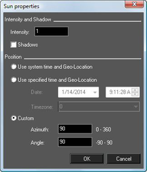 Intensity: sets the power of the sunlight It takes values from 0 to 1,000,000 (or 1E + 06), with a default of 1.
Shadows – If checked the sunlight casts shadows.
Use System time and Geo-Location: If selected the date and time is derived from the computer clock and the location is specified by Geo-Location
Use Specified time and Geo-Location: If selected the date and time and time zone (GMT+/-) are user-specified and the location is specified by Geo-Location
Date: Sets the date.
Time: Sets the time.
Timezone: Sets the timezone as relative plus or minus to Greenwich Mean Time (GMT)
Custom: If selected the user may directly specify the Azimuth and Angle.
Azimuth: The user can specify the Azimuth from 0.00 to 360.
Angle: The user can specify the Angle from -90 to 90.
Intensity: sets the power of the sunlight It takes values from 0 to 1,000,000 (or 1E + 06), with a default of 1.
Shadows – If checked the sunlight casts shadows.
Use System time and Geo-Location: If selected the date and time is derived from the computer clock and the location is specified by Geo-Location
Use Specified time and Geo-Location: If selected the date and time and time zone (GMT+/-) are user-specified and the location is specified by Geo-Location
Date: Sets the date.
Time: Sets the time.
Timezone: Sets the timezone as relative plus or minus to Greenwich Mean Time (GMT)
Custom: If selected the user may directly specify the Azimuth and Angle.
Azimuth: The user can specify the Azimuth from 0.00 to 360.
Angle: The user can specify the Angle from -90 to 90.
New Sun and Sky shader
TurboCAD 2019 Platinum only
New properties "sun dir by geo-location" and "dir by geo-location" added to "Sky" and "Sun" shaders correspondingly.
Lightworks
Default UI Menu: Options/Drawing Setup/LightWorks
Ribbon UI Menu:
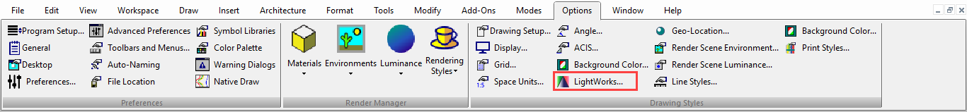
The options on this page are relevant to Render Styles.
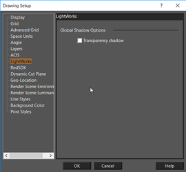 Transparency Shadow: Specifies whether a render created with a render style will support shadows cast by transparent objects.
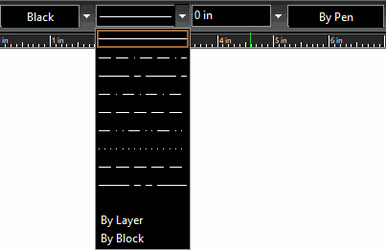
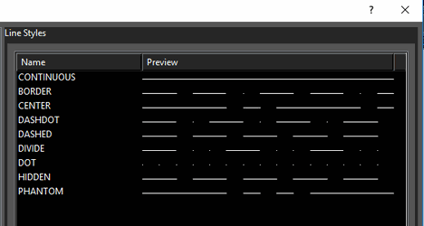
Line Styles
(Available in Platinum, Professional)
Default UI Menu: Options/Drawing Setup/Line Styles
Ribbon UI Menu:
View predefined line styles, modify or delete them, and create new ones.
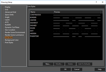 An object's line style can be set in the Property toolbar or in the Pen page of its Properties
If you clickNew or Modify, you will access the Line Style Editor.
Add to Defaults: New line styles will be saved so that they can be used in future drawings. Otherwise, the line styles will be used only in the current drawing.
An object's line style can be set in the Property toolbar or in the Pen page of its Properties
If you clickNew or Modify, you will access the Line Style Editor.
Add to Defaults: New line styles will be saved so that they can be used in future drawings. Otherwise, the line styles will be used only in the current drawing.
Tip: You can use the TC Explorer Palette to view line styles defined for any open drawing.
Applying a Line Style
To apply the line style, you can use the Property toolbar. You can also set the line style, and adjust its scale, in the Pen page of the object's Properties.
- Create the object, which appears in the default line style.
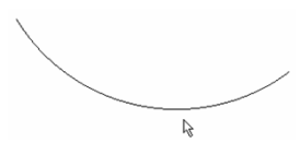
- Select the desired line style from the Property toolbar.
 The line style is applied.
Tip: You can use the TC Explorer Palette to view line styles defined for any open drawing, and to import line styles from one drawing to another.
Line Style Editor
Enables you to edit an existing line style or define a new one.
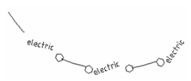
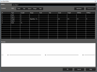 The example is shown above (line style "Utility") has four components: one dash, one text, and two shapes (hexagons). You can also add dots and spaces. Either click Add Item to add another component, or click the relevant button (Dash, Dot, etc.)
For each type of line style component, you can set various parameters. ForShape you can choose the actual shape and its size and spacing. For Text, you can choose the font and angle. The Preview window helps you see how the line style will look; use it as a guide when adjusting the parameters.
The example is shown above (line style "Utility") has four components: one dash, one text, and two shapes (hexagons). You can also add dots and spaces. Either click Add Item to add another component, or click the relevant button (Dash, Dot, etc.)
For each type of line style component, you can set various parameters. ForShape you can choose the actual shape and its size and spacing. For Text, you can choose the font and angle. The Preview window helps you see how the line style will look; use it as a guide when adjusting the parameters.
Note: Shapes are read from .shx files (not to be confused with .shx font files), found in TurboCAD's Shapes folder. For Example: My Documents\TurboCAD 2019 Professional x64\Shapes
Once the line style has been created, it appears in the Line Styles page of the Drawing Setup.
 The new style also appears on the Property toolbar.
Print Style Table
Default UI Menu: Options/Drawing Setup/Print Styles
Ribbon UI Menu:
Select the print styles you want in your drawing.
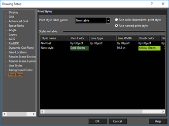 Print styles are specific pen and brush settings you can apply to objects when printing.
Redsdk 5.0
TurboCAD 2019 (Platinum, Professional and Deluxe Only)
Note: RedSDK is now offered as only an optional plug-in to TurboCAD 2019 Deluxe, Professional and Platinum. Enhancements described below are only found after the plug-in has been installed. LightWorks has been reintegrated into TurboCAD and will no longer be an optional plug-in
The Redsdk settings allow you to control how object appear when using the Redsdk for draft rendering and hidden line rendering.
Shading
Use background color: When it is turned off (On by default), the option for editing the internal color of objects will become available (by default the color is white).
Front line
Width by graphic: When this option is on the Width of the visible part of graphic's line is taken from the graphic itself. When it is turned off, the field for editing the width of the visible part of object lines will become available (by default the width is = 0). Color by graphic: When this option is on the color of the non-hidden part of an object's lines is taken from the graphic itself. When the option is off the option for editing the color of the non-hidden part of an object's lines will become available (by default the color is white).
Backward line
Width by graphic: When on the Width of the hidden part of an object's line is taken from the graphic itself. When it is turned off, the field for editing the width of the hidden part of object lines will become available (by default the width is = 0).
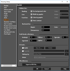
Note: the width of hidden lines must be less than or equal to the width of visible lines.
Color: This option defines the color of hidden lines (by default it is grey; R=G=B=128 Transparency: This option defines the transparency of hidden lines, with the range of 0 to 1 (by default it is 0.1) Stipple: This option defines the type of dashed line used for hidden lines, with the range of 0 to 255 (by default it is 255)
Draft Mode Settings
Ambient: This field defines the light intensity factor for all light sources of Ambient type (by default it is 10). Diffuse: This field defines the luminance factor (by default it is 75). Specular: This field defines the glare factor (by default it is 50). Exponent: This field defines the glare attenuation parameter (by default it is 10). Soften: This field defines glare 'softness' (by default it is 0).
GI Cache - Baking
By baking, we mean pre-calculating a given information, storing it and restituting it, faster, as a later rendering phase. Two types of data will be baked in our example:
- The global illumination information of our scene.
- The direct contribution of physical lights in the scene.
The baking process for this model takes between a few seconds up to a few minutes, depending on the quality of the baked signal. Then, the replay of the baked cache is either performed in real-time or in software.
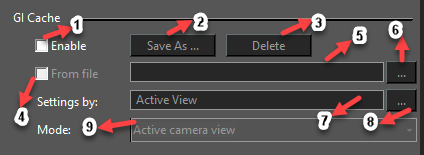 1. Enable - Turns on/off GI cache. By default – Off.
2. Save As - Saves the GI cache to a RED file. Enabled – if GI cache was created or loaded.
3. Delete - Clears the GI cache. Enabled – if GI cache was created or loaded.
4. From file - Turn on/off GI cache loading from file. By default – Off Enabled – if GI cache is On
5. File name - RED file name. By default – Empty Enabled – if GI cache is On and From file is On
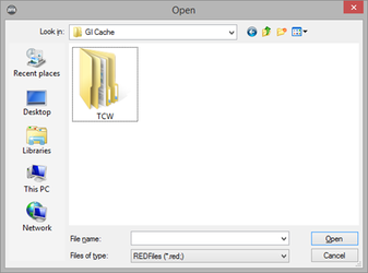
6. … (Browsing RED file) - Browsing RED file. Enabled – if GI cache is On and From file is On
1. Enable - Turns on/off GI cache. By default – Off.
2. Save As - Saves the GI cache to a RED file. Enabled – if GI cache was created or loaded.
3. Delete - Clears the GI cache. Enabled – if GI cache was created or loaded.
4. From file - Turn on/off GI cache loading from file. By default – Off Enabled – if GI cache is On
5. File name - RED file name. By default – Empty Enabled – if GI cache is On and From file is On
6. … (Browsing RED file) - Browsing RED file. Enabled – if GI cache is On and From file is On
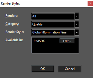
 7. Active View or Render Style name - Source of parameters for GI cache creating. By default – Active View. Enabled – if GI Cache is On and From file is Off
8. … (Browsing render style) Browsing renders style. Enabled – if GI cache is On and From file is Off
7. Active View or Render Style name - Source of parameters for GI cache creating. By default – Active View. Enabled – if GI Cache is On and From file is Off
8. … (Browsing render style) Browsing renders style. Enabled – if GI cache is On and From file is Off
 9. GI cache computation mode - Choosing GI cache computation mode. By default – Active Camera View. Enabled – if GI cache is On and From file is Off
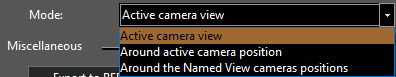
| Active Camera view | The GI cache is computed for the given camera only. |
|---|---|
| Around active camera position | The GI cache is computed for the whole set of directions around the camera position. The generated GI cache is then suitable to render panoramas. |
| Around the Named View camera positions | The GI cache is computed for the whole scene, without taking the camera into account. |
Miscellaneous Export to RED file: This option allows you to save the current RedSDK settings.
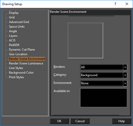
Render Scene Environment
Default UI Menu: Options/Drawing Setup/Render Scene Environment
Ribbon UI Menu:
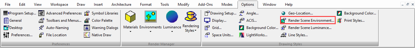
The options on this page are relevant while rendering. You can specify a background and/or foreground for the model.
Render Scene Luminance
Default UI Menu: Options/Drawing Setup/Render Scene Luminance
Ribbon UI Menu:
The options on this page are relevant while rendering. You can specify one or more lights to the overall drawing render.
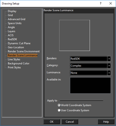 Luminance uses the RedSDK and Lightworks rendering engine and provides a wider range of effects than standard lights. You can also specify luminance for individual objects (as opposed to the overall drawing) by opening theLuminance page of the object's Properties.
Drawing luminance can be applied to the WCS (World Coordinate System) or UCS (User Coordinate System).
Space Units
Default UI Menu: Options/Drawing Setup/Space Units
Ribbon UI Menu:
Controls for setting units in Model and Paper Space.
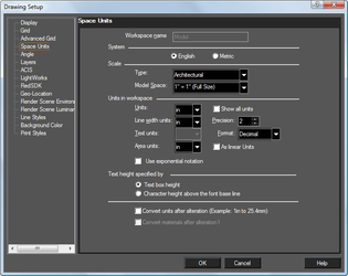
Note: Templates generally have units built in, but you can change units, or create custom units.
Workspace name: Available in Paper Space only.
System: Selecting English or Metric will affect controls on the rest of the page.
Scale: The ratio of measurements on the page (Paper units) to measurements in the object being modeled (World units).
Architectural: 3/16" = 1'-0"
Engineering: 1"= 200'
Absolute: 1:500
Units: The unit of measure for linear measurements.
Show all units: Displays all available units, regardless of whether English or Metric is used.
Line width units: The unit for setting and displaying the line width in the Pen page of the Properties window.
Precision: The number of decimal digits. For Fractional or Architectural units, Precision determines the accuracy of the denominator, in powers of two (1=1/2", 2=1/4", 3=1/8", etc.).
Text units: Unit for setting and displaying the size of the text.
Area Units: Unit to be used for displaying area.
As Linear Units: Sets Area units to the same unit type as Units.
Use Exponential Notation: Exponential Notation is used in Area fields  Format: Controls the display of numbers:
- Decimal - 3.25
- Scientific - 1E+01
- Fractional - 3 3/16
- Architectural 1'-5 11/16"
- Engineering (scale): 1"= 200'
Text height specified by: Two methods to adjust text height when the current font is changed. Text box height (default): In specifying the height value for the text, define the height of the text bounding box. In this case, changing the font does not affect the height of the bounding box. Character height above the font base line: The text height value will be used as the actual height of the text. This method preserves the text height (but not the height of the text box) when you change the font.
Note: The value of text height is determined by the vertical size of the uppercase letter "A" in the currently selected font. This value is the sum of four components: External Leading is the amount of space that the designer of the font suggests should be added between character rows. Internal Leading is the amount of space allowed for an accent mark above a character. Ascent is the amount of space allowed for the characters that have neither an accent mark above the character nor a character part below the font baseline. Descent is the amount of space allowed for the character part below baseline. (Lowercase letters such as "g", "p", and "q" have a character part occupying some space below the font baseline.)
Convert units after alteration: Forces unit recalculation after changing the units.
- Example 1 - Converting a drawing from feet to inches: if unchecked, 1 foot will become 1 inch. If checked, 1 foot becomes 12 inches.
- Example 2 - Converting a drawing from inches to mm: if unchecked, 1 inch will become 1 mm. If checked, 1 inch will become 25.4mm.
Convert material after alteration: Forces conversion of material sizes after changing units.
Convert styles properties on switching between spaces: Activates the conversion mechanism when switching between Model Space and Paper Space.
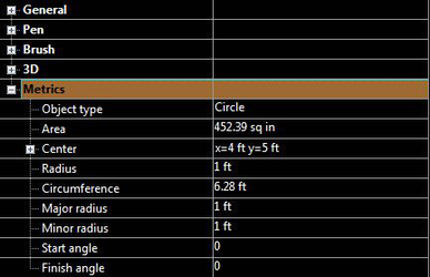
Units are typically viewed in a variety of places including Selection Info;