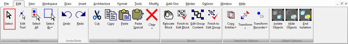
Selecting Objects
(Available in all TurboCAD Variants)
Default UI Menu: Edit/Select
Ribbon UI Menu:
Tip: In most cases, you can also access Select mode by pressing the Space Bar (if another tool is active).
- To select a single object, click on it.
- To select multiple objects, keep the Shift key pressed while selecting.
- To deselect an object from a selected group,Hold Shift-select it again.
- To select all objects, use Select All or use Ctrl+A.
- When a group of objects is selected, press Ctrl to select one of the objects in the group. You can edit just this one object, and when you are finished, click outside the group. The previously selected group is once again selected.
- Four hotkeys are also available for selecting:
- F6 selects the first object created. Pressing F6 repeatedly will select subsequent objects in the order they were created.
- F7 selects the last object created. Pressing F7 repeatedly will select subsequent objects in reverse creation order.
- Shift+F6 selects multiple objects. Starting with one object, subsequently created objects are added to the selection set.
- Shift+F7 selects multiple objects. Starting with one object, previously created objects are added to the selection set.
- For any selected object or group of objects, you can view and access some properties in the Selection Info Palette.
Tip: You can use the Design Director to select all objects that reside on a particular layer or sit on a particular workplane, select lights, etc.
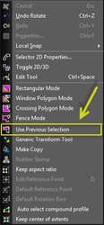
Use Previous Selection
This option in the local menu allows you to re-select the last previously modified selection.
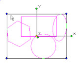
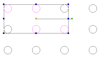
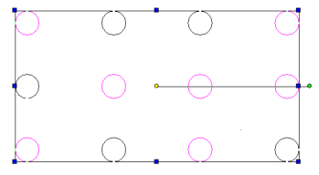
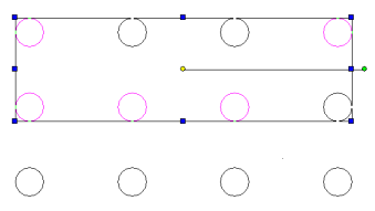
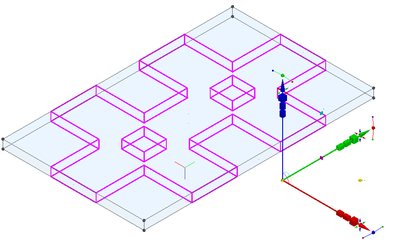
Using a Selection Window
You can select a group of objects by dragging a rectangle around them. Click the first corner of the rectangle, keeping the mouse button pressed, and drag the rectangle to the opposite corner. 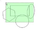
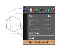
If you need to select objects using a shape other than a rectangle, If you draw the selection rectangle from right to left, all objects completely or partially inside the fence will be selected.
Alternatively, if you need a shape other than a rectangle this can be performed by using Draw any shape for selecting the objects. Turn the Open Window Mode 'On' from local menu if it is 'Off'. Then click on 'Finish'.
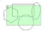
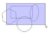
If you draw the selection rectangle from left to right, only objects completely inside the fence will be selected.
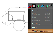
Alternatively,if you need a shape other than a rectangle this can be performed by using
Draw any shape for selecting the objects. Turn the Open Window Mode 'Off' from local menu if it is 'On'. Then click on 'Finish'
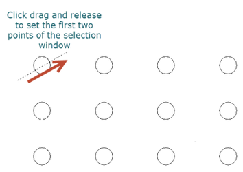
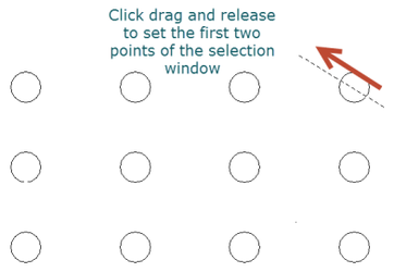
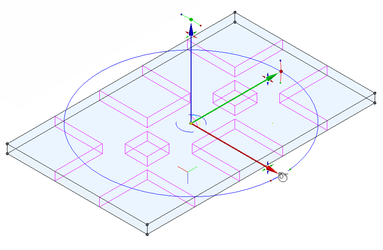
Super Selector Modes
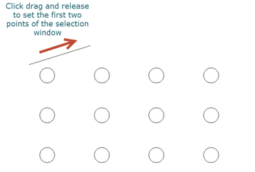
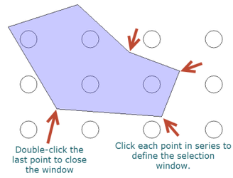
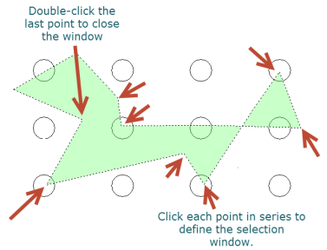
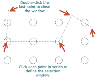
You can specify how selection will work with the Super Selection modes: Rectangular mode, Window Polygon mode, Crossing Polygon mode, and Fence mode. Rectangular mode -the default standard bi-directional rectangle selector. Window Polygon mode - objects completely inside closed polygon will be selected.
- Click and drag to set the first two points of the selection window.
- Click each subsequent point to define the selection window.
- Double click the last point to close the window and finish the selection.
 Crossing Polygon mode - objects crossed by or within a closed polygon will be selected.
- Click and drag to set the first two points of the selection window.
- Click each subsequent point to define the selection window.
- Double click the last point to close the window and finish the selection.
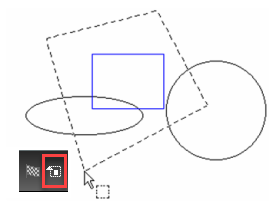
 Fence mode - objects crossed by an open polygon (fence) will be selected.
- Click and drag to set the first two points of the selection window.
- Click each subsequent point to define the selection window.
- Double click the last point to close the window and finish the selection.
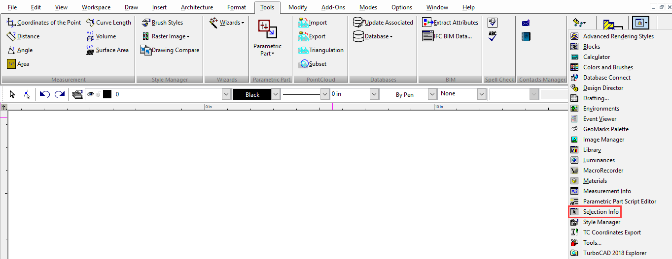
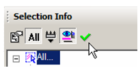
Selection Info Palette
Default UI Menu: Tools/Palettes/Selection Info
Ribbon UI Menu:
Note: For details on using the Selection Info palette for 3D objects, and to see part history,
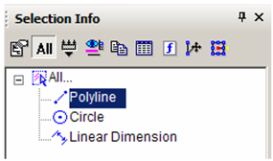
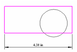
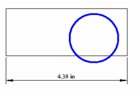
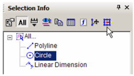
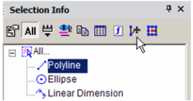
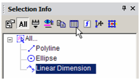
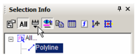
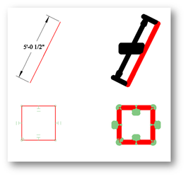
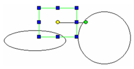
This example consists of a rectangle, a circle, and a linear dimension.
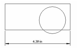 Open the Selection Info palette to see the three objects listed.
Tip: The number of selected objects must be less than or equal to Maximum Selection Info Entities, which is set in the Program Defaults page of the TC Explorer Palette.
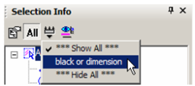
In the Selection Info toolbar, click Highlighting, and make sure Polyline is selected.
This highlights the rectangle in the drawing window.
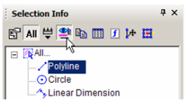
Conversely, if you select objects in the drawing area, they will be highlighted in the Selection Info palette.
Note: If a group is selected, its objects will be listed under the group name in a similar tree format.
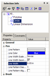
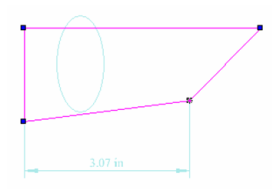
You can use this palette to change an object's properties. Highlight the circle, and the lower section of the palette contains the categories of properties for the circle. In this example, the color and line weight was changed in the Pen category.
Note: For 3D ACIS objects, physical properties are not automatically listed. Click the Physical Metrics icon in the palette toolbar if you want to see engineering properties (volume, moments of inertia, etc.).
The new properties appear in the drawing area. (You may have to turn off the Highlight icon in the toolbar to see the changes.)
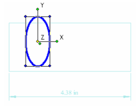
 To make some changes to the circle, click Select.
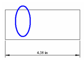
This invokes Select Edit mode, and all objects other than the circle are faded. Perform a change like moving and scaling the circle. (For details on editing this way, ).Note that this changes "Circle" to "Ellipse" in the palette.
 Select Cancel to exit Select Edit mode.
 You can also invoke the Edit Tool. Highlight the Polyline and click Edit Tool. This enables you to reshape an object by moving its nodes.
 Move one or more nodes to change the shape.
 To exit the Edit Tool, select Cancel twice.
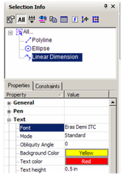
To change the dimension, highlight and make changes in the Text category.
To exit the Edit Tool, select Cancel twice.
To change the dimension, highlight and make changes in the Text category.
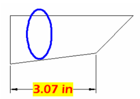
The changed dimension appears in the drawing area.
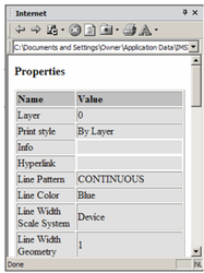
Note: You can also edit an object's properties by clicking the Properties icon in the palette toolbar. This opens the Properties window for the object.
 The Copy icon is used to view an object's properties in HTML format.They will appear in your default browser. The HTML file is stored in the ...Profiles/Built-in folder.
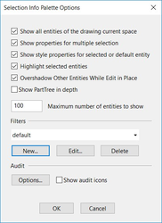
 To set options for the Selection Info palette, click Options.
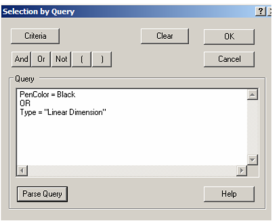
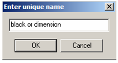
 The options at the top control highlighting and fading for objects that are not being edited. To set a filter for what objects are displayed in the palette, click New. This opens the Selection by Query window, in which you can specify types of objects you want to display.
Note: For details on selecting by query,
- Each filter must be assigned a name.
- To apply this filter, click Filter in the toolbar.
- Select the filter you just created.
Now only the polyline and dimension appear in the palette.
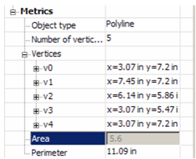
- You can change geometry by modifying geometry in the Metrics category. Open Metrics for the Polyline - the coordinates for each vertex are listed.
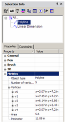
- Open the branch for a vertex to see its X and Y coordinates. These values can be changed.
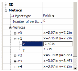
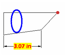
The vertex highlighted in the palette is also highlighted in the drawing area.
Some values cannot be edited, such as Area and Perimeter. These values depend on the coordinates of the vertices and are grayed out
. 
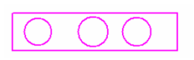
- To see options for another type of object, create several objects and group them (select them, then select Format / Create Group).
The Extents Size parameter has been added to the selection Info palette properties.Extents Size parameter also works with groups, blocks, and insertions. You can use the ‘Extents Size’ property to select entity according to size valuation. Select objects that you think are big or small, or object in any range you want.
The Extents Size update provides you with additional flexibility so that you can use this parameter for various needs and for analyzing wrong entities.
The Extents Size update provides you with additional flexibility so that you can use this parameter for various needs and for analyzing wrong entities.
You can also select objects on the basis of extents size parameter using Select by Query
Note: For details on groups,
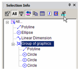
- This object is a "Group of Graphics," and you can open it to see each object that comprises the group. To edit the group, click Edit Content.
- The group's contents fill the screen. You can make some change, such as adding or removing objects from it.
- When finished, click Finish Edit Content.
Selection Info- Constraints
The Constraints tab of the Selection Info palette shows what constraints have been applied, and to which objects they are applied.
For details on constraints,
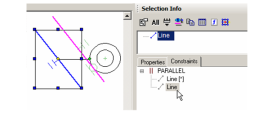
This example consists of two lines and two circles. Three constraints were applied: the two lines are constrained to be parallel, the circles are constrained to be concentric, and a tangent constraint was applied to the outer circle and adjacent line.
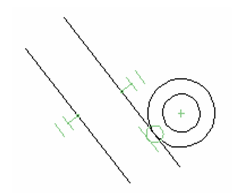
- Make sure the All icon is disabled at the top of the Selection Info palette. Select the outer line, which only has one constraint (parallel). In the Constraints tab, the PARALLEL constraint is listed, below which are listed the two lines to which the constraint applies.
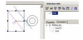
- Move the cursor over the PARALLEL constraint in the Constraints tab, and the two lines that have this constraint are highlighted.
- Move the cursor over either line below PARALLEL. The relevant line is highlighted.
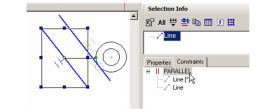
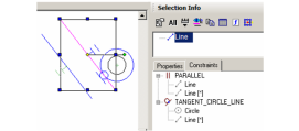
- Now select the inner line, which has two constraints applied to it. These two constraints are listed: PARALLEL and TANGENT.
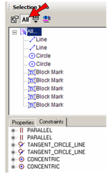
- Now click All. The four objects (two lines, two circles) are listed, along with several blockmarks. These are the constraint markers themselves, which can be selected and deleted if you want to remove the constraint. In the Constraints tab, two items are listed for each constraint - one for each of the constrained objects.
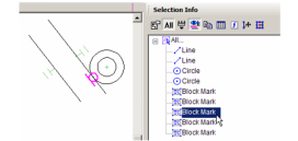
- Select any blockmark in the palette to see it highlighted onscreen (Highlighting must be enabled).
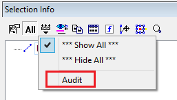
Audit System:
“Audit” is added to menu “Filters”. Audit System is used to detect a ‘bad’ object in drawing. A ‘bad’ object triggers at least one audit conditions.
Font-weight: normal;
Font-style: normal;"New item “Audit” was added to menu “Filters”.
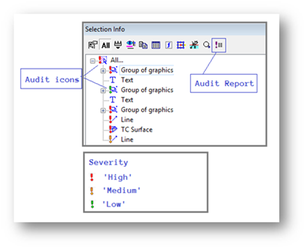
- The possibility to highlight ‘bad’ objects in Selection Info palette
- The possibility to turn on/off audit conditions and changing their parameters
- The possibility to generate an audit report for one or more objects
- The possibility to filter ‘bad’ objects in Selection Info palette
- The possibility to send notify (about a ‘bad’ object) to Event Viewer palette
The bad objects are highlighted in the selection info palette with severity mark with audit icons.
Audit Report:
We can also generate an audit report by clicking on the audit report icon on the menu bar of selection info palette.
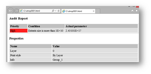
"Audit" report (HTML page).
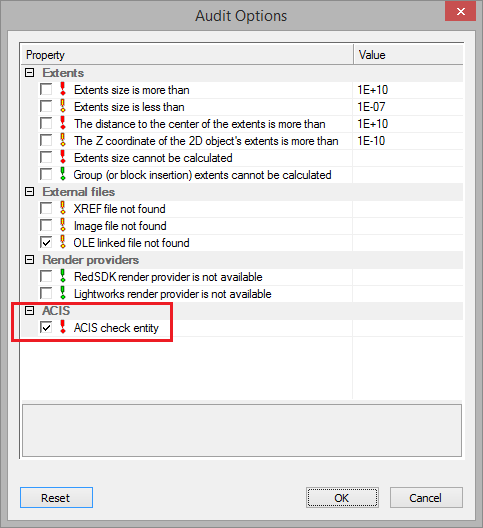
Audit Options:
Audit icons which are shown in Selection Info Palette with objects can be enabled or disabled by Selection Info Palette Options dialogue box. To open Selection Info Palette Options dialogue box select options icon from selection info menu bar.
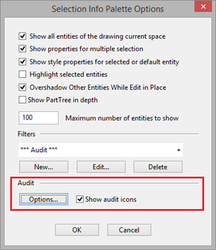
Select "Options..." from Selection Info Palette Options.
“Audit” section
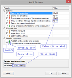
New audit condition 'ACIS check entity' (Level = 70) was added. Switched 'Off' by default.
2D-3D Selector
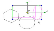
The properties of the 2D Selector can be set in the Selector Properties window. This can be opened by right-clicking anywhere while in Select mode, and selecting Selector 2D Properties from the local menu. (If the 3D Selector is active, the local menu item will be Selector 3D Properties.)
You can also click the icon on the Inspector Bar to open the selector Properties.
 While working, you can easily switch between2D and 3D Selector Mode, without having to open the Selector Properties window.
Simply click the Toggle 2D/3D* icon on the Inspector Bar.
While working, you can easily switch between2D and 3D Selector Mode, without having to open the Selector Properties window.
Simply click the Toggle 2D/3D* icon on the Inspector Bar.
General
Controls how 2D and 3D objects are selected, and what transformation fields appear in the Inspector Bar.
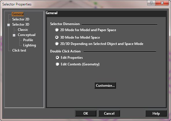 2D Mode for Model and Paper Space: Treats all objects as if they are 2D, and only uses the 2D selection rectangle. The Inspector Bar contains transformation fields in X and Y only.
3D Mode for Model Space: Treats all objects as if they are 3D, and only uses the 3D selection box. The Inspector Bar contains transformation fields in X, Y, and Z.
2D/3D Depending on Selected Object and Space Mode: Treats objects differently; 2D objects are treated as 2D objects and 3D objects are treated as 3D objects.
Edit Properties: If this option is set, double-clicking on an object with the selector will open its Properties dialog.
Edit Content (Geometry): If this option is set, double-clicking on any object with the selector will set the object for editing. For most objects, this will be the equivalent of activating the edit tool. For text double clicking will allow you to edit the text content.
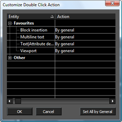
Customize: Allows you to specify how double clicking will act for each class of objects.
2D Mode for Model and Paper Space: Treats all objects as if they are 2D, and only uses the 2D selection rectangle. The Inspector Bar contains transformation fields in X and Y only.
3D Mode for Model Space: Treats all objects as if they are 3D, and only uses the 3D selection box. The Inspector Bar contains transformation fields in X, Y, and Z.
2D/3D Depending on Selected Object and Space Mode: Treats objects differently; 2D objects are treated as 2D objects and 3D objects are treated as 3D objects.
Edit Properties: If this option is set, double-clicking on an object with the selector will open its Properties dialog.
Edit Content (Geometry): If this option is set, double-clicking on any object with the selector will set the object for editing. For most objects, this will be the equivalent of activating the edit tool. For text double clicking will allow you to edit the text content.
Customize: Allows you to specify how double clicking will act for each class of objects.
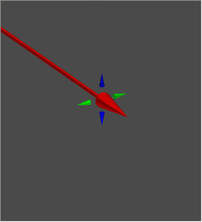
Selector 2D
Options for 2D selection and fields in the Inspector Bar.
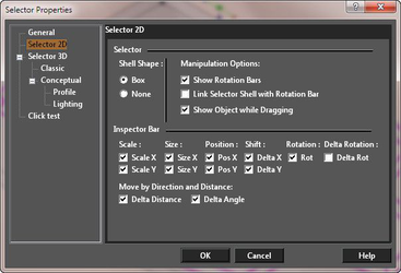 Shell Shape: Select None to make the selector shell (bounding rectangle) invisible. The options are:
- Box
- None
Manipulation Options
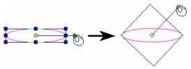
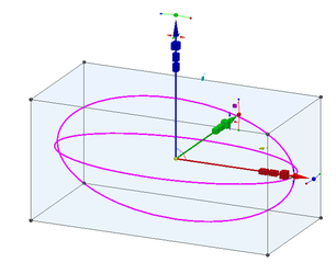
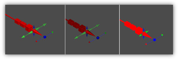
Show Rotation Bars: If unchecked, the rotation bar is not shown and is not accessible. Link Selector Shell with Rotation Bar: If checked, when you press Ctrl and move the rotation handle, the selector shape will change accordingly.
Link Selector Shell not checked
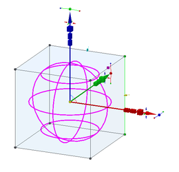
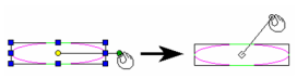 Link Selector Shell checked
 Show Object while Dragging: Displays the selected objects dynamically as they are transformed. If not checked, only the selection shell is visible.
Inspector Bar: Controls the 2D transformation fields that appear on the Inspector Bar.
Show Object while Dragging: Displays the selected objects dynamically as they are transformed. If not checked, only the selection shell is visible.
Inspector Bar: Controls the 2D transformation fields that appear on the Inspector Bar.
Note: The 2D Selector always moves the UCS (workplane) to the selection.
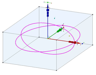
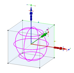
Selector 3D
Selector 3D contains options for 3D selection such as additional options for selection boxes and Inspector Bar fields. Many of these parameters are the same as for the Selector 2D page.
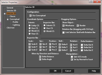
Configuration
Use Conceptual: Activates the Conceptual Selector (3D).
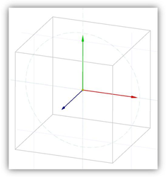
Coordinate System
CS Stands for COORDINATE SYSTEM Extents CS: Sets the coordinate system (workplane) used by the selector shell. Because these settings work in tandem with other settings, their performance can become complex. Careful study of the Extents CS and Coordinate system parameters will help you understand this powerful tool. Entity CS: Selector shell CS equals the CS of the selected objects. User CS: Selector shell CS equals the CS of the current workplane. World CS: Selector shell CS equals the world CS. View CS: Selector shell CS equals the CS of the plane of the current view. Inspector Bar: Sets the coordinate system (workplane) used by the Inspector bar. Because these settings work in tandem with other settings, their performance can become complex. Entity CS: Inspector bar CS equals the CS of the selected objects. User CS: Inspector bar CS equals the CS of the current workplane (UCS). World CS: Inspector bar CS equals the world CS.
Dragging Options
Show Object: Displays the selected objects dynamically as they are transformed. If not checked, only the selection shell is visible. Two options are available which allow you to activate showing object for Wireframe, or Render, or both. Rotation Bar (dragging with Ctrl key): If unchecked, the rotation bar is not shown and is not accessible. Link Selector Shell with Rotation Bar: If checked, when you press Ctrl and move the rotation handle, the selector shape will change accordingly.
Inspector Bar
Manipulation
Safe UCS Mode: Prevents changes to the current workplane when you manipulate objects with the 3D Selector. If unchecked, you will get a warning message when using 3D Selector for 2D object replacement. Warning: Use this option with caution. Simply moving an object along the same workplane will not change the workplane, but rotating an object will change the workplane. Set by normal of facet: New mode is meant to facilitate the assembling of 3D objects. If Set by normal of facet = On and snap to facet is turned on (Nearest on facet = On), then Z axis of the selector is placed on the normal to the facet.
Classic
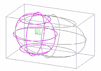
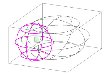
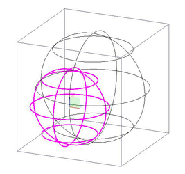
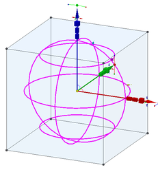
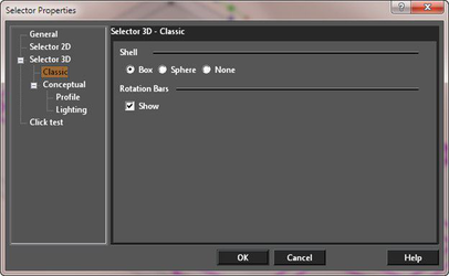 Shell Shape: Box is the default. The Sphere shell is useful for visualizing rotation, but does not allow drag and drop scaling. Select None to make the selector shell invisible.
Conceptual
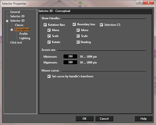
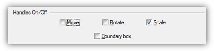
Show Handles
These options set which parts of the Conceptual Selector are visible. The options are: Move, Scale, Rotate, Boundary Box. and the Selection CS.
Screen Size
The options go from 50 pixels to 1000 pixels. Minimum: Sets the minimum size for the display of the selector. Maximum: Sets the maximum size for the display of the selector.
Mouse Cursor
Set cursor by handle's transform: When on, this causes the cursor to alter in order to indicate the available operation (scale, rotate etc.)
Lighting
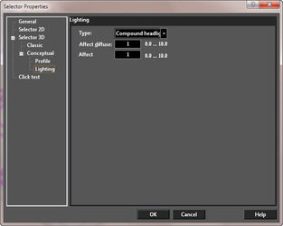 The Conceptual Selector is drawn in a separate render scene, which has its own lighting, independent of the drawing.
Type: Use this to specify what the Conceptual Selector will use for lighting: Ambient, Headlight, Compound headlight.
The Conceptual Selector is drawn in a separate render scene, which has its own lighting, independent of the drawing.
Type: Use this to specify what the Conceptual Selector will use for lighting: Ambient, Headlight, Compound headlight.
- Ambient and Headlight light sets are the regular ambient and headlight light sources.
- Compound headlight set (by default) consists of three headlight light sources, which are not located at the camera center. Instead, they are positioned on different sides of the view direction. This provides a better 3D effect when lighting the Universal Selector.
Profile
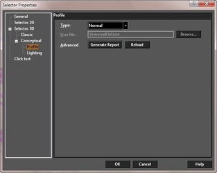 The profile defines the appearance and functionality of the Conceptual Selector. There are two default options Normal and Simple, and a third custom option, User. The Simple option has fewer controls than the Normal. Users can create their own profiles. To select a user created profile select User in the drop-down list. Then browse to and select the appropriate TCW file containing the profiles specification.
More details and specifications for the Conceptual Selector can be found under:
The profile defines the appearance and functionality of the Conceptual Selector. There are two default options Normal and Simple, and a third custom option, User. The Simple option has fewer controls than the Normal. Users can create their own profiles. To select a user created profile select User in the drop-down list. Then browse to and select the appropriate TCW file containing the profiles specification.
More details and specifications for the Conceptual Selector can be found under:
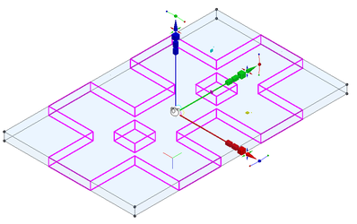
When using the 3D Selector, the local menu and Inspector Bar provide three options that do not appear when working in 2D.
Set UCS by Selector: Moves the UCS origin to the selection reference point.

Set Selector by UCS: Moves the selection to the UCS origin (similar to the Format / Place on WorkPlane option for 2D objects).

Note: The 2D Selector always moves the UCS (Workplane) to the selection.
Lock/Unlock Axis: Locks or unlocks a rotation bar. Move the cursor to the end of the rotation bar you wish to lock or unlock, and select Lock or Unlock Axis from the local menu.
Auto select compound profile: When selecting curves for a geometry tool, this option will enable you to select smoothly connected chains of curves.
Click Test
If this option is turned on, then the Rectangular Mode fence will be used for the visualization of a screen area where the 'Click Test' will be performed. This provides a method for verifying and identifying those areas on the screen which are valid for the selection of objects. For each pixel of the specified area (by Rectangular Mode fence) the virtual 'mouse click' will be performed. If the user clicks on a pixel that will allow a graphic to be selected, then those pixels are colored by the graphic's color. If there are selected graphics, then other graphics are ignored. The test takes into account the 'Aperture size', Render Mode and Layer's styles.
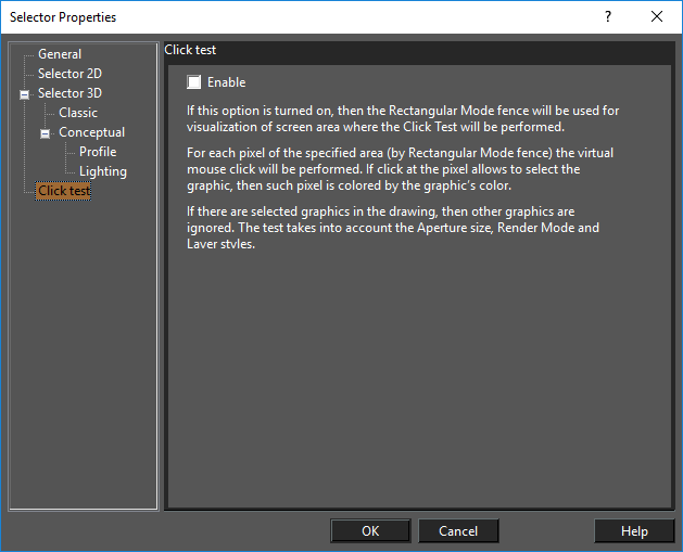
Example of Click Test:
Conceptual Selector Details
The Conceptual Selector is enormously powerful and is extremely adaptable. The following sections detail the usage and management of this tool.
Note:The Conceptual Selector, since version 2018, is only available to use if the RedSDK plug-in is installed.
Introduction
In contrast to the classic mode, the Conceptual Selector uses the full-blown 3D model, materials, lighting, adjustable scale and editing capability. The user is able to edit: the selector geometry, materials, the set of handles, response to mouse movements, etc. All data about the Selector is stored in, which are accessible for editing. The GCtrlProfiles folder contains selector variants (profiles), and the Samples sub-folder contains additional Samples. A user can create and use his own profiles. At the moment Conceptual Selector is available only in Model Space and only for the 3D mode of selector.Using RedSDK imposes certain restrictions. the Conceptual Selector can be displayed only in RedSDK windows. When objects in non-RedSDK windows are edited, it will automatically force the classic selector mode to be used. As is, the primary functions of the Conceptual Selector are:
- Move only back and forth along this axis (X).
- (Cube) Scale bi-directionally but only along this axis (X).
- (Rectangular cuboid) Scale uni-directionally on this side (equivalent to dragging one face of the selection bounding box).
- (Rectangular cuboid) Scale uni-directionally on this side (equivalent to dragging one face of the selection bounding box (opposite face from #4)).
- (Rectangular cuboid) Scale along both axes (X, Y).
- (Colored arc and cylinder) Drag, but only on two axes (X, Y).
- (Yellow sphere) the reference point.
- (Colored ball) Acts like the rotation handle for accurate snapping (Y).
- (Colored ball) Rotate around associated axis (X).
- (Colored ball) Rotate around associated axis (Z).
- (Colored arc) Rotate around associated axis.
- Boundary box
 To use any of the handle you may click-hold-and-drag or click-drag-click.
Colors and Materials
The Normal profile uses the following color scheme: XYZ -> RGB, that is, colors Red, Green, Blue correspond to axes X, Y, Z. Handles that are located on the axes or that are tied to the axes by transformation (rotation around the axis) have the color matching that specific axis. Shades of Red, Green, Blue are used either for auxiliary highlight geometry (which appears when the mouse cursor hovers over a handle):
Using light red color for highlight geometry Or to differentiate an 'accurate' (i.e. with snap) handle from non-accurate:
Using light blue color (on the right) to mark imprecise rotation
The Yellow, Magenta and Cyan colors are used for the handles that work in XY, XZ and YZ planes, respectively.
Another possibility for planes is to paint the handles using the colors of corresponding axes, for example, paint one half of the handle red, the other - green  .But as the handles themselves are small, this type of coloring is often not visible enough. Light Gray is used for the Boundary Box.
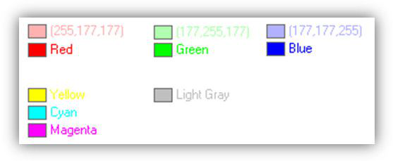
Colors used in the Normal profile.
Conceptual Selector Boundary Box
In addition to the handle controls, you can scale using the Boundary Box (if it is turned on in the Selector Properties)
Scale By Side
- Hover over the side of the boundary box until it highlights (Note: This will only happen if you are in a RedSDK rendering mode, not GDI of LightWorks).
- Click and Drag to scale the object along that sides axis.
Scale By Edge
- Hover over the edge of the boundary box until it highlights (Note: This will only happen if you are in a RedSDK rendering mode, not GDI of LightWorks).
- Click and Drag to scale the object along that the two axes that are perpendicular to that edge.
Scale By Corner
- Hover over the corner of the boundary box until its three associated edges highlight (Note: This will only happen if you are in a RedSDK rendering mode, not GDI of LightWorks).
- Click and Drag to scale the object along all three axes.
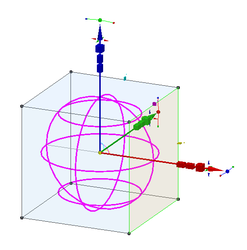
Interactive Handles
General Structure and Function
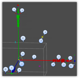
As mentioned above, profiles can have an arbitrary set of handles. Below is shown a list of handles for the default Normal profile (UniversalCtrl.tcw).

- Move only back and forth along this axis (X).
- (Cube) Scale bi-directionally BUT only along this axis (X).
- (Rectangular cuboid) Scale uni-directionally on this side (equivalent to dragging one face of the selection bounding box).
- (Rectangular cuboid) Scale uni-directionally on this side (equivalent to dragging one face of the selection bounding box (opposite face from #4)).
- (Rectangular cuboid) Scale along both axes (X, Y).
- (Colored arc and cylinder) Drag, but only on these two axes (X, Y).
- (Yellow sphere) the reference point.
- (Colored ball) Acts like the rotation handle for accurate snapping (Y).
- (Colored ball) Rotate around associated axis (X).
- (Colored ball) Rotate around associated axis (Z).
- (Colored arc) Rotate around associated axis.
- Boundary box
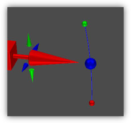
Snapping, accurate /nonaccurate handles
Handles that provide accurate transformation (with mouse snap) are marked with outlined callouts on the illustration (handles 7, 8). For the handle to perform an accurate transformation, it is necessary to specify yes for the handle_snap_to_center variable in the profile. In this case, the mouse cursor will be pulled up to the reference point or to the center of the visible part of this handle. 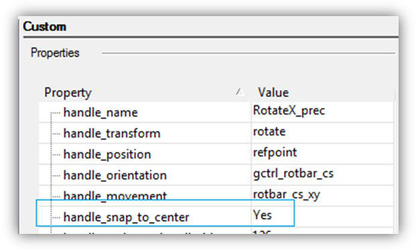
'handle_snap_to_center' variable In reality, even if the above-mentioned variable is not set, a handle can perform accurate transformations, for example, using the edit bars.
Priority
A user can assign priority to handles. If several handles with varying priority get into the cursor aperture, the handle with the higher priority will be chosen. The following priorities are set for the default profile: Reference Point has the highest priority (number 0), Boundary box has the lowest (-1). Priority is controlled by the handle_priority variable:
'handle_pr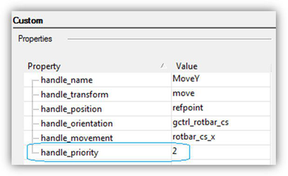 iority'variable
Small Handles
The ability to zoom in/out makes it reasonable to create handles of different sizes. A combination of large and small handles provides a way to fit interactive handles in the window tightly, without obstructing the view.
Seven handles at the spike of the X axis
Grouping Handles by type of Transformation
Tighter packing enabled by the grouping of handles (portals) by type of transformation. Such portals are slightly larger than a handle, but they allow for all types of transformations. One of the problems with the classic selector was that it was impossible to change the rotation axis. Typically, a user would realize that he selected a wrong axis only after rotation was started. In Conceptual Selector, a portal that contains handles 8, 9, 10, 11 (see the handles layout) allows rotating around an axis. The Normal profile includes the following portals:
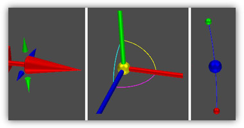
Portals: movement along axes, movement in planes, rotation around axes.
Movement along axes, shown dynamically. Animated GIF (animation only in HTML version)
Introduction
In contrast to the classic mode, the Conceptual Selector uses the full-blown 3D model, materials, lighting, adjustable scale and editing capability. User will be able to edit selector geometry, materials, the set of handles, response to mouse movements, etc. All data about the manipulator is stored inTCW Profiles, which is accessible for editing. GCtrlProfiles folder contains selector variants (profiles), and Samples subfolder - additional Samples. User can create and use his own profiles.
Lighting
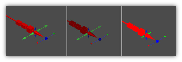
As mentioned, the Conceptual Selector is drawn in a separate render scene, which has its own lighting, independent of the drawing. There are three preset light sets available to the user: Ambient, Headlight, Compound headlight. TheAmbient and Headlight light sets are the regular ambient and headlight light sources. The Compound headlight set (by default) consists of three headlight light sources, which are not located at the camera center but are positioned on different sides of the view direction. This provides a better 3D effect when lighting Conceptual Selector. The profile parameters affect diffuse and Affect specular provide a way to adjust intensity of corresponding lighting components.
Lighting: Compound headlight, Headlight, Ambient
Repositioning Control Handles of the Selector
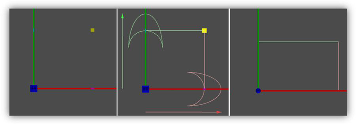
Changing the Reference Point
To move the reference point, you must first select (or pick) it. There are several ways to do this:
- Press D
- Press Ctrl and click the reference point
-
Select Edit Reference Point from the local menu or Inspector bar.
-
The cursor changes to a hand symbol.
-
Click on the Reference point to select it. (Note: if you used D this step happens automatically.)
-
Move the reference point to its new location
- Click to set the new location.
-
Now any moving, scaling, or rotating will be done relative to this new point.
-
To return the rotation bar to its default position, select Default Reference Point from the local menu or the Inspector Bar.
Changing the Rotation Bar
For both ends of the rotation bar, you can select the points by pressing Ctrl and clicking. (The yellow point is the reference point and has additional ways to be selected.)
- The cursor changes to a hand symbol. Click on the Rotation handle.
- Move the handle to a new location.
- Click to set the location.
-
To return the rotation bar to its default position, select Default Rotation Bars from the local menu, or click the icon on the Inspector Bar.
-
Now any rotating will be done relative to the new rotation handle and reference point.
Response to User Actions
Using the Cascading Style Sheets (CSS) language creates the possibility to have a formal description of visual style for the conceptual Selector which is dependent on user actions. For example, a button can have different styles depending on whether the mouse cursor is hovering over it or not. A similar approach is used in the Conceptual Selector. For each handle in the selector, three types of geometry can be added to the TCW profile: when the mouse cursor is outside the handle, when it is over it, and while dragging.This allows for the active handle to be highlighted. It also provides feedback (tips) to the user about the transformation that is associated with the handle in addition to the nature of handle movement while dragging (axis, plane).Generally, an experienced user does not need tips, so it is desirable to have a way to turn them off. Currently, this can only be done by deleting the corresponding graphics from the profile.
As a default, when the cursor is placed on the handle,a transparent, 10% larger copy is drawn. This provides a highlighting effect: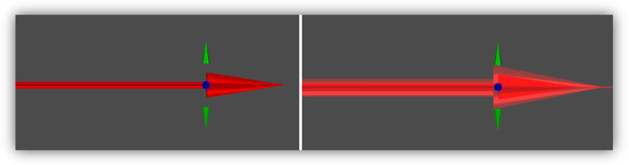
Response of MoveX handle to mouse movement.
Representation of ScaleXY handle for 'mouse cursor outside', 'mouse cursor over', 'while dragging'. Light red and light green are used to denote the possibility to move along X, Y axes, and the result for movement of the arc along an axis.
TCW Profiles
Profiles can have an arbitrary (non zero) number of handles, which can access any available transformations, including non-interactive (for example, coordinate-axes). Filtering of the handles in the current profile can be done by using filters by type of transformation from the selector settings dialog.
Filtering handles of the current profile by type of transformation Users can create their own profiles or modify existing ones. There are, however, certain specific characteristics of profile loading that need to be observed. To save time on reading the TCW file, profiles are unloaded only when the application is closed. Otherwise, they would have to be opened/closed upon each activation of the corresponding tool. This can slow down the work significantly. So if a profile is already uploaded to memory, reloading it (for instance, after editing) is possible only after restarting the application. A new profile can be set up without an application restart.
Samples
The Samples folder contains several examples of different profiles. It makes sense to start all new templates by using the template.tcw, which contains the minimum set of handles and also includes all required variables (graphics custom properties).
Template.TCW profile
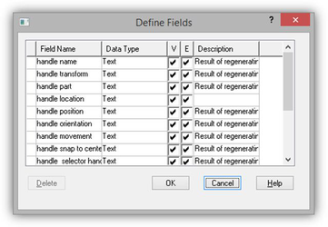
Defined custom properties in the Database Define Fields dialog TheMoveRotate2D.TCW sample demonstrates the possibility of creating a selector in a "protractor" style. It contains 12 handles for movement along axis, positioned at every 30 degrees, and a handle for rotating around the z-axis.
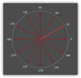
MoveRotate2D.TCW profile The FlatGrid3x3.TCW example demonstrates the possibility to create a flat 5x5 grid from handles for accurate movement in the XY plane (reference point). Grid spacing is 1-inch. A specific feature of this grid is that the distance between handles (1 in) does not change when zooming in/out. Ability to set fixed values of coordinates (in a selector coordinate system) allows for placing selector handles at critical points for drawing objects (for example, focal plane of the lens or focuses of an ellipse).
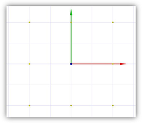
FlatGrid3x3.TCW profile
Layers
All profiles that are distributed with TurboCAD have a certain system of layers. Each handle has its own layer. This provides a way to hide unnecessary handles. Layers whose names have the "handle" prefix are used for handles. For example, the _"handle_MoveX" layer contains the handle for movement along the x-axis. Layers whose names have the "part"_ prefix are used for parts of handles. For example, the "part_MouseIn" layer contains the geometry that becomes visible when the cursor hovers over the handle.
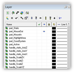
Fragment of layer table from a profile. It should be noted that this system of layers exists only as an added convenience for profile development. When a profile is uploaded into the application, layer 0 is assigned to all handles.
Handles
When a profile is uploaded into the application, the loader analyzes graphics and uses certain criteria to identify handles. A handle is a 'group' graphic that has a certain set of subgroups and a set of custom properties. Graphics that do not meet these criteria are ignored. A handle has to have several mandatory custom properties, such as 'text', type that define its name, position, transformation type, etc. In addition to mandatory custom properties, there are optional properties. These properties are used by the program to determine the purpose, behavior, appearance of the handle, and its response to mouse movement. A user can set other admissible values and change the handling behavior that way.
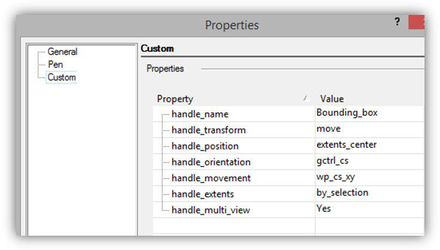
Set of variables for the Boundary Box handle.
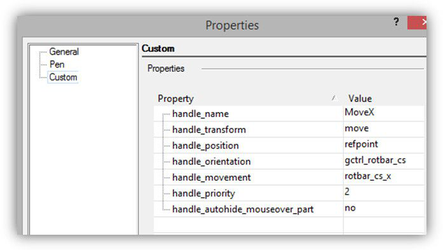
Set of variables for MoveX handle. The current set of variables is not final as of this writing, it may be changed and expanded. A handle has to include a certain set of subgroups. Each of the subgroups is responsible either for the drawing or for the behavior of handle. The type of the subgroup is set by the handle_part variable:
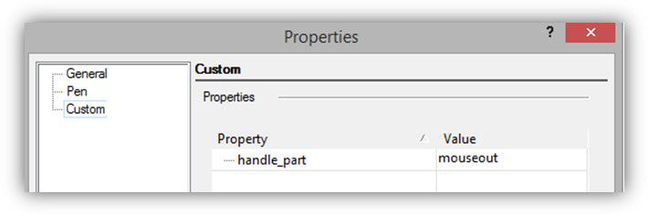
'handle_part variable' This variable can have one of the following values:
- mouseout- visible geometry when the cursor is outside the handle
- mouseover - visible geometry when the cursor is over the handle
- active - visible geometry while dragging (optional)
- static- visible geometry (optional)
- coordsystem- invisible geometry, defining the coordinate system of the handle
- highlight_area - invisible geometry, turns on mouseover when the cursor is over it. If this part is absent, mouseout (optional) is used instead.
- visibility_area - reserved (optional)
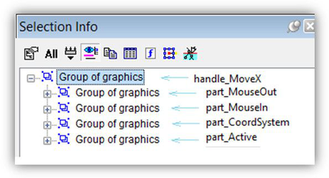
Parts of MoveX handle
Visual Representation
Foreground Camera
The Conceptual Selector is created in a separate render scene that has its own geometry, lighting, and list of materials. The scene is connected with the foreground camera, so it is drawn in front of drawing objects. Foreground Camera is set depending on render mode
Drawing in front of the main scene provides visibility and accessibility of all the selector handles to the user, regardless of selected objects' positions.
Selector is in front of drawing objects.
Scaling
The user can set the minimum and maximum size of the Conceptual Selector on the screen in pixels. The benefit of an adjustable scale range over a fixed scale is that it gives users the capability to use a single movement (rotating the mouse wheel) to zoom in and get access to additional control handles that are grouped into sets by type of transformation (move, scale, rotate).
A part of the selector with the size of 200 pixels and 500 pixels In fact, saying "selector size" is not quite correct. The Selector model contains several sets of graphics that are drawn depending on the selector state and can have different sizes. In addition, there are auxiliary graphics that are not drawn at all and whose size does not matter.So there is the following assumption: Screen size (min/max) parameters defines the screen size of a unit cube (1 inch) from the TCW profile of selector.
Size of the visible part of Normal profile (UniversalCtrl.tcw) The idea is that a developer of a TCW profile will fit the size of visible selector geometry into the unit cube. Dependence of selector size on window zoom within the defined limits is practically linear, outside of the limits – a constant (has a resemblance to hysteresis).
Dependence of selector size on window zoom
 Zoom in dynamic. Animated GIF. (Animation only in HTML version) Only users can tell how convenient this scaling algorithm is in any instance. It is possible that scaling parameters, default values and the range will need to be adjusted, for example, for desktop and laptop, and touch screen.
Multi-Window Mode, Active Window
The Conceptual Selector is drawn in its entirety in the active window. In other windows (if they are open) – only parts of it are drawn. This was done to speed up drawing as well as single out the active window. Active control handles (that respond to mouse movements) are drawn only in the active window. Those that are not interactive (e.g. coordinate axes) are drawn in all windows.
Drawing in the active (left) and inactive windows. The User can control the drawing mode in multi-window mode, by specifying 'yes or 'no' for a handle_multi_view variable for the specific handle in the TCW profile.
'handle_multi_view' variable
Select by Color
Default UI Menu: Edit/Select by/Color
Ribbon UI Menu:
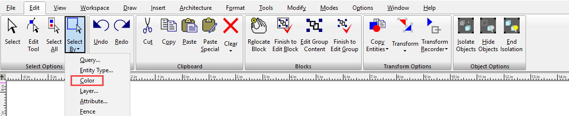
Hotkey: Ctrl+K
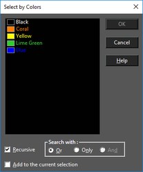
Selects objects of specified colors. By default, the color list contains all colors used by visible objects in the drawing. The default list does not include colors used by objects that are contained within groups and blocks. Press Shift to select a range of colors from the list. Press Ctrl select or deselect individual colors. Recursive: Colors of objects contained within groups and blocks are added to the color list. Because the color list needs to be rebuilt, select this option before selecting colors. Search with: Or: Objects that contain at least one of the highlighted colors will be selected. Only: Objects that contain all of the highlighted colors, and only those colors, will be selected. And: Objects that contain all of the highlighted colors will be selected. Add to current selection: All objects selected by the color match will be added to any current selection in the drawing.
Select by Attribute
Default UI Menu: Edit/Select by/Attribute
Ribbon UI Menu:
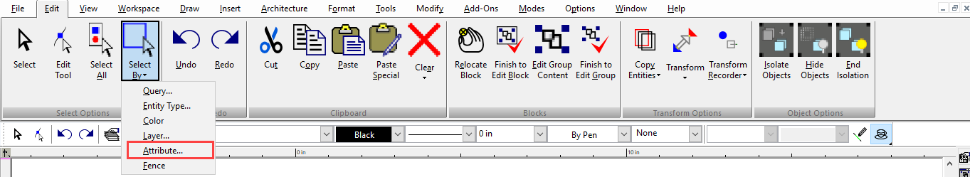
Hotkey: Ctrl+I
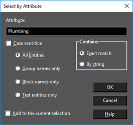
Selects objects that share the same text in their Attribute fields. This field is on the General page of their Properties window. Type text in the Attribute field that exactly matches the contents of the Attribute field of a set of objects, then click OK to select the objects. The attribute text can contain the wildcard symbl. For example, the attribute "Wall" will select "Wall1," "Wall+Window" and WallBrick." All characters that follow the * symbol will be ignored. Case sensitive: The search will distinguish between uppercase and lowercase letters. All Entities: Selects all objects that share the specified text attribute. Group names only: Selects only groups that share the specified text attribute. Block names only: Selects only blocks that share the specified block name - the name that is assigned to a block while creating. The name of an inserted block is listed in the Refers to the field of the Properties window, Block Insertion page. Text entities only: Select only text objects that share the specified text attribute.
Note: The attribute of a text object is the text string itself.
Exact match: Selects all attributes that exactly contain the text in the Attribute field. By string: Selects all attributes that contain the string in the Attribute field. Add to current selection: All objects selected by the attribute match will be added to any current selection in the drawing.
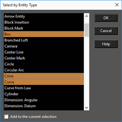
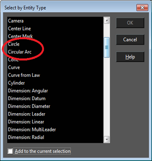
Select by Entity Type
Default UI Menu: Edit/Select by/Entity Type
Ribbon UI Menu:
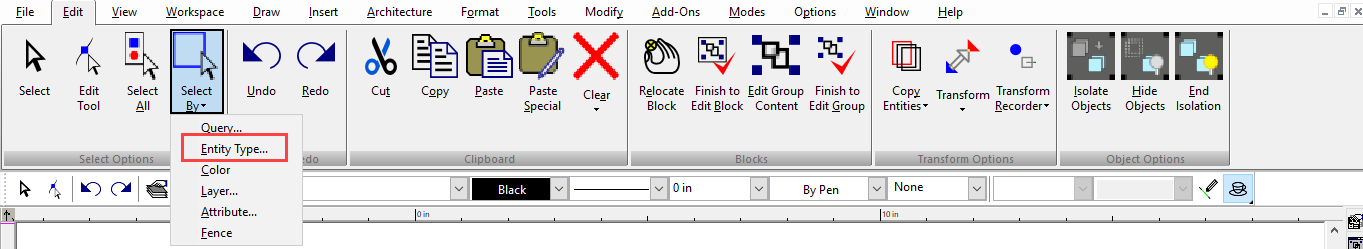
Selects objects of specified types. Press Shift to select a range of types from the list. Press Ctrl to select or deselect individual types. Add to current selection: All objects selected by the match will be added to any current selection in the drawing.
In this version, Circle/Ellipse item of previous TC versions is separated into two cases: Circle or Ellipse. The same is for Circular and Elliptical arcs. Previous versions could not select Circles or Arcs separately.
Select by Fence
Default UI Menu: Edit/Select by/Fence
Ribbon UI Menu:
Selects a set of objects by drawing a closed polygonal "fence" around them. Irregular Polygon for details on how to create the fence.
If Open Window Mode is activated, all objects completely or partially inside the fence will be selected.
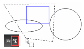
If Open Window Mode is not activated, only objects completely inside the fence will be selected.
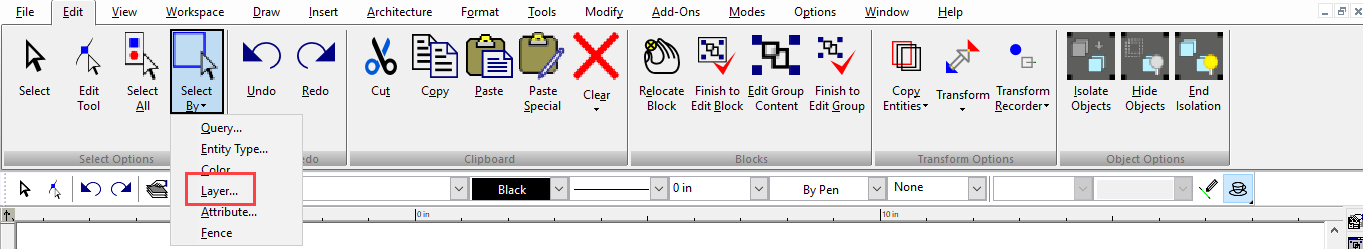
Select by Layer
Default UI Menu: Edit/Select by/Layer
Ribbon UI Menu:
 Hotkey: Ctrl+L
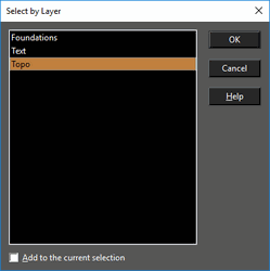 Selects objects that lie on specific layers.
Press Shift to select a range of layers from the list. Press Ctrl select or deselect individual layers.
Add to current selection: All objects selected by the layer match will be added to any current selection in the drawing.
Selects objects that lie on specific layers.
Press Shift to select a range of layers from the list. Press Ctrl select or deselect individual layers.
Add to current selection: All objects selected by the layer match will be added to any current selection in the drawing.
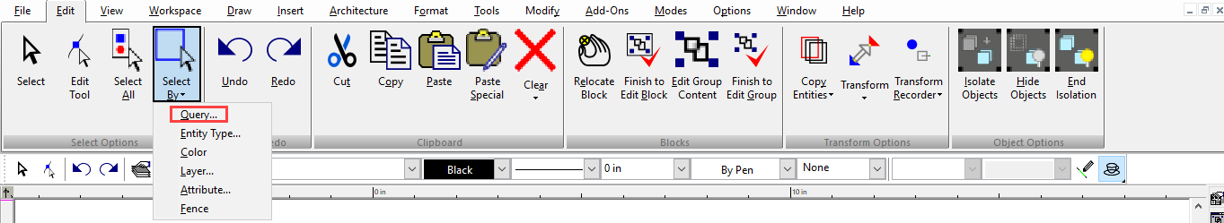
Select by Query
Default UI Menu: Edit/Select by/Query
Ribbon UI Menu:
Hotkey: Ctrl+Q
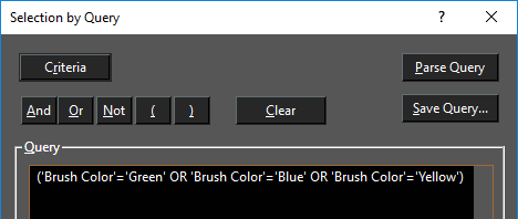
Selects objects meeting a complex set of criteria. For example, you can select all blue arcs or yellow dashed curves on Layers 3 and 5. Query selection can be useful in large or complicated drawings in which you need to filter through numerous colors, layers, entity types, etc. You can write a query manually in the edit box if you know the syntax rules but it is recommended to use the tools in the Selection by Query window.
Note: Query will not select individual objects that are members of groups or blocks.
Query window: Contains the expression used to filter the objects for selection. You can assemble the expressions via the Criteria button, or you can enter them manually.
Note: The query text does not automatically wrap. Press Enter to separate lines. Also, new criteria are inserted at the end of the expression, regardless of the cursor position. You can cut and paste text to correct the order.
And: Selects objects meeting all criteria. Or: Selects objects meeting any criteria. Not: Selects objects that do not meet the specified criteria. Parenthesis: Used for grouping elements of the expression. Clear: Erases the current expression. Parse Query: Tests the syntax of the query expression. If there is an error in logic or format, an error message will appear. You will also be notified if the query is sound.
Note: Parse Query only tests the logic of the query expression. It does not test whether objects will be selected, nor does it implement the query.
Query Criteria
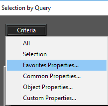
The main elements of a query are names of object properties, values of properties, and logical operations. Click the Criteria button to start your query.
All: Runs the query on all objects in the file.
Selection: Runs the query only on selected objects.
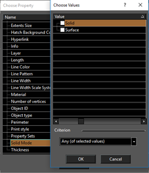
Common Properties: Enables you to select from a list of commonly-used properties. For example, you can select objects that have certain brush colors, line widths, layers, etc.
For example, If you click Brush Color, the Choose Values window will have the list of all brush colors. Check all the colors you want to include in the query. At the bottom of the window, you can choose Any to select all objects with these colors. If you choose None, objects that have other colors will be selected.
This is how the brush color query looks in the Selection by Query window.
Note: Some properties do not have specific values or a list of choices.
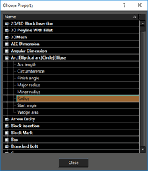
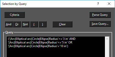
Object Properties: Enables you to select objects that have certain physical properties such as length or radius. For example, arcs and circles can be selected by arc length, circumference, radius, etc. Click Radius.
Enter a Value and its Relative (equal, less than, greater or equal, etc.). In this example, the query will select arcs and circles with radii between 3 and 5 inches, or equal to 10 inches.
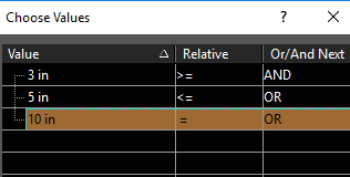
This is how the radius value query looks in the Selection by Query window.
Custom Properties:
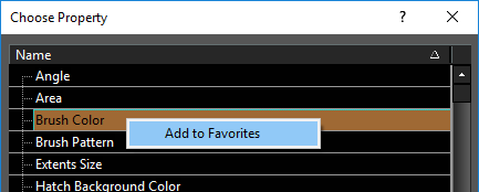
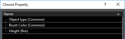
Favorite Properties: Enables you to choose from a list of queries you use often. You can add common properties and object properties to the list of favorites.
For example, open the Common Properties, and right-click on Brush Color. Select Add to Favorites.
Then open the Common Properties, and right-click on Height under Box. Select Add to Favorites.
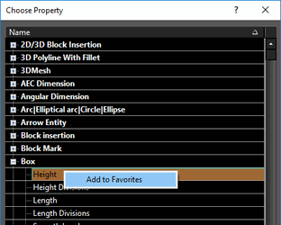
To see where these favorites are listed, open Favorite Properties.
The brush color and height properties are listed here.
To remove a property from the favorites list, right-click on it and select Remove.
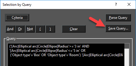
Saving and Loading a Query
If you want to use a query later, you can save it. Click Save Query.
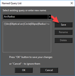
Enter a name for the query and click Save.
Then in the Selection by Query window, find the query name in the List.
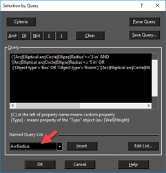
To change saved queries, click Edit List.
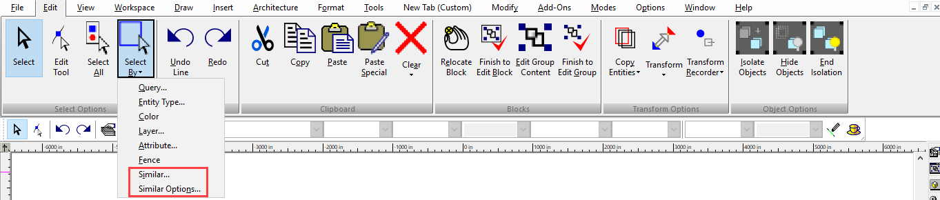
Select by Similar
Available in TurboCAD 2019 Platinum and Pro only
Default UI Menu: Edit / Select by Similar
Ribbon UI Menu:
A powerful new tool that allows you to select any 2D or 3D object type or a Block and then find all occurrences of that in the drawing. Very detailed selections can be made that include parameters such as pen color and style, brush color and style, layer, even the selected object’s coordinate system. A great tool to use in conjunction with making further global changes to that selected object.
Select Entity By Similar command is available after you've selected an object.
Select Entity By Similar Options command is available if there is at least one open drawing.
Example:
- Select an object in the drawing

- Then go to the Edit menu and choose Select by Similar:
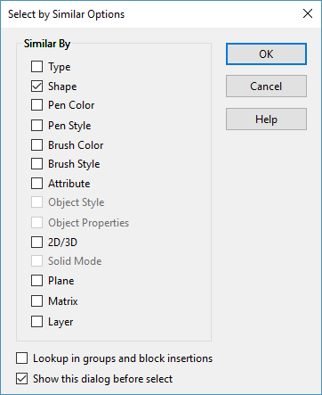
- After choosing Similar, a new Dialog box will appear which will let you define which of the selected object’s parameters will be selected:

Result: All the objects that are on the same layer as the selected object will be selected automatically.

Following are the available Properties for Similar By command:
| Type | Graphic type |
|---|---|
| Shape | The Shape filter compares geometry measurements such as Area, Perimeter, Volume, Surface Area, number of Vertices/Edges/Faces to determine if the two objects are the same |
| Pen Color | Pen Color property |
| Pen Style | Pen Style property |
| Brush Color | Brush Color property. Disabled if object does not support brush. |
| Brush Style | Brush Style property. Disabled if object does not support brush. |
| Layer | Layer property |
| Attribute | Attribute property |
| Object Style | Style property. Enabled for regen-method only. |
| Object Properties | List of regen-method properties. Enabled for regen-method only. |
| 2D/3D | Graphic dimension 2D or 3D. Disabled for paper spaces. |
| Solid Mode | ACIS/Surface/Smesh. Disabled for paper spaces. Disabled for 2D graphics. |
| Plane | XY plane of Local CS. Disabled for paper spaces. |
| Matrix | Local CS matrix.Disabled for paper spaces. This is the working title of graphic's coordinate system,which is stored as a matrix of 3D coordinate system.There are three types of coordinates system available. - Entity Coordinate System (ECS) - Object Coordinate System (OCS) - Graphic Coordinate System (GCS) |
Demo Video:
https://youtu.be/aenXqqM4qjQ