Palettes
Default UI Menu:

Ribbon UI Menu:

TurboCAD LTE palettes are convenient screen areas used for performing common tasks and for obtaining information. By default, the palettes are displayed on the right side of the screen, and contain tabs for easy display and switching. The palettes commands are available on the Tools menu. You can also display the Palettes toolbar by right-clicking on any toolbar area and selecting Palettes.  To customize how palettes are displayed.
Type a word to search to browse through the commands and materials. The first suitable item is highlighted. Buttons next to the input field highlight the previous or next suitable item. Successful search options are added to the list and saved between sessions.
The Find box is used in Materials, Luminance, Environment and Advance Rendering style palettes:
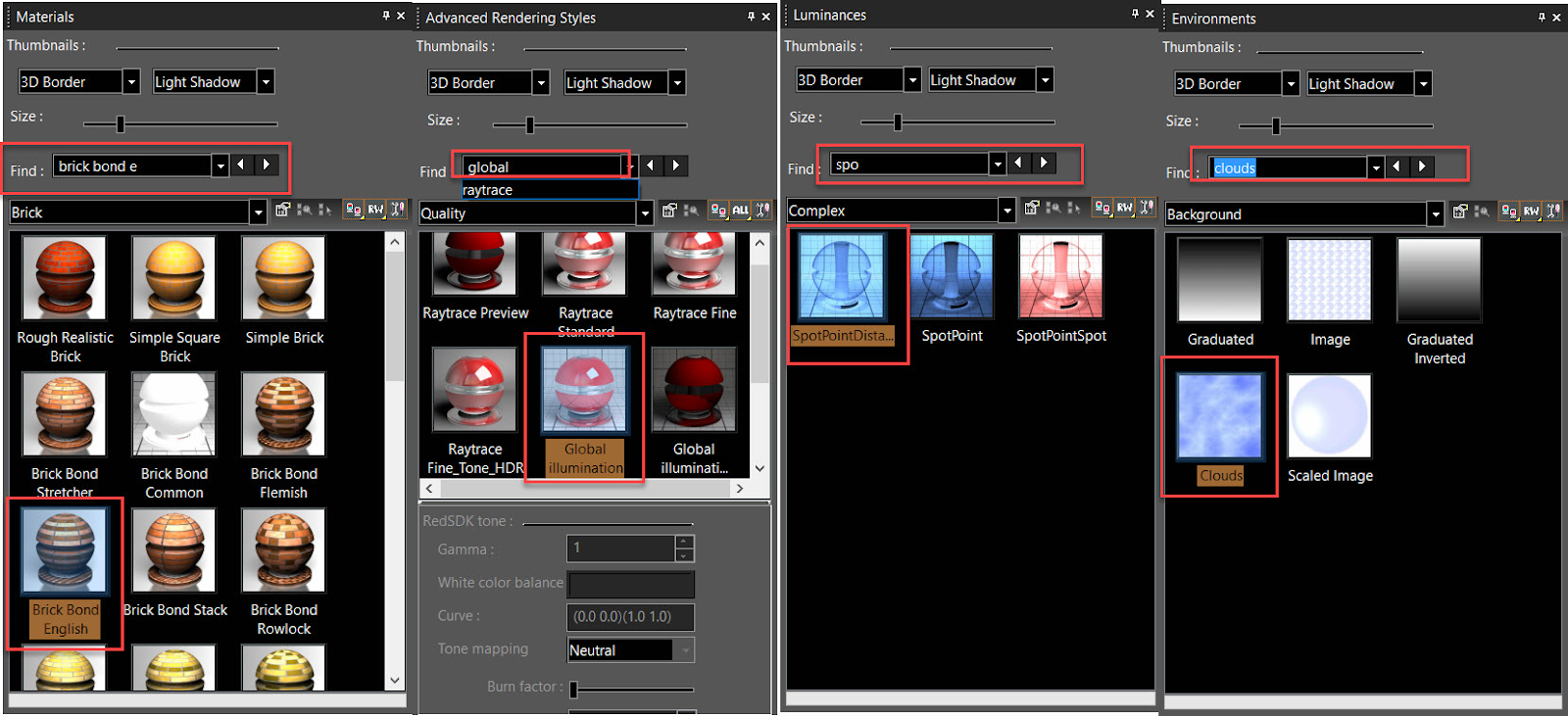
Find can also be used to search through the Toolbars and Menus under the Options menu.
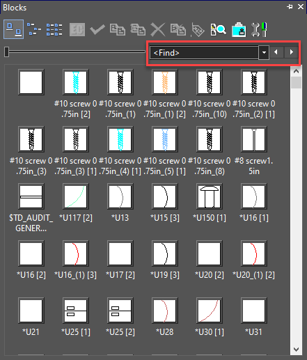
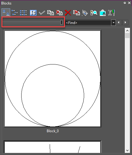
Blocks Palette

Default UI Menu:

Ribbon UI Menu:

A block is a collection of objects combined into a single object. Blocks are useful for storing complex, common drawing objects that you will use more than once. Blocks are stored in the drawing's internal block library and a block reference, and not the actual object, is inserted into the drawing. When a block is edited, all instances of that block in the drawing are updated.
User can scroll through the Blocks Palette via mouse wheel, find block within the Blocks Palette, or resize blocks previews as well.
Smallest Preview:
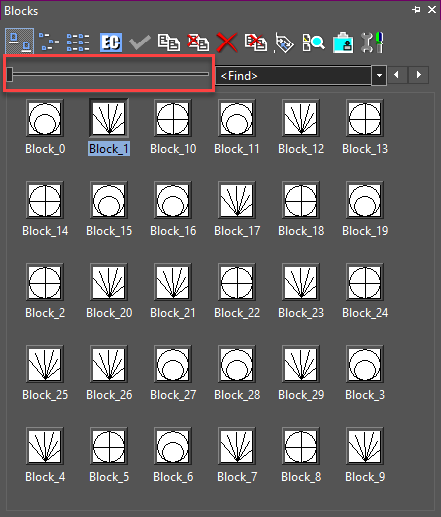
Largest Preview:
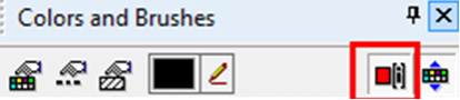
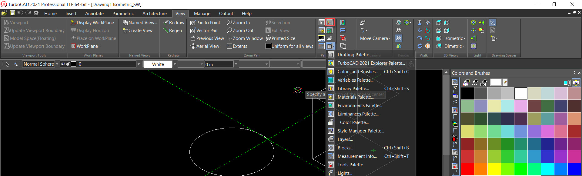
Colors and Brushes
Default UI Menu:

Ribbon UI Menu:

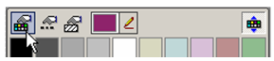
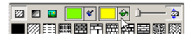
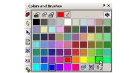
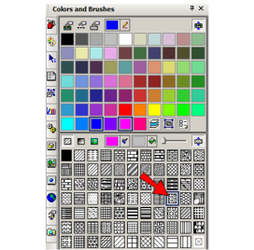
Displays all colors and brushes currently available. By default, the Colors and Brushes palette shows colors on the top and brushes (hatch patterns) on the bottom. 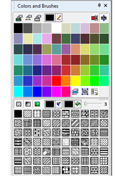 The color selected at the top and the brush pattern selected at the bottom appear in the Property toolbar. These properties become the default for the current tool and other tools in the tool group.
  For example, if Line is active and you set a color, this color will become the default for Rectangle, Polyline, etc. The icons at the top of the palette are as follows: Color Palette:
Opens the palette in which you can create new colors or modify existing ones.
Line Style Editor:

Opens the Line Styles page of the Drawing Setup. Brush Style Editor:

Opens the Brush Editor, in which you can create new brushes or modify existing ones. Pen Color:

Click the color swatch to replace the color with one from the palette. If you click the pen icon, you can then click any TurboCAD object to select its color. To pick the color of any other object, i.e. objects in other applications, keep the left mouse button pressed and release it when hovering over the object whose color you want. Index Colors: Toggles on the display of indexed colors instead of RGB colors. Indexed colors correspond to the indexing of colors in AutoCAD.
Expand Colors:

Toggle this icon off if you don't want the colors displayed. The icons at the bottom of the palette are as follows: Show hatches, gradients, or bitmaps:

Filters what types of brushes are displayed. Hatches are simple repeated line patterns. Brush Color and Fill Color: 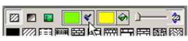
Sets the colors of the hatch pattern lines and the empty space between lines. If you click the brush or fill-can icons, you can select color on screen as described for Pen color above. Brush Transparency: 
Controls the transparency of the brush pattern and fill. Expand brushes:

Toggle this icon off if you don't want the colors displayed.
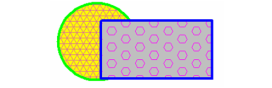
- To see how Colors and Brushes works, set a color, line weight and brush for the Circle tool group, and create a circle.

2. Select the circle, and click another color in the upper section of the palette.
The color of the circle updates.

- Change the brush pattern the same way - first select the circle, then click a different pattern from the lower section of the palette.

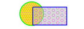
- To easily change the brush color, select the circle and right-click on the color you want for the brush.
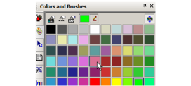
The brush pattern (not fill color) updates to the new color.

Note: The above changes only affect the selected circle. If you create a new circle, or use any other tool in the Circle/Ellipse group, the properties you originally set will be used. You can change the default properties simply by activating a tool and setting new properties.
- Activate Rectangle (or any other tool in the Line group), and set a new pen color, brush, and brush and fill colors.
- Create a rectangle that overlaps the circle.
Any tool you use in this group will have these properties.
7. Select the rectangle and lower the **Brush Transparency**.

You can now see through the rectangle.
Note: The rectangle is in front of the circle because it was created after the circle. For details on stacking.
Design Director
Default UI Menu:

Ribbon UI Menu:
 )
)
A convenient place to perform commands related to layers, workplanes, views, cameras, and objects or object groups.
Docking Palettes
Palettes can be docked just like toolbars . In addition, palettes can be docked onto other palettes to create palette groups. Drag a palette onto the desktop by its named tab (the tab that contains the name of the palette. The palette must actually be displayed before it can be dragged onto another palette group. To dock a palette to any of the four edges of the TurboCAD window, drag the palette toolbar to the relevant arrow, either displayed at the center of the drawing area, or along the desired edge. 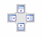
Note: These arrows are displayed only if Docking Stickers is checked on the Palettes page of the Customize window (Tools / Customize).
To combine palettes into a group, drag more palettes onto a docked palette. 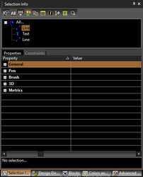 To replace palettes, simply drag their tabs back to the palette area.
Drafting Palette
Default UI Menu:
Ribbon UI Menu:

Enables you to place standard views of a model into Paper Space. You can also create sectional views.
Environments Palette

Default UI Menu:

Ribbon UI Menu:

Render scene environments can be assigned to a drawing to enhance its rendering. Options are available for the model background and foreground. For details on using the palette.
Library Palette
Default UI Menu:

Ribbon UI Menu:

Symbols and parametric parts are groups of objects available for repeated use. While groups and blocks are internal to a drawing, symbols and parts are external files. The Symbols palette is used to display and insert symbols found in the various symbol libraries - both those included with TurboCAD installation and those you create yourself. You can also use the palette to save symbols.
Luminances Palette

Default UI Menu:

Ribbon UI Menu:

Luminances luminance.html#a_1248200405Luminance1)) are light types that are added to an object, as opposed to lights added to the overall model.
Materials Palette

Default UI Menu:

Ribbon UI Menu:

Materials can be assigned to 3D objects in order to create more realistic rendering.materials.html#a600570026UsingTheMaterialsPalette1)
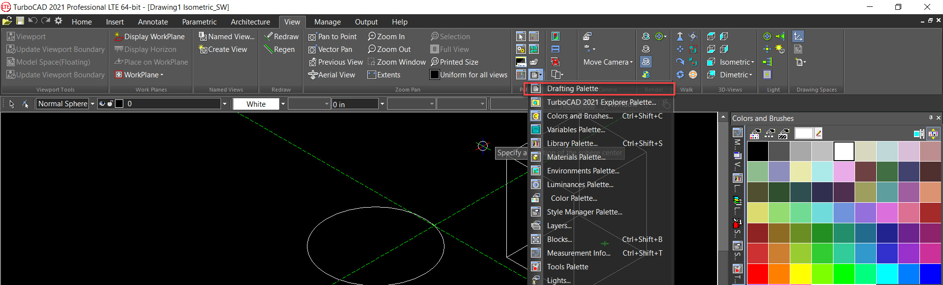
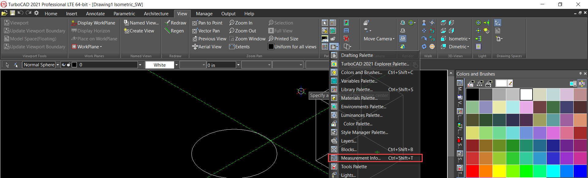
Measurement Info

Default UI Menu:
Ribbon UI Menu:

Displays measurements calculated by the Measure tools. You can measure point coordinates, distance and perimeter, angle and are a measuring.
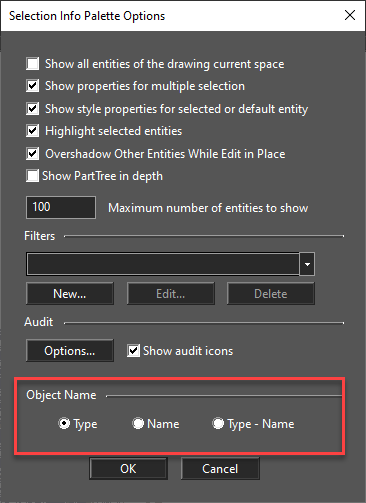
Selection Info

Default UI Menu:

Ribbon UI Menu:

Displays information about the currently selected object or objects, such as entity type, measurements, location in the drawing, and physical and engineering properties.
User can now select Object Name in the Selection Info Palette Options dialog. The name displays the value set in "Info" attribute for that particular object.
Selection info palette shows block insertion structure as well.
The Selection Info palette shows the Block Insertion structure. This feature does not allow the editing, but only visualizing the structure.
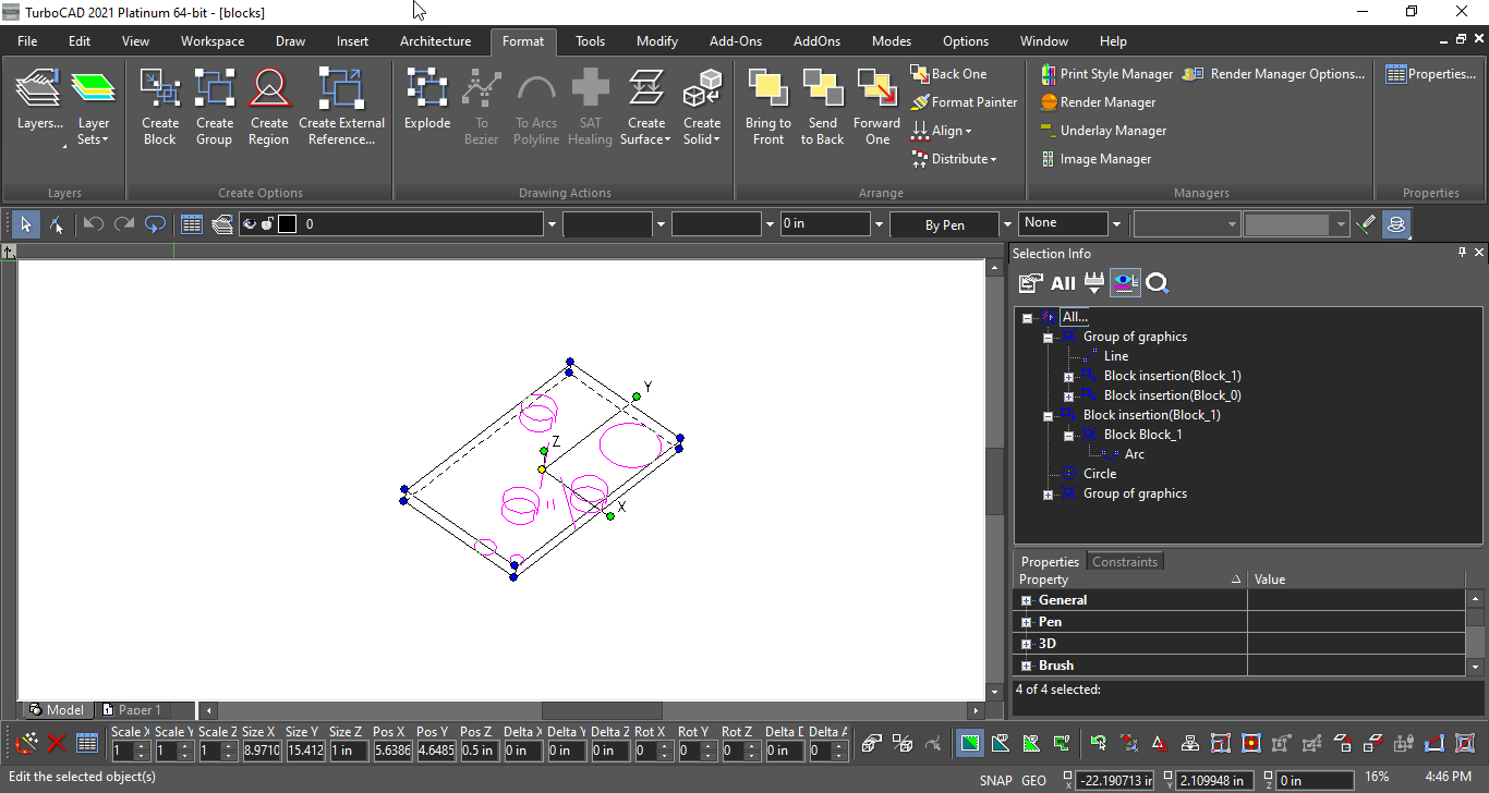 You can also use this palette to edit 3D objects.
Style Manager

Default UI Menu:
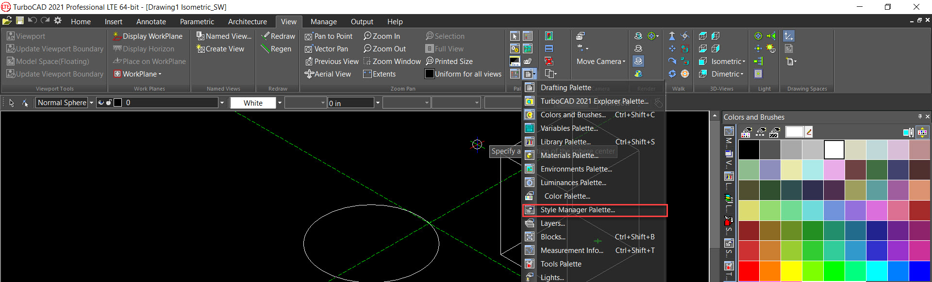
Ribbon UI Menu:

Enables you to define styles for commonly-used architectural items, such as windows, doors, and tables.
TC LTE Explorer Palette
Default UI Menu:

Ribbon UI Menu:

A multi-purpose palette, enabling you to browse files, view components (layers, blocks, etc.) of all open files, and copy components from one file to another.
Tools Palette

Default UI Menu:

Ribbon UI Menu:

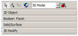
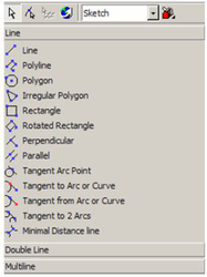
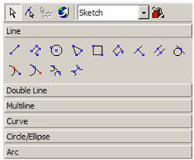
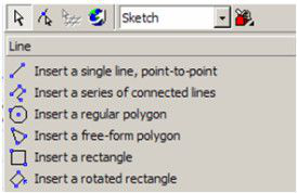
A palette that enables you to view commonly-used sets of tools. The Tools Palette contains, by default, four templates of tool groups. The default template is Sketch, which contains toolbars for Line, Double Line, Curve, etc.
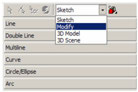
If you switch to another template, such as 3D Model, you will see tools relating to 3D modeling: 3D Object, Boolean Facet, etc.
Open a set of tools to see what tools are listed within. These are the same tools you would see in the toolbar of the same name. For example, the Line toolbar is available as a separate toolbar, or as a fly-out toolbar along the left vertical toolbar. But if you use Line tools often, it is handy to keep them open in this palette for easy access.
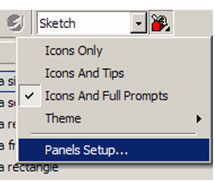
You can also control how these tools are listed in the palette. Click the toolbox drop-down icon on the Tools Palette toolbar. Icons and Tips is shown below, each tool has an icon and a tool name listed.
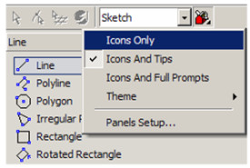
Icons Only displays only the icons. This is handy if you are already familiar with the tools and want to save space.
If you are not familiar with each tool, Icons and Full Prompts shows the icon along with a complete tool description.
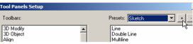
You can also create new templates. Click the toolbox icon and select Panels Setup.
Note: If you select Theme, you can control the look and colors (skins) of the Tools Palette.
The default templates, or panels, are listed here:
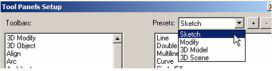
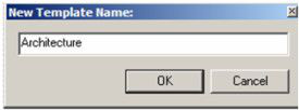
To create a new template, click the + icon.
You are then asked for a template name. For example, if you create architectural drawings, name this template "Architecture."
On the left side of the window, find the toolbars you want to add to this template. Click the right-facing arrow to add it to the list. (Or double-click on the toolbar name.)
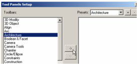
Continue adding toolbars. You can use the Move Up and Move Down icons to arrange the order of the template.
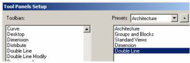
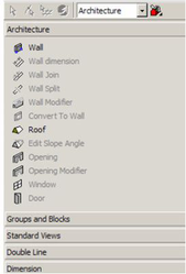
Click OK, and the "Architecture" tool group appears in the palette.
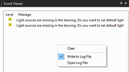
Event Viewer
(Available in Platinum, Professional)
Default UI Menu:
Ribbon UI Menu:

The Event Viewer palette creates a log detailing Error and Warning events effectively improving access to the TurboCAD diagnostic information.
Local menu
- Clear – clears all events
- Write to Log File – turns on/off the recording to the log file.
- Open Log File – opens the log file in a text editor.
Level
The icon shown under the 'Level' field can have 3 colors with the values: YELLOW = Warning, RED = Critical, and GREEN = Info If the 'Show' parameter of a warning dialog is set to 'Off', the icon in the Event Viewer will be displayed with a strikethrough X.
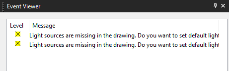
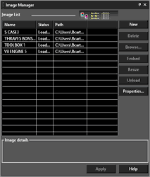
Image Manager Palette
(Available in Professional)
Default UI Menu:

Ribbon UI Menu:

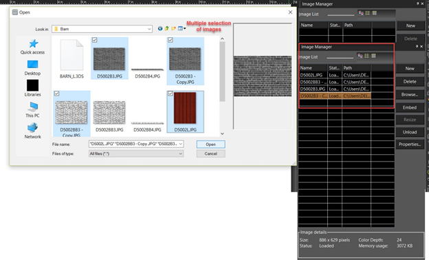
Enables you to manipulate all the raster images in the current drawing. You can insert files directly from this window using From Image List. You can also select Multiple files by using "New" button and importing multiple images in the Image Manager palette.
Insert Insert a new image by drag and drop.  Use the PPI (pixel per inch) option or the Width/Height options from the Inspector bar to set the size of the image. The PPI image property is also available from the Selection Info Palette
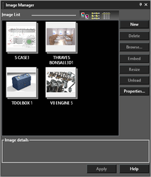
 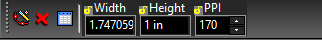 The toolbar at the top of the window can be used to change the image list as thumbnails, list, or detailed list.
Image List: Lists all images inserted into the drawing. The list can be sorted by name, status, or path. To edit a name, select it and then click it again. You can then enter the new name. New: Adds a new image file to the list. Delete: Deletes an image file from the list. Browse: Browse to replace the source of a drawing.
Warning!: the same name from the original source will continue to be used. Extract: Option to dis-embed and save and embedded image Embed: Saves the image file in the drawing as an embedded object, and not as a reference to an external file. Resize: decrease the resolution of the embedded image:
- open Image Manager Dialog or Image Manager Palette;
- press "Resize"button for embedded image or "Embed" for not embedded one;
- set by slider desired image resolution and press OK;
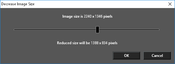
- press "Apply" button. Warning!: The decreasing resolution of image is irreversible.
Unload: Unloads image data from work memory. Reload: Reloads image into work memory. Properties: Opens the Image Visualization Properties* window, which is useful for setting the image quality for large images. 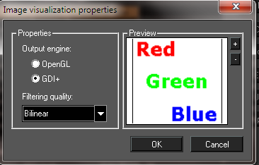
OpenGL: Limits image output to the maximum OpenGL texture size (1024x1024 is supported by most hardware), and resizes image to a square view. For example, a 400 x 300 image will be resized to 512 x 512, thereby losing accuracy. As you increase the zoom, the image may become blurry.
GDI+: Supports large images without resizing, maintaining high accuracy. Not all hardware can render this way efficiently, so this method may be slower than OpenGL.
Filtering quality: Controls scaled or rotated images.
Nearest point: The pixel with coordinates nearest to the desired pixel value is used, resulting in a set of large squares when viewed closely.
Bilinear: A weighted average of a 2 × 2 area of pixels surrounding the desired pixel is used. This is the most common filtering algorithm, adding smoothness in large scales.
Trilinear: A more exact extension of Bilinear and is practically indiscernible. But it is unsupported with OpenGL.
Note: These parameters are not file-specific; they affect visualization of all images in all TurboCAD files.
Choosing Multiple Images:
(Available in all Variants)
You can now select Multiple files from Open Dialog box when importing pictures in the Image Manager palette.
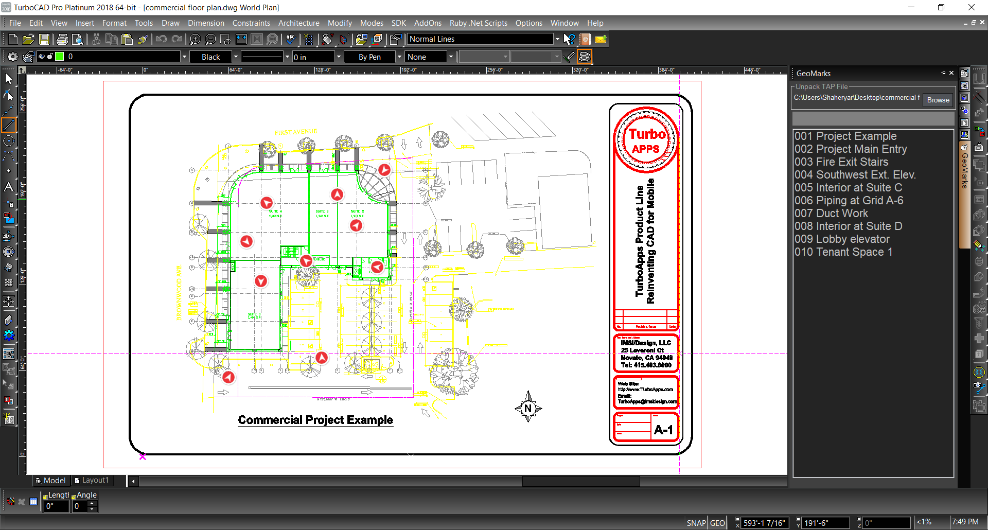
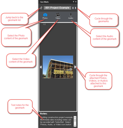
GeoMarks and TAP files
(Available in Professional)
Default UI Menu:

Ribbon UI Menu:

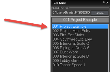
The Geomarks palette allow you to open TAP file created in IMSI/Design TurboApps products. 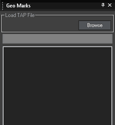 To open a TAP file:
- Open the GeoMarks palette.
- Click the Browse button.
- Browse to the file you wish to open.
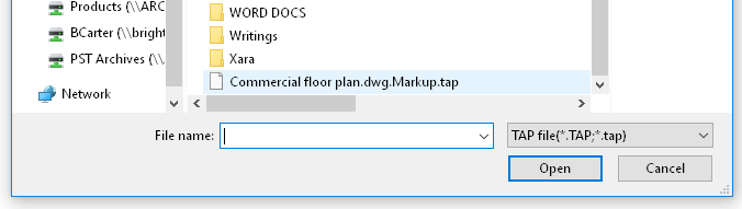
- Select the file and click Open.
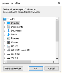
- The contents of the TAP must be unpacked. Select a folder to unpack the TAP content, or click Make New Folder to create a new folder, or press Cancel to use a temporary folder.
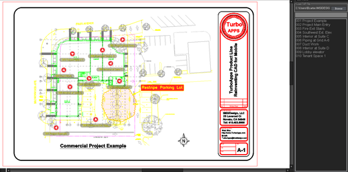
You can click on any link to view its content.
 The controls are explained below:
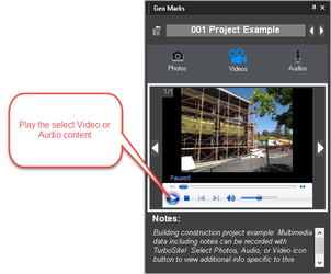
If a TAP file has been created in TurboApps with markups, then TurboCAD now has the ability to display these mark-ups when a TAP file is imported and opened into the program.