Drawing Setup
Drawing Setup
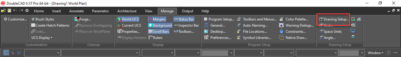
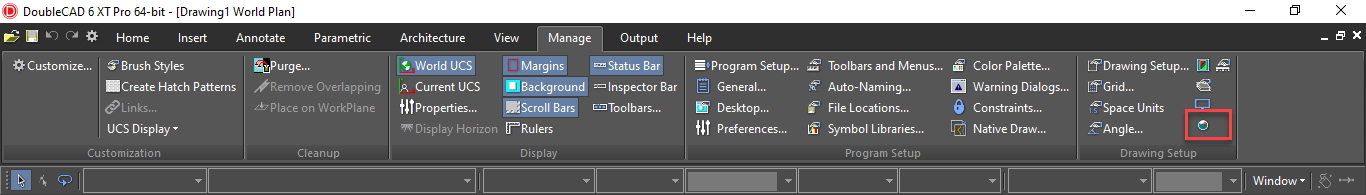
Default UI Menu: Options/Drawing Setup
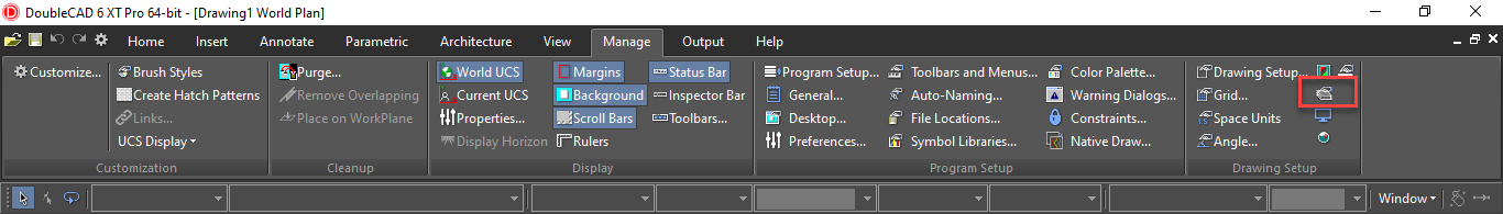
Ribbon UI Menu:
Sets properties related to the current drawing.
TheDrawing Setup pages can be accessed from the Options menu, or from the flyout icon on the Standard toolbar.
 You can also display the Drawing Setup toolbar by right-clicking in any toolbar area and selecting Drawing Setup.
Tip: You can also use the Defaults for a drawing in the DC Explorer Palette to set drawing setup options.
Angle Options
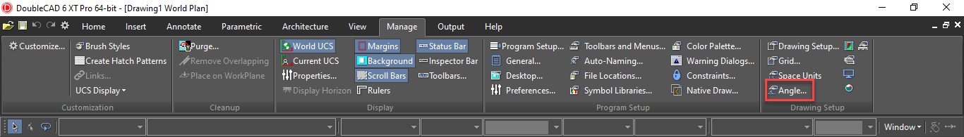
Default UI Menu: Options/Drawing Setup/Angle
Ribbon UI Menu:
Controls the measurement and display of angles, as well as control over the Ortho angle.
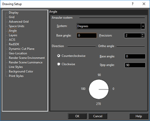
Angular System: Select degrees, degrees-minutes-seconds, grads, radians, or the surveyor system.
Base angle: The default base angle is 0 degrees (right quadrant point). You can change this value to start angle measurement from another base angle.
Precision: The number of decimal digits.
Direction: Choose whether to measure angles clockwise or counterclockwise.
Ortho Angle: By default, Ortho lines are 0 and 90 degrees. You can change this by entering new values here.
Base angle: Sets the angle from which the Ortho angle is measured.
Step angle: The angle to which Ortho constrains lines. If you set the step angle to 15, for example, the line will be constrained to angles 15 degrees apart. The default step angle is 90 degrees.
Background Color
Default UI Menu: Options/Drawing Setup/Background Color
Ribbon UI Menu:

Changes the background color, which is white by default.
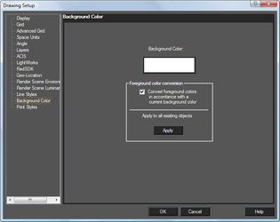 Foreground color conversion: This option is designed to prevent objects from disappearing into a background of the same color (e.g. White on White) This is accomplished by inverting the display color of the object, but not the actual color setting. Color conversion will occur if this is checked. This can be controlled at the object level as well:
Apply to all existing objects: Overrides the setting in individual objects and sets them to the 'By Drawing' default.
Foreground color conversion: This option is designed to prevent objects from disappearing into a background of the same color (e.g. White on White) This is accomplished by inverting the display color of the object, but not the actual color setting. Color conversion will occur if this is checked. This can be controlled at the object level as well:
Apply to all existing objects: Overrides the setting in individual objects and sets them to the 'By Drawing' default.
Display Options
Default UI Menu: Options/Drawing Setup/Display
Ribbon UI Menu:

Options for adjusting the quality and redraw speed of the display, and options for displaying block attribute values.
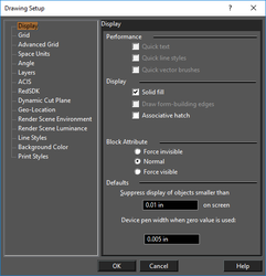
Performance
When working with large files or a slow computer, you may be able to increase your display speed by selecting one or more of these options. The display speed can sometimes be slowed by heavy text, styled lines, and fill patterns. Quick text: Displays all text as small boxes. Quick line styles: Simplifies the display of line styles. Quick vector brushes: Simplifies the display of hatch and fill patterns.
Display
Solid Fill: A line of a specified width will be drawn as solid. Draw form-building edges: Available in GDI mode. Draws form-building edges of 3D surfaces. Associative hatch: When you modify a hatched object, the hatch pattern will update to fit the new shape.
Block Attribute
Options relevant for blocks that contain block attribute definitions. Force invisible: Hides all attribute values. Normal: Shows the attribute values as they were defined while creating. Force visible: Shows all attribute values, even those defined as invisible.
Defaults
Suppress display of objects smaller than: Sets the size at which DoubleCAD will draw a simplified representation of objects. This size is measured in device units (the "device" is your computer's display) so that one inch will be equal to approximately one inch of space on your screen. At smaller sizes, DoubleCAD will display objects using a simplified representation, increasing display speed. As you zoom in, you get the detail required for precise editing; as you zoom out, you get faster redraw. Device pen width when zero value is used: Controls the printed width of lines set to zero width.
Grid Options
Default UI Menu: Options/Display Options/Grid Ribbon UI Menu:

Controls the grid type, size, and display. You can set up different grid properties for Model Space and Paper Space.
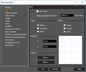 Show grid: Equivalent to displaying the grid using the Grid menu or Grid toolbar.
Hide grid when finer than: This value applies to distances on your screen which are not related to World or Paper units.
Type: These grid types are based, by default, on a horizontal baseline. This can be changed on the Advanced Grid page.
Ortho: Orthogonal grid.
Isometric: Aligned along lines measured 30º and 150º from the horizontal axis. This type of grid is used in isometric drawing, which uses perspective drawing techniques to represent 3D objects.
Polar: Points in the polar grid radiate from the origin, and are aligned by their radial distance from the origin and their angular distance from the horizontal axis.
Style: Select Points (dots at each grid point), Crosses (crosses at each main grid point), or Lines (graph paper).
Spacing: Sets the distance between all grid lines, major and minor, without respect to frequency. Select X and Y spacing, or angular and radial values for a polar grid.
Show grid: Equivalent to displaying the grid using the Grid menu or Grid toolbar.
Hide grid when finer than: This value applies to distances on your screen which are not related to World or Paper units.
Type: These grid types are based, by default, on a horizontal baseline. This can be changed on the Advanced Grid page.
Ortho: Orthogonal grid.
Isometric: Aligned along lines measured 30º and 150º from the horizontal axis. This type of grid is used in isometric drawing, which uses perspective drawing techniques to represent 3D objects.
Polar: Points in the polar grid radiate from the origin, and are aligned by their radial distance from the origin and their angular distance from the horizontal axis.
Style: Select Points (dots at each grid point), Crosses (crosses at each main grid point), or Lines (graph paper).
Spacing: Sets the distance between all grid lines, major and minor, without respect to frequency. Select X and Y spacing, or angular and radial values for a polar grid.
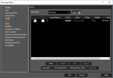
Layers
Default UI Menu: Options/Drawing Setup/Layers
Ribbon UI Menu:
Enables you to create new layers, set the current drawing layer, set the properties of layers, and delete layers.
These are legacy functions, use the Design Director or Layer Manager instead.
Geo-Location
Default UI Menu: Options/Drawing Setup/Geo-Location
Ribbon UI Menu:
Geo-Location contains three primary functions: Location, Orientation, and Display.
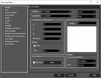 Location
- Latitude
– set the latitude of the drawing in degrees, to six decimal places.
-
South/North – specify whether the latitude angle is South or North
-
Longitude
– set the longitude the drawing in degrees, to six decimal places.
- East/West – specify whether the longitude angle is East or West
Coordinates and Elevation
-
X, Y, Z – specify the location in the drawing which corresponds to the geo-location. Units are in the model space defined Space units.
-
Elevation – specify the elevation of the drawing at that geo-location.
-
Marker
-
Show – When on this shows a crosshair marker within the drawing, located at as specified by the X, Y, Z values. This maker can be snapped to as a drawing reference.
- Size – Sets the relative size of the to the crosshair marker.
North Direction
-
Angle – Specify the Angle of orientation for North relative to the drawing.
-
Marker
– Displays a compass rose for drawing orientation
- On Screen Position – Specify the location of the compass rose: Not Display, Top Left, Bottom Right, Top Left, and Bottom Left.
- Size-- Sets the relative size of the compass rose: Tiny, Small, Normal, and Large.
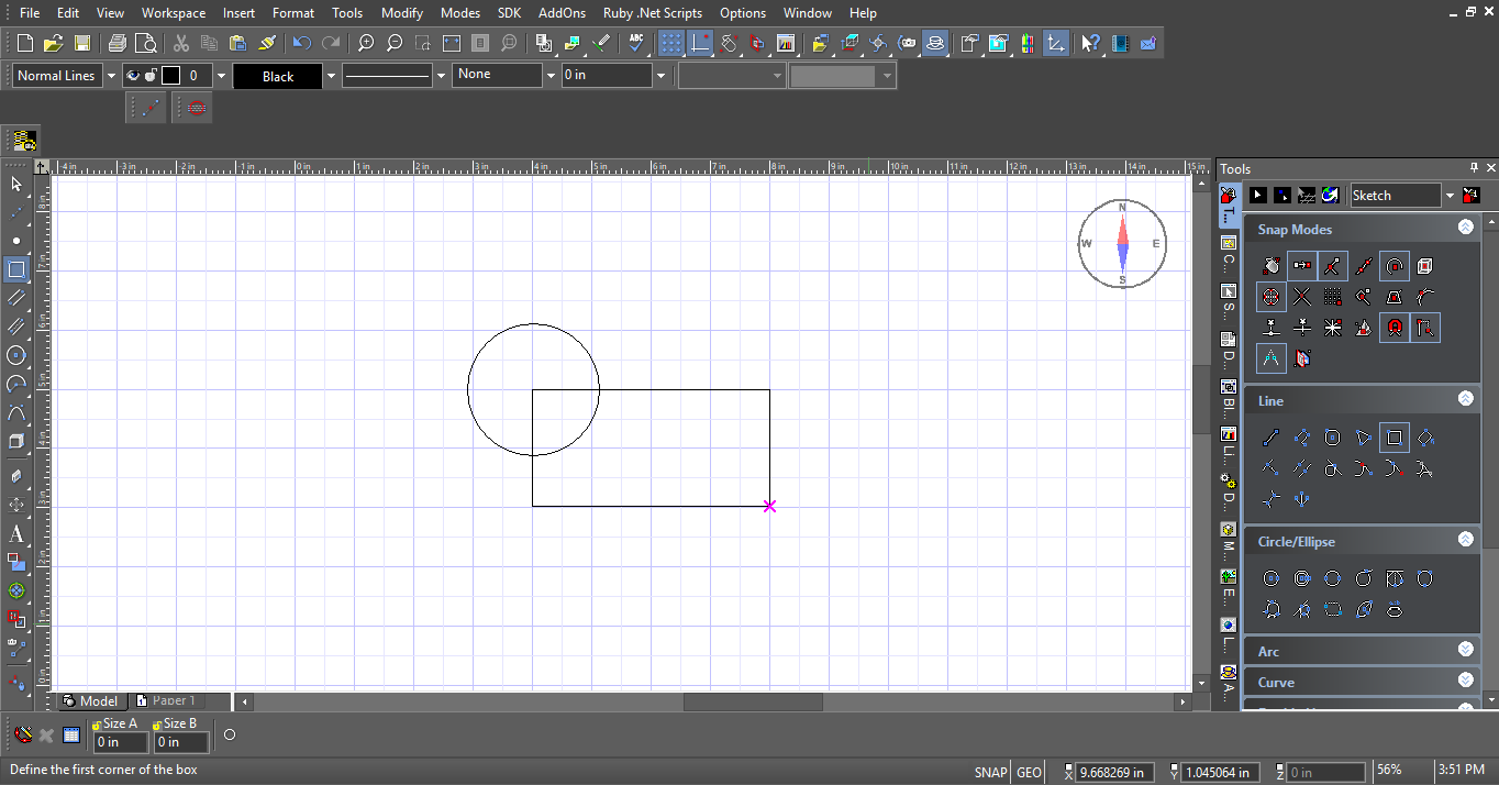
Geo-Location Crosshairs and Compass Rose
Line Styles
(Available in XT Pro)
Default UI Menu: Options/Drawing Setup/Line Styles
Ribbon UI Menu:
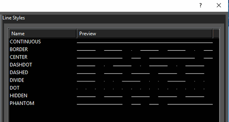
View predefined line styles, modify or delete them, and create new ones.
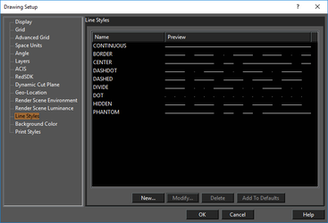 An object's line style can be set in the Property toolbar or in the Pen page of its Properties
If you clickNew or Modify, you will access the Line Style Editor.
Add to Defaults: New line styles will be saved so that they can be used in future drawings. Otherwise, the line styles will be used only in the current drawing.
An object's line style can be set in the Property toolbar or in the Pen page of its Properties
If you clickNew or Modify, you will access the Line Style Editor.
Add to Defaults: New line styles will be saved so that they can be used in future drawings. Otherwise, the line styles will be used only in the current drawing.
Tip: You can use the DC Explorer Palette to view line styles defined for any open drawing. S
Applying a Line Style
To apply the line style, you can use the Property toolbar. You can also set the line style, and adjust its scale, in the Pen page of the object's Properties.
- Create the object, which appears in the default line style.
- Select the desired line style from the Property toolbar.
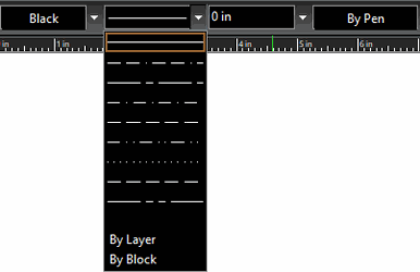 The line style is applied.
Tip: You can use the TC Explorer Palette to view line styles defined for any open drawing, and to import line styles from one drawing to another.
Line Style Editor
Enables you to edit an existing line style or define a new one.
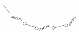
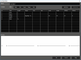 The example is shown above (line style "Utility") has four components: one dash, one text, and two shapes (hexagons). You can also add dots and spaces. Either click Add Item to add another component, or click the relevant button (Dash, Dot, etc.)
For each type of line style component, you can set various parameters. ForShape you can choose the actual shape and its size and spacing. For Text, you can choose the font and angle. The Preview window helps you see how the line style will look; use it as a guide when adjusting the parameters.
The example is shown above (line style "Utility") has four components: one dash, one text, and two shapes (hexagons). You can also add dots and spaces. Either click Add Item to add another component, or click the relevant button (Dash, Dot, etc.)
For each type of line style component, you can set various parameters. ForShape you can choose the actual shape and its size and spacing. For Text, you can choose the font and angle. The Preview window helps you see how the line style will look; use it as a guide when adjusting the parameters.
s
Once the line style has been created, it appears in the Line Styles page of the Drawing Setup.
 The new style also appears on the Property toolbar.
Print Style Table
Default UI Menu: Options/Drawing Setup/Print Styles
Ribbon UI Menu:

Select the print styles you want in your drawing.
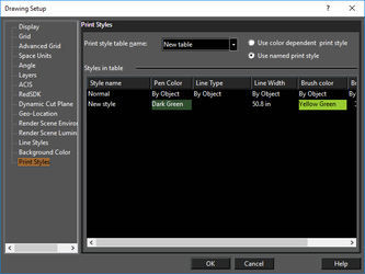 Print styles are specific pen and brush settings you can apply to objects when printing.