A Quick Tour
To get the most benefit from Punch! Home & Landscape Design Software, you should take a minute to become familiar with the layout of the Punch! drawing space, plan tabs, and toolbars.
In most cases, detailed information on standard Windows concepts or on specific menu items is not provided here. For information on standard Windows concepts, such as the mouse, the Control menu, the window border, the maximize button, dialog box controls, and other standard computer functions, refer to Windows online Help.
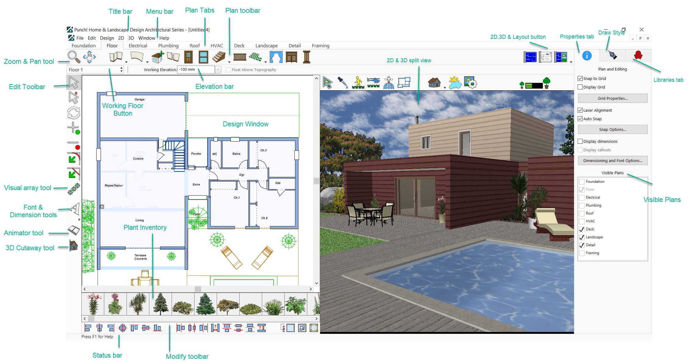
Title Bar
The title bar extends across the top of the application window. It displays the name of the program and the name of the current drawing file. Using the buttons at the right end of the title bar you can minimize, maximize, close, or restore the window. You can also maximize or restore a window by double-clicking on the title bar. Double-clicking the Control menu box at the left end of the title bar is a quick way to exit. If the application is running in a window, rather than maximized, dragging the title bar moves the entire window on the desktop.
Menu Bar
You can choose menu items using either the mouse or the keyboard. To use the mouse, click the menu name; when the menu drops down, click the item you want. Menu items with an arrow to the right display cascading menus when you place the pointer over one of them. When you highlight a menu item, a description is displayed on the Status Bar.
To use the keyboard, press ALT and type the underlined letter in the menu name, then type the underlined letter in the menu item’s name. If there is a cascading menu, you must type another letter. You can also use the arrow keys to move through menu items and press ENTER to select one. Pressing ESC backs out of the menu items one level at a time.
There are single-key or key combination shortcuts for certain frequently-used menu items. Each menu lists available shortcut keys to the right of the item’s name. You can use the techniques for choosing menu items in combination.
Plan Tabs
Punch! Home & Landscape Design Software utilizes a collection of layers, which are accessible by clicking the tabs along the top of the design window. Clicking a plan tab accesses, a set of tools that you can use to design your floor plan; for example, clicking the Electrical tab accesses outlets, switches, and ceiling fans, while clicking the Landscaping Tab accesses tools for edging, fencing, ground fill, excavation, and so on.

Tip: You can also change plans by clicking Design menu > Work on Plan and choosing the plan you want.
Once placed, each component, such as a door, window, plant, or outlet, can be altered at any time. Click the component and its properties are displayed on the Properties tab (a default that can be changed) where the customizable properties of that component are available.
You can further customize which plan layer or combination of plan layers you want to be active. In addition, you can make each plan layer a different color, so you can tell at a glance which layer a specific feature is on. You can even move some of the components to a different plan, when necessary.
By controlling which plan tabs are visible at any time, you are also controlling which layer(s) will be printed. For example, if you just want to print your electrical plan, you can turn off all other layers and just print that one.
For more information, see “Customizing Visible Plans”.
Working Floor Button
Use the Working Floor button to switch the current view, based on the number of floors in your home plan. For more information on working on different floors, see “Work on Floor”.
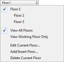
The Floor button also provides access to floor management options to control existing and new floors. For more information on adding and inserting floors, see the chapter titled “Working with Floors”.
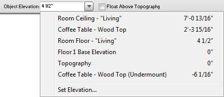
Elevation Bar
With Punch! Home & Landscape Design Software’s Elevation Bar you can easily place the selected item(s) to any level, including those that you have previously drawn. In addition to making sure windows, doors, and other components are placed at the correct elevation, you can easily place objects relative to previously-drawn entities. For example, placing a lamp on a table. For more information, see “Elevating Objects”.
Measurement Tools
The measurement tools, available from the 2D Menu, include associative dimensions, window/door callouts and cursor dimensions visibility.
Associative Dimensioning are the measurements that appear as you are adding features. For example, the Associative Dimensioning feature will show how far from the ends of each wall the window is positioned.
When the Window/Door Callouts option is checked, the measurements of all window and door openings will be shown, with the wall measurements, and be displayed in the floor plan view.
Cursor Dimensions show exactly where your cursor is located, making it easy to place lighting a precise distance from a wall, for example.
For more information on these and other measurement tools, see “Dimensioning”.
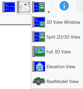
View Icons
When you load Punch! Home & Landscape Design Software, you will be working in 2D Full Plan View. This allows you to quickly draw walls, add doors and windows, and other drawing plan elements.
When you want to focus primarily on your 2D actions, while maintaining a clear view of the 3D design, select 3D View Window or Split 2D/3D View. These views are also useful for adding colors or materials. The Full 3D View and Elevation View are ideal when viewing or navigating the design in 3D.
As you move on to building a scale model of your design, RealModel View provides the pieces you will need.
For a full explanation of the view options, see the chapter titled “Viewing in 2D & 3D”.
Zoom and Pan Toolbar
The Zoom and Pan tools are quickly accessible from the main toolbar to make it easy to navigate your 2D drawing.
Zoom Tool - get a closer look at an area or see a larger portion of your plan drawing by zooming in and out. For more information, see “Zooming In and Out in 2D”.
Pan Tool - moves the design window to see portions of the plan which are outside the current view.
For more information, see “Panning Across the 2D Drawing”.
Edit Toolbar
Tools that you will use most frequently are located on the Edit Toolbar. From top to bottom, these tools include:
- Selection Tool used to select any 2D element in the design window. When an item is selected, its properties become available on the Properties tab. Use the Selection Tool to move selections and drag points to reshape.
- Resize Segment Tool precisely update the length of an individual, previously-drawn wall, stairway, railing, or another straight segment.
- Rotate Tool freely rotate the selection or specify the exact amount of rotation (by double-clicking the tool).
- Insert Point adds a point where you click.
- Remove Point deletes the point where you click.
- Fillet Corner adds a fillet (curved) corner to your topography, patio, freehand roof panel, floor, and other angled edges.
- Chamfer Corner adds a chamfer (straight) corner to your topography, patio, freehand roof panel, floor, and other angled edges.
- Visual Array Tool place a line of plants or objects at exact distances from each other

Text & Dimension Toolbar
Tools for adding text and dimensions are located on the Text & Dimension Toolbar. Simply click a tool to activate it.
Note: When the application window is not large enough to display the entire toolbar, the Text & Dimension tools are collapsed and are accessible by clicking the arrow button that is displayed below the active tool.
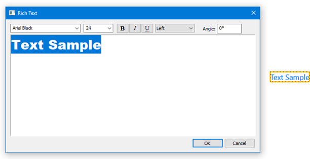
- Rich Text adds important information to your drawing. For example, add text to annotate rooms, specify at home address, the date the drawing was created, or a specific feature in your plan.
This tool includes the following features:
- Text can be rotated to different angles.
- You can define one or multiple text lines.
- Fonts can be customized, including its styles, sizes, and attributes.
- Text colors and transparencies can be defined according with your necessities.
- Assigned drawing styles to bounding box such as background fill and pattern
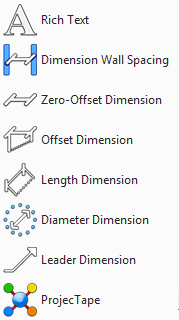
- Dimension Wall Spacing especially useful to add interactive dimensions between walls, for situations where they are not automatically generated. Dimensions drawn with the Dimension Wall Spacing Tool are automatically updated when either wall is moved.
- Zero-Offset Dimension adds a horizontal, vertical, or angled dimension directly onto the measured element.
- Offset Dimension adds a horizontal or vertical dimension with a custom offset distance between the extension lines and the measured element.
- Length Dimension allows you to measure the distance of a single segment by placing a horizontal, vertical, or angled dimension with a custom offset distance between the extension lines and the measured element.
- Diameter Dimension measure the diameter of a circle by dragging along the circle’s perimeter, automatically detects the opposite edge and displays the dimension in the middle of the circle.
Note: The Diameter Dimension Tool does not measure ellipses.
-
Leader Dimension annotate the elements in your workspace by positioning a leader dimension that points to an object, for example, when associating text with a 2D object. You can also automatically add a room’s name and area by pointing into an enclosed room.
-
ProjecTape sets and measures points at specified distances from walls, fences, as well as objects like furniture.
Animation Path
The Animation Path is a way for you to create a movie-like navigation path through or around your design. You can create a number of paths to view your design, set the viewing elevation, speed, and other settings. You can even export the animation as an .AVI file.
3D Cutaway
3D Cutaway lets you see inside your design in 3D by slicing away layers from a side, the top, or the bottom.
Properties Tab
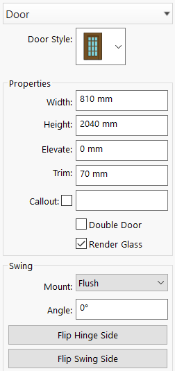
You can easily modify elements you have previously drawn by selecting them and editing their options on the Properties Tab. Properties are easily accessed by clicking an element on your floor plan.
For example, clicking a door accesses the customizable properties for doors and clicking a plant accesses the properties for plants.
If the Properties tab does not automatically display when you select an object, enable the auto display by clicking Window menu > Auto Display Tool Options. When a checkmark is visible, properties auto-display.
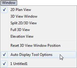
Note: You can also enable Auto Display by clicking Edit menu > Preferences > User Interface and selecting the
Auto Display Tool Options on selection checkbox.
Libraries Tab
The Libraries tab gives you access to the expansive libraries for adding objects, colors, materials, plants, and more to your design. Each library is organized into Content categories, and in some cases the categories include sub- categories. The available libraries include:
- Stock Library content included with the initial installation
- User Library items copied from the default library that can be edited
- Downloaded Library content items downloaded from content packs
- Favorites List items tagged as favorites
When you switch content libraries, the Preview bar is updated to only display those items that exist in the active library, so you can easy sort through items as you work on your design.
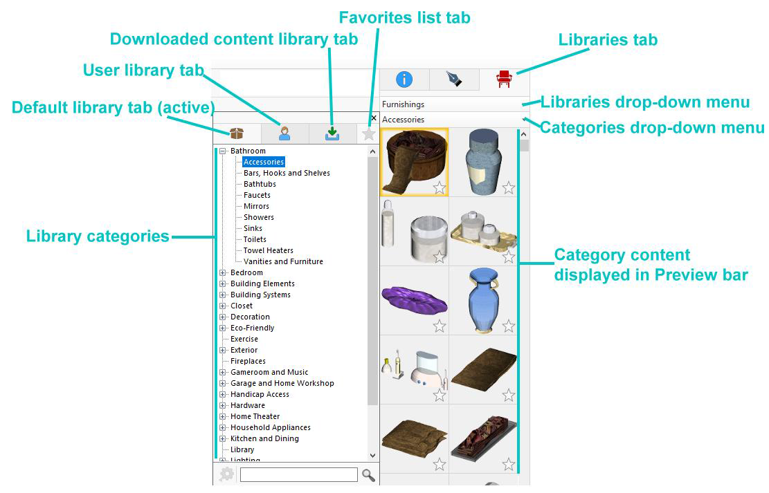
Preview Bar
You can click and drag objects, templates, materials, colors, and other items available from the Libraries tab, from their Preview Bars into your design. The Preview Bar changes to reflect your selection. For instance, if you click the Plants tab, plant options are displayed.
If you cannot add an object or material, try adding it to a different view. For example, you cannot add paint in the 2D view; this must be applied to a surface in a 3D view. Objects such as furniture or plants can be added to either the 2D or 3D view.
Status Bar
The Status Bar is located in the lower left of the window and displays prompts, program messages, and measurements. It is a good place to look when you are holding the pointer over certain buttons or menu items to find their function.
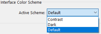
Interface Color Scheme
The application interface uses a default color scheme, which you can change as desired. Color schemes are not saved with drawing files, so the application and .PRO files always open using the default color scheme.
To change the interface color scheme
-
Click Edit menu > Preferences. The Preferences dialog box is displayed.
-
Select User Interface and choose the color scheme you want from the Color Scheme drop-down menu.
-
Click OK to set the color scheme. The interface is updated when you select an option.
Build Green Information
Punch! Home & Landscape Design Software includes information to help you with designing an energy-efficient, environmentally- minded home. Tips and information are available to help guide you as you are creating your design. Features in your design that have “green” information available are highlighted with green in the design window when the Green Information Center is open. To access information about that feature, click to select the feature.
While nothing is selected in your design, general tips and guidelines are available for review.
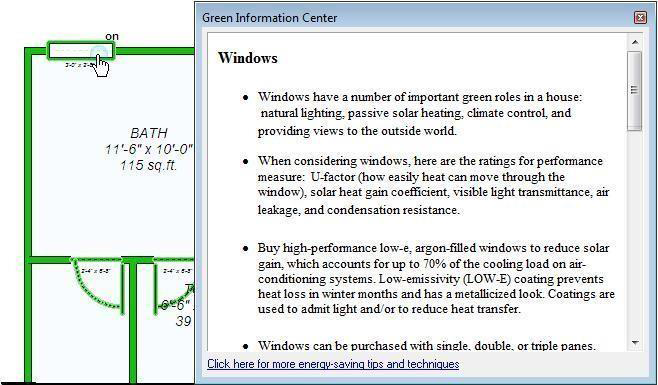
To access green tips for features in your design
-
Click Help menu > Going Green. The Green Information Center window is displayed.
-
Click to select a feature in your drawing that is displayed in green and the green information that is available is displayed in the Green Information Center window.